
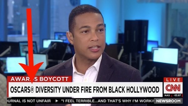
CNN bows to Oscar pressure, includes registered trademark icon next to award’s name
Weekly insights on the technology, production and business decisions shaping media and broadcast. Free to access. Independent coverage. Unsubscribe anytime.
There are certain organizations out there that think their name should always include a registered trademark icon — a practice that news organizations widely ignore. However, CNN apparently finally felt enough pressure to include it (or someone who didn’t know better was running fonts that day).
The network included the ® symbol, which denotes a federally registered trademark, next to the word “Oscars” in a lower third during a “CNN Newsroom” segment on the boycott of the Academy Awards by celebrities of color.
While the name “Oscars” is certainly a registered trademark of the Academy of Motion Picture Arts and Sciences (so CNN is correct on that count), most style manuals, including the AP Stylebook, forgo the use of it or the non-registered trademark symbol (™).
Not only does the use of it clutter up pages and graphics, but back in the old days when news was literally distributed via wires, such symbols couldn’t be transmitted.
Many of the prominent entertainment award-giving organizations, including the Academy of Motion Picture Arts and Sciences and National Academy of Television Arts & Sciences, which gives out the Emmys, are notorious strict about including proper credit next to their names and even the imagery of their statuettes, though this has been relaxed a bit over the years.
For example, it’s not uncommon to see a credit for “AMPAS” (the Academy’s acronym) tucked next to the name or images of the statue in all official imagery associated with the awards — including the graphics packages for the broadcasts.
AMPAS, like many other similar organizations, also regulate the usage of the award name or even imagery of the trophy in advertising.
Ironically, the media industry itself is not immune to overly-picky stylizing of names.

Both Tegna, which was formed as part of a restructuring of Gannett, and the latter’s flagship publication USA Today insist that their names should always be presented in all caps — despite the fact they aren’t acronyms for anything.
By the way, this site has opted not to adhere to this style since it not only draws perhaps unwarranted extra attention to the names, but also tends to make copy look messy.
[field name=iframe]

tags
AP Stylebook, CNN, cnn newsroom, emmys, lower third, Oscars
categories
Cable News, Featured