
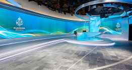
Looking back at Al Jazeera America’s appearance

Subscribe to NCS for the latest news, project case studies and product announcements in broadcast technology, creative design and engineering delivered to your inbox.
As Al Jazeera America ends its short run on the American TV dial, we look back at some of the incredible motion graphics produced by the networks in-house creative team, led by Ross Henderson, and Trollbäck+Company.
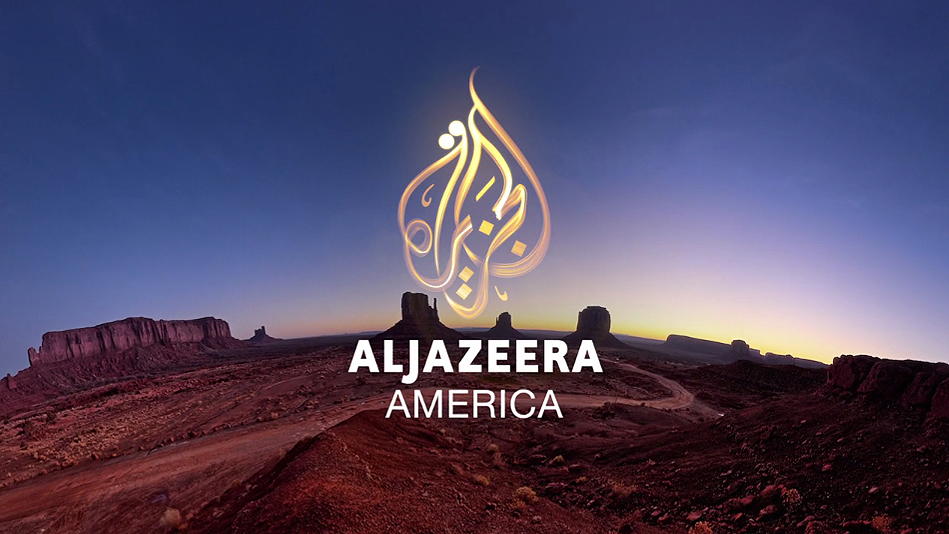
In the Beginning, There is Light
The channels main look, building off Al Jazeera’s signature logo mark, is crafted around the idea of illumination.
“The keyword at the heart of the media network brand message is ‘luminous.’ We are at the source, illuminating life with energy and clarity,” notes a AJAM creative direction presentation.
Pairing the logo mark with Helvetica Neue and the established Al Jazeera color palette from its other international properties, the master brand begins to develop, which is then carried out through the main identity, interstitials and show opens.
“It was important to find a unique American voice for Al Jazeera America. The network wanted to connect warmly with both major US metros and the Heartland, standing apart from other Al Jazeera territories,” writes Trollbäck+Company in its case study of the project. “To represent the sweeping stories and information thread together by this powerful news agency, we developed ribbons of converging light. As it flashes through glorious American landscapes, our world is illuminated with energy and power.”
Main Identity
Rays of illumination flow through scenes from across the country, culminating in the creation of AJAM’s logo for the networks main identity and titles.


This simple yet complex logo animation sequence is at the heart of AJAM’s look, with these ribbons of light also appearing in the main news open for Al Jazeera America.

The news opening reflects the global to local reach with four endings for each daypart of the news broadcast.
Interstitials
The networks interstitials build upon these rays, showcasing 360 degree panoramas of various locations that “reflect the compelling unbiassed reporting of the network as well as its commitment to coverage that is far-reaching.”
Example of Interstitial Ident
Show Opens
While some networks (like BBC) use a standardized look for its programs, Al Jazeera America programs operated with a large amount of autonomy in their motion graphics.
The design style of “America Tonight” to “Consider This” varied widely, giving each show its own voice on the channel. Here’s some of the title cards from the networks main lineup:


Explore more of the program title cards in our gallery of Al Jazeera America.
Today marks the end of Al Jazeera America, but its legacy of design will live on through the unique style it exposed the America audience to daily. It’s design style was not “safe,” it was not meant for the Fox News audience; it was distinctly foreign, yet felt comfortable for a U.S. viewer.
The team of 27 at AJAM produced many great pieces throughout the channels three year run, we hope they can bring this vision to their new jobs.
Our previous post recaps AJAM’s set design, which brought a unique style and simplicity to the cable news race in America, something we may not see again for a while.
Subscribe to NCS for the latest news, project case studies and product announcements in broadcast technology, creative design and engineering delivered to your inbox.

tags
Al Jazeera, Al Jazeera America, Branding, design, motion graphics, Ross Henderson, Trollbäck+Company
categories
Branding, Broadcast Design, Exclusives, Graphics, Heroes, MoGraph, TV News Graphics Design, TV News Graphics Package, TV News Motion Graphics Design