NBC O&Os launch disjointed new websites
Weekly insights on the technology, production and business decisions shaping media and broadcast. Free to access. Independent coverage. Unsubscribe anytime.
Two NBC O&Os have switched over to new website designs that are both uninspired and disjointed.
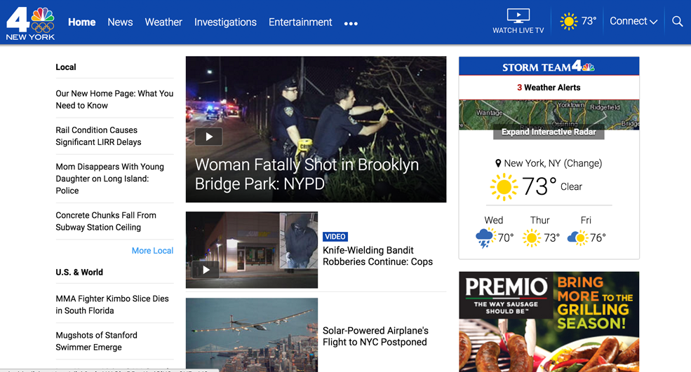
WNBC-TV in New York City and WTVJ-TV in Miami are both using the new look that includes a bold blue bar running across the top of the page.
That bar includes a streamlined navigation menu.
On the homepage, the lead story moves to the center of the page, with the far left column now devoted to headline scrapes of other top stories. Weather retains its right-hand side location with a redesigned and slightly larger module.
Elsewhere on the homepage, the sections lose their two-column layout in favor of a stacked approach, while social media embeds are also given more prominent placement.
Another key change is the addition of banner ads separating many of the section boxes, which creates a rather cluttered and haphazard look — which seem to be the ongoing theme of the new design.
The whole design feels oddly proportioned with a layout that makes it a bit confusing as to where the eye should rest. There’s also nothing terribly revolutionary about the new look — in fact it’s rather boring.
The new look is also expected to come to other NBC O&Os in the coming weeks.

Other changes coming to many NBC O&Os soon also include a new graphics package, known as “Look N,” as well as the debut of new or revamped 4 p.m. newscasts.

tags
local, NBC, NBC O&O, NBC Owned Television Stations, website, website design, WNBC
categories
Featured, Local News, Online and Digital Production