Fox News creates epic mess of clutter during Tuesday’s primary coverage

Subscribe to NCS for the latest news, project case studies and product announcements in broadcast technology, creative design and engineering delivered to your inbox.
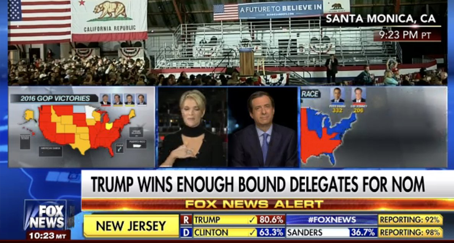
Fresh off its graphics overhaul that simplified things a bit, Fox News managed to create one of the most cluttered looks ever during its coverage of Tuesday’s primaries.
The screen, which was observed on social media by multiple folks was a sort of “franken-four-box” situation.
A large, extreme rectangle topped off the layout, with three smaller boxes under it.
Under this, meanwhile, was the network’s normal bug and lower third, plus an additional bar showing race results.
The wide banner space at top was used for both live video (that needed to be carefully framed to fit in the non-standard space) and bold graphics announcing key results.
The smaller boxes, meanwhile, were also used for live feeds, but also maps and results graphics, which were likely unreadable for some viewers.
Subscribe to NCS for the latest news, project case studies and product announcements in broadcast technology, creative design and engineering delivered to your inbox.


tags
election, Fox News
categories
Broadcast Design, Cable News, Elections, Featured, Graphics