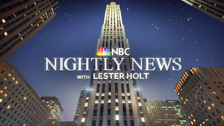
‘Nightly’ overhauls graphics package to match new open

Subscribe to NCS for the latest news, project case studies and product announcements in broadcast technology, creative design and engineering delivered to your inbox.
The typography in the lower thirds has also been updated to match the sans serif face used in the show’s reworked logo — a big improvement over the show’s previous rather eclectic mix of typefaces.
In addition, a slight gradient effect is now applied to on-screen text, making the text feel more integrated — whereas the previous look felt more like it was simply slapped on over the graphic.

The rectangles with accented corners continue on most of the show’s on-set graphics as well — where the box to hold short phrase over topical imagery.
In other segments, where the studio’s large video walls aren’t used as the primary background, the walls are filled with a world map design that’s similar to the old look — though with adjustments made to the color scheme to match the new palette.

Accented corners also make a prominent appearance in the new OTS template — which includes a larger space for topical images accented with some lighted line segments and a reflection effect below.
The OTS layout does a better job of placing the emphasis on the topic at hand and also coordinates perfectly with the rest of the package — where the previous template featured a rather random band of not-quite-orange-not-quite-pink-not-quite gold color scheme.
The show is also sporting a new logo that removes the rectangles around the logotype in favor of standalone text.
Along those lines, the show’s bug has been updated to a rather simple and elegant stacked version of that design.
However, it’s worth noting that the bug still, rather distractedly, still animates between that look and a full-color version of the NBC peacock.
In keeping with the overall graphics package, laser lines are used heavily in the animation, which hint at the old, boxy version of the show’s logo.
Subscribe to NCS for the latest news, project case studies and product announcements in broadcast technology, creative design and engineering delivered to your inbox.


tags
lester holt, NBC, NBC ArtWorks, NBC News, NBC Nightly News
categories
Graphics, Heroes, Networks, TV News Graphics Design, TV News Graphics Package, TV News Motion Graphics Design, Uncategorized