Readers pick notable Channel 9 logo designs

Weekly insights on the technology, production and business decisions shaping media and broadcast. No paywall. Independent coverage. Unsubscribe anytime.
Here’s a roundup of some of our readers’ picks for notable Channel 9 TV station logo design.
WFTV-TV

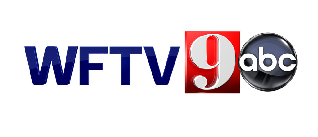
This Cox Media owned ABC affiliate in Orlando, Fla., has a bold and most distinct 9.
WFTV-TV’s logo, which typically sits inside a bright red rectangle, features a numeral with thick vertical strokes offset by elegantly thin horizontal ones.
Also of note is the large circular accent at the end of the 9’s “tail.”
The thick lines in this character are matched by the sturdy box it sits inside and also draw the eye to the number even more.
It’s also worth noting that the logo has both interesting similarities and differences with competitor WESH-TV (mentioned in the Channel 2 part of this series). Both logos use a more elegant, refined serif typeface, but the “9” is thick where the “2” is thinner.
Both also sit inside of a red field (actually, in Orlando, all of the big three broadcast affiliates use red behind their logos), but where WESH-TV’s is a circle, WFTV-TV is a rectangle.
Incidentally, WKMG-TV, the market’s CBS affiliate, currently uses an oval container and a more script-style font, but it also used a rectangular box in the past.
Bay News 9

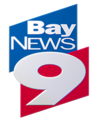
Just across the state from WFTV-TV is Bay News 9, the Bright House Networks owned cable news channel for the Tampa Bay area.
The channel has a distinct logo that uses two intersecting polygons to form a contain that holds both the words “Bay News” and much of the “9.”
The “9” itself is also distinct — with its thick strokes maintained throughout and sharp “foot” that matches the shard-like polygons. The extreme wideness of the numeral, meanwhile, gives the logo a solid foundation, while the placement of the red background helps the number stand out.
The channel’s logo, incidentally, has been duplicated at the Orlando based “News 13,” also owned by Bright House, though arguably a bit less successfully (but more on that when we hit “13” with this series).
WMUR-TV

WMUR-TV, the Hearst owned ABC affiliate in Manchester, N.H., uses a narrower yet still thick “9” in its logo.
The numeral the station uses is more structural and places less emphasis on the curves of the glyph.
Recently, the station has started placing the logo in a blue field tucked inside an oblong blue and silver rings that also circle its call letters.
That ring motif ties into the station’s unique situation as the only Hearst station that doesn’t use the group’s trademark “diagrid” look due to its proximity and overlap with the group’s stations in Boston, Plattsburgh, N.Y./Burlington, Vt., and Portland, Maine.
WCPO-TV

WCPO-TV, E.W. Scripps owned ABC affiliate in Cincinnati, Ohio, uses a clean and smooth “9” that’s most recognizable by the distinct “notch” taken out of the space where the curved left stroke connects back to the right portion of the character.
It’s interesting to note how this one seemingly small detail can make the character so distinct in what’s otherwise a pretty basic “9.”
The “9” also features a shorter “leg” than most other typefaces, which also places more emphasis on the rounded portion of the number, which also allows the round negative space in the “9” to stand out better as a parallel design element to the ABC globe that’s typically tucked in the lower right of the numeral.
The station also typically places the number between a red and yellow box, with the negative space of the “9” remaining red, leaving the yellow area as space for the station’s “On Your Side” branding.
That branding is set in blocky, condensed right aligned text that creates some odd trapped negative space, while the station’s URL fills a black box just below.
In some lockups of the logo, however, the station uses a wider, more contemporary font that seems to be compete less with the bold “9” while also connecting to the circular strokes a bit better.
Nine Network

Jumping outside the United States, Australia’s Nine Network also uses a highly recognizable logo that includes some clever references to its channel number.
The broadcaster uses a boxy “9” glyph that’s somewhat reminiscent of an old fashioned egg crate readout — though its rounded corners add a bit more character and to the look.
To the left of the custom drawn number, meanwhile, are nine dots arranged in three rows of the three.
It’s worth noting how the dots match the thickness of the number and also align with the three horizontal strokes in the “9” on the vertical baseline.
The negative spacing between the dots makes the left side feel “lighter” so the “9” remains the dominant element. At the same time, because, collectively, the nine dots occupy basically the same footprint as the “9,” the logo still manages to feel balanced at the same time.
This post is part of a semi-regular series on NewscastStudio that takes a look at TV station and network logos that include the numbers 1 and up. These posts aren’t meant to be a comprehensive list of all logos featuring the number in question, but rather a look at notable logos with creative, historic or an otherwise significant impact on branding design. If you have other logos with the number featured in this post, feel free to share it in the comments.


tags
Australia, Bay News 9, Boston, Burlington, Cincinnati, design by numbers, logo design, manchester, News 13, Nine Network, orlando, Plattsburgh, portland, tampa, wcpo, wesh, wftv, wkmg, wmur
categories
Branding, Design By Numbers