
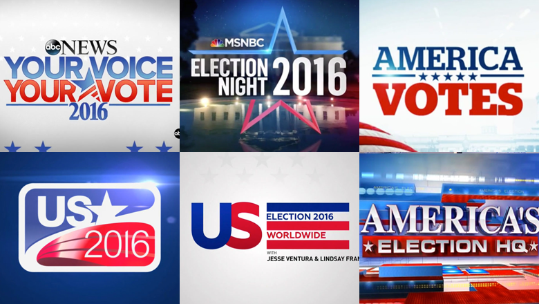
A look at notable Election Night logos from around the globe
Weekly insights on the technology, production and business decisions shaping media and broadcast. Free to access. Independent coverage. Unsubscribe anytime.
This week, we take a brief break from Design by Numbers for an overview of the logos used across the globe to cover the 2016 U.S. presidential elections.
Here’s an in-depth look at some of the notable election night logo designs from 2016.
ABC News

Using its “Your Voice Your Vote 2016” branding, ABC News‘ text-heavy election logo includes a star shaped icon with diagonal stripes.
The star, which loses its right “arm” to mirror the angle of the “V”s, is probably one of the stronger elements of the logo. It manages to be a start while also incorporating a stripes motif at the same time and in the same space.The rest of the logo, however, suffers from too much text, odd spacing, strange scaling and lack of a clear dominant element.
The rest of the logo, however, suffers from too much text, odd spacing, strange scaling and lack of a clear dominant element.
The letters in both lines are extremely condensed, making the logo feel a bit tight in places.
It’s also interesting to note that the two instances of “Your” are slightly different sizes. While this likely was a conscious design choice to make room for the lower part of the star icon and add some balance to the layout, it comes across as looking more like a mistake.

The lower “Your” is also condensed, but doesn’t use a truly condensed version of the typeface, which creates some odd stroke variances.
The two “V”s also stack oddly. Though the angle attempts to match the right side of the star, it’s a bit off and the left side stroke of “V” in “Voice” appears to be slightly tweaked.
Overall, the eye doesn’t quite know where to rest. While “Your Voice” appears to be slightly more dominant, the star and second line both compete for attention.
NBCUniversal networks
![]()
The networks of NBCUniversal used the “Decision 2016” branding as sort of an umbrella theme, with each one having a unique name as well as variation of the star-based Decision 2016 logo.
Overall, the Decision 2016 logo is strong and consistent. While a more traditional star shape is used to separate “Decision” and “2016,” a larger star-inspired outline is used a variety of ways to sort of frame and anchor the logo.
The exaggerated left and right horizontal bar of the star has a weight that ties into the letters’ strokes while also creating an abstract rendition of wings being spread open.
It’s also worth noting the care that was given to how the lower right of the “N” and lower left of “2” are placed in relation to the start outline below it.
That said, one of the weaker elements of the logo is the decision to colorize “2016” in two separate hues, which causes the year to feel a bit “broken” into two pieces while also fading into the background into many cases.

tags
ABC News, CBC, CBS News, CNBC, CNN, euronews, Fox News Channel, logo design, MSNBC, NBC News, NBCUniversal, rt, telemundo
categories
Branding, Elections, Heroes