
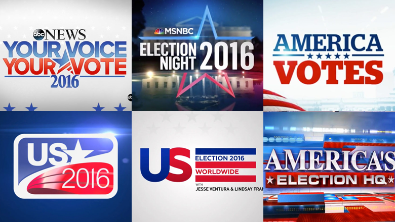
A look at notable Election Night logos from around the globe
Weekly insights on the technology, production and business decisions shaping media and broadcast. Free to access. Independent coverage. Unsubscribe anytime.
Telemundo

Spanish-language Telemundo used “Decisión 2016” branding — with an almost identical logo as “Decision 2016.”
Conveniently, the Spanish and English spelling of the “Decision” are nearly identical — the only difference being the accent mark on the “o,” which is carefully notched out of the left horizontal bar of the star.
CNBC

Finally for NBCUniversal, over at CNBC, perhaps the weakest version of the “Decision 2016” family of logos is used.
While the network used a similar, off balanced, version of the star outline to MSNBC, this version starts to suffer from the same clutter issue that ABC News’ logo has (ironically, both logos also use a parallel structure that uses two instances of the word “Your”).
With the amount of text crammed into the logo, its hard for any text to really be a dominant element — and the very large star that separates the two elements feels a bit misplaced and out of scale.
It’s also worth noting that, with the exception of Telemundo, all of the NBCUniversal logos tended to use a more generic, condensed typeface in favor of the “Decision 2016” font that added a bit more character with its rounded corners and sharp hooks.

tags
ABC News, CBC, CBS News, CNBC, CNN, euronews, Fox News Channel, logo design, MSNBC, NBC News, NBCUniversal, rt, telemundo
categories
Branding, Elections, Heroes