
A look at notable Election Night logos from around the globe
Weekly insights on the technology, production and business decisions shaping media and broadcast. Free to access. Independent coverage. Unsubscribe anytime.
CBS News

CBS News branded under the “Campaign 2016: Election Night” moniker with its ultra-condensed typeface used prominently.
In some cases, however, the two parts of the logotype are split in half vertically, with the left half meant to be read first and the right half second.
The effect is a sort of checkboard pattern of blue and red typography, with a vertical line separating the two lines and preventing, at least to some extent, the logo from being read as “Campaign Election 2016 Night.”
This logo suffers a bit from a lack of dominant element as well, with the extra spacing between characters in “2016” drawing the eye in that direction, but the larger size of “Night” in direct competition with it.
The logo does, however, work well in conjunction with the network’s lighter toned background images, giving the overall package what’s perhaps a fresher and more modern take, as well as, perhaps, a subtle nod to the White House.
Fox News Channel

Over at Fox News Channel, the network used a strong and sturdy look with thick letters and bars combined with red, white and blue shapes and gold accents.

The network’s branding “America’s Election HQ,” includes a logotype with a large, serif “America’s” atop a bold red bar with the “Election HQ” words capped with stars on either end.
In certain uses, such as the one shown here, the red bar in the logo is cleverly combined with the 3D blocky shapes to create an abstract American flag — with the shield of blue in the upper left created by a series of stacked blue-edged boxes and the stripes incorporated through the use of the red undersides of the blocks. Light bursts as well as negative space.
Light bursts as well as negative space stand in for the white stripes.
CNN

CNN, which branding its election coverage under the “Election Night in America” branding as well as the broader “America’s Choice” moniker.
In most cases, the network relied on a logotype using its proprietary CNN Sans typeface with its venerable logo perched atop three horizontal bars, which could be interpreted as flag stripes or “meters.”
That said, some instances of the branding appeared in a more condensed typeface:

In these applications, a red white and blue rule at the bottom is intersected by two diagonal light bursts that “cut” through the stripes to make room fo the “in America” text.
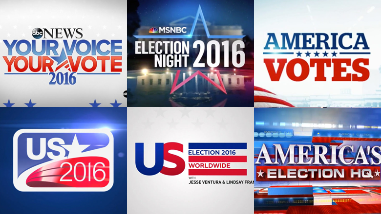
CBC

Canadian broadcaster CBC used “America Votes” as its title for election night coverage.
The logotype is rendered in a friendly, serif typeface that’s been carefully spaced. A horizontal bar separated by five stars separates the two lines of the stacked logotype.

Euronews

European broadcaster Euronews created one of the more interesting logos used this election cycle.
The elements of the logo are placed inside a rounded rectangle with thick border. The logo is bisected by a gentle curve that creates a blue and red area that, in turn, contain the words “US” and “2016.”
Next to the “US” is a star that’s integrated with the curve with a subtle notched taken out of the lower left. Also note how the left “arm” of the star tucks in gently under the end of the “S” stroke.
Meanwhile, the red background of “2016” features three curved shiny bands.
One of the particularly nice touches of this logo is how well the curves of the typeface, particularly the “2016” appear to match the curves found elsewhere in the logo. Combined, these curves, while not perfectly matching, do a great job of creating a sense of even and consistent flow and motion.
RT

Russian broadcast RT’s election night logo included a large “US” with the letters purposefully butting into each other — one appears in blue, the other red.
To the right of this, three horizontal bars, one blue and two red, serve as a sort of framework for the words “Election 2016 Worldwide.”
The logotype is rendered in a typeface similar to the London Underground font, giving the logo a modern and clean look.

tags
ABC News, CBC, CBS News, CNBC, CNN, euronews, Fox News Channel, logo design, MSNBC, NBC News, NBCUniversal, rt, telemundo
categories
Branding, Elections, Heroes