
‘Today’ launches swipe-centric new app
Subscribe to NCS for the latest news, project case studies and product announcements in broadcast technology, creative design and engineering delivered to your inbox.
NBC News‘ “Today Show” is celebrating its 65th anniversary with a completely redesigned mobile app that places an emphasis on “swipeable” content.
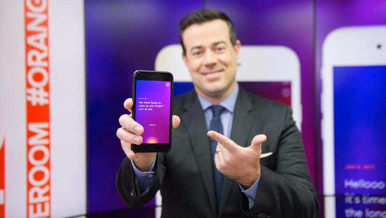
The centerpiece of the new app, available in both the Apple App Store and Google Play, is the “Digest,” a vertically scrolling collection of the day’s top stories told via text, photos and large pull quotes.

The digest opens with a snappy greeting (“Hello, hump day” on launch day) and then prompts the user to swipe up to scroll through a collection of top content.
For a visual cue to swipe, the app uses an alternate, animated version of the show’s “sunrise” logo.
The pulsating effect of circular rings could be confused, at first glance, to a voice activated feature, but its function quickly becomes apparent through both visual cues and simply experimenting with the app.
The “Digest” provides a clean and easy to use experience that Snapchat users will find very familiar. In many ways, the entire user experience interface appears to be a
In many ways, the entire user experience interface appears to be a thinly veiled attempt to duplicate Snapchat’s experience of scrollable content that’s easy to read at a glance.

The color scheme of the app, especially the one used in the Digest, is also a bit of an unusual choice for a morning-focused app.
The mostly dark purples and blues instead of the oranges, yellows, reds and bright blue the show uses elsewhere are much more suggestive of evening, rather than the warmer color scheme more frequently associated with sunrises and morning.
Along these same lines, it’s also worth noting the purples and blues are also used heavily in the “NBC Nightly News” graphics package.
The typography in the app uses a clear and simple sans serif that’s similar to that used on air, with serif accents that give the app a feel of elegance,
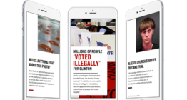
Outside of the Digest, the app uses a more traditional news app look and feel.
Here, stories across all content areas are mixed together in a newsfeed-style layout with left-to-right swipeable carousel at the top.
The other main part of the app is a “Discover” section that provides a more category-based layout.
Overall, the combination of these three primary parts of the app allow users to select from a variety of presentation formats.
The Digest, meanwhile, remains easily accessible from almost any part of the app, again using the show’s logo icon as its graphical cue.
The new app can be downloaded for iOS and Android devices here.
Subscribe to NCS for the latest news, project case studies and product announcements in broadcast technology, creative design and engineering delivered to your inbox.

tags
mobile app, mobile apps, NBC, NBC News, NBC Nightly News, Today, Today Show
categories
Heroes, Networks, Online and Digital Production