
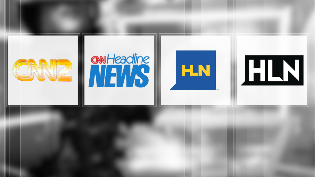
A look back at the history of HLN’s branding, logos
Weekly insights on the technology, production and business decisions shaping media and broadcast. Free to access. Independent coverage. Unsubscribe anytime.
![]()
The design of this logo was later refined to become italicized and include the CNN logo next to the word “headline.” During this period, the network heavily branded around its 24-hour “news wheel” format.
![]()
The network also simplified its logo to use “Headline News” rendered in Helvetica, with the word “Headline” boldfaced. For some portions of this period, the CNN logo is tucked above “ea” and part of the “d.”
Along with the new logo came a new approach — a screen divided into multiple sections with traditional anchor and tape segments appearing in one frame, along with news, weather and other information appearing in others. The amount of on-screen information going beyond a ticker was revolutionary for the time, though not necessarily well received by critics and viewers.
The screen setup was eventually simplified and done away with altogether during primetime hours, when the network offered single topic and personality driven programming under the “Headline Prime” banner.
Over the years, the network was sometimes referred to as simply “Headline News” — while other times the “A CNN Network” tagline was included.


tags
CNN, cnn headline news, CNN2, headline news, HLN, logo design, TV station logo design
categories
Branding, Broadcast Design, Cable News, Featured