A look back at the ‘CBS Evening News’ logo designs

Subscribe to NCS for the latest news, project case studies and product announcements in broadcast technology, creative design and engineering delivered to your inbox.
As CBS News begins the process of transitioning anchor Scott Pelley away from the anchor desk, here’s a look back at some of the logo designs the “CBS Evening News” has used over the years.
Most recently, the network used a white-toned look with square imagery and an extruded map design motif.
The broadcast’s logotype is rendered in a heavy, condensed sans serif typeface.

Prior to this, the network used a similar look with a slightly different logotype configuration. This version also included a gold-toned world map along with dark blue-gray accents and frosted rectangle elements.

Before this look, the broadcast used a red, white and blue color scheme along with three globe icons. This look was a holdover from Katie Couric’s time at the anchor desk.

Prior to this, the Couric era featured a logo that was accented with curved elements and warmer colors.

During Dan Rather’s final days at the anchor desk, as well as during Bob Schieffer’s interim tenure, the broadcast used a heavier Bodoni-esque font borrowed from the network’s news division logo, along with Banker’s Gothic as a secondary font.
The graphics during this period included vertical blue textures and curved “panels.”

Another Rather-era look used two intersecting lines with the CBS eye in the upper left quadrant, “CBS” in the upper right and the “Evening News” in the lower right. The line “with Dan Rather” appeared at the bottom, with the vertical line to the left of Rather’s name.

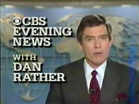
Here’s a collection of other logos used during Rather’s tenure at the helm of the broadcast.


Finally, here’s a quick look at some of the logos from when Walter Cronkite anchored the broadcast:


Subscribe to NCS for the latest news, project case studies and product announcements in broadcast technology, creative design and engineering delivered to your inbox.


tags
Bob Schieffer, CBS, CBS Evening News, CBS News, dan rather, katie couric, logo design, scott pelley, walter cronkite
categories
Branding, Broadcast Design, Featured, Networks