Chicago’s ‘The U’ gets new logo

Subscribe to NCS for the latest news, project case studies and product announcements in broadcast technology, creative design and engineering delivered to your inbox.
WCIU, a Chicago based independent station that brands as “The U,” has updated its logo.
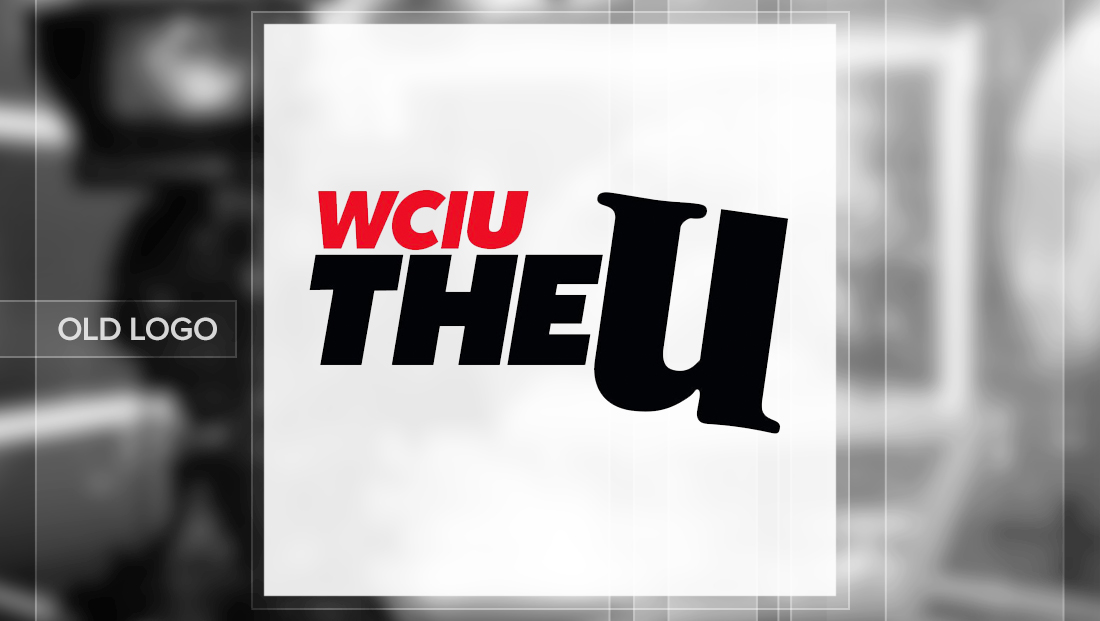
The station, which is owned by Weigel Broadcasting, previously used a logo that mixed a bold, italic sans serif typeface for its call letters and the word “the” along with lowercase “u” in a playfully drawn typeface.
WCIU’s branding is somewhat unique in that it almost never mentions the station’s channel number, unlike many other stations, with the only reference to it that appears regularly onscreen is in the tiny text used in IDs.
The angle of the “u” roughly matches the italic tilt in the sans serif font, while the call sign appears in red.

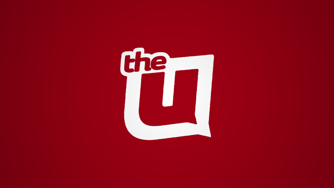
The new logo, meanwhile, switches to a darker shade of red and places more emphasis on the “u,” which now appears as a custom drawn sans serif glyph with a “tail” that not only retains some of the playfulness of the previous look but also suggests a speech bubble.

The new logo also includes the word “the” in lowercase letters integrated into the thick border around the “u” figure, which plays a big role in adding to the suggestion of a speech bubble.
By allowing the “the” to overhang off the upper left side of the logo, the “tail” in the lower right is mirrored and balanced, while also adding to the informal nature of the look.

WLS, the Chicago ABC O&O, which produces a 7 p.m. newscast for WCIU, also updated the newscast’s open to incorporate the new logo.

The insert graphics and bug, which rotates between the “U” logo and the ABC Circle 7 logo have also been updated to incorporate the new logo, while the newscast still utilizes the WLS graphics package.

The bug has also been updated on the station’s morning offer, “You & Me,” and its onscreen promos, which use a yellow accent against a red background with “pop dots” pattern.

Subscribe to NCS for the latest news, project case studies and product announcements in broadcast technology, creative design and engineering delivered to your inbox.


tags
Chicago, wciu, weigel broadcasting, wls
categories
Branding, Featured, Local News, TV News Graphics Design, TV News Graphics Package