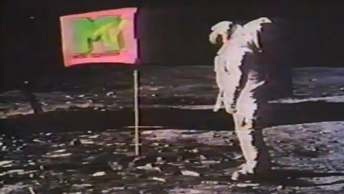
A look back at MTV’s iconic logo design

Subscribe to NCS for the latest news, project case studies and product announcements in broadcast technology, creative design and engineering delivered to your inbox.
One of the most iconic brands in television celebrates its 36th birthday Aug. 1, 2017 — MTV.
Although the network that built its name on running music videos has shifted its programming to hardly iAlthough the network that built its name on running music videos has shifted its programming to hardly include any today, the network’s logo design has remained remarkably similar.nclude any today, the network’s logo design has remained remarkably similar.
Of course, the MTV logo is perhaps best known for its iconic placement over the flag in imagery taken from the Apollo 11 moon landing.
This image was part of the official launch broadcast of the network, which was accompanied by the words “Ladies and gentlemen, rock and roll,” spoken by one of the founders of the network, John Lack and featured additional shuttle and moon mission images.
While the logo has undergone numerous treatments and stylizing over the years, the basic concept of the logo has remained the same — with the only major change coming in 2009.

Prior to 2009, the official logo included the tagline “Music Television” below the iconic “M” with scrawled “TV” placed on the right side.

However, marking the network’s decreased focus on music videos, the network dropped the longhand form of its name and removed it from its logo as well.
The 2009 logo include a few a significant tweaks:
- The letter “M” became significantly wider
- The overall footprint of the logo grew wider as well
- The “point” in the middle of the “M” was, at the same time, brought down closer to the baseline.
- The “scrawling” typography of the “TV” was cleaned up a bit.
- The outline on the “tail” of the “V” was removed, instead allowing the letter to fade out into the surrounding whitespace.
Another change to the logo was when the channel began offering a high definition feed, when a thick bar was added under the logo with the letters “HD” — making the footprint of the logo more of a square.

Subscribe to NCS for the latest news, project case studies and product announcements in broadcast technology, creative design and engineering delivered to your inbox.


tags
logo design, MTV
categories
Branding, Broadcast Design, Broadcast Industry News, Featured