
‘Morning Joe’ celebrates 10 years of coffee-hour talk on MSNBC
Weekly insights on the technology, production and business decisions shaping media and broadcast. Free to access. Independent coverage. Unsubscribe anytime.
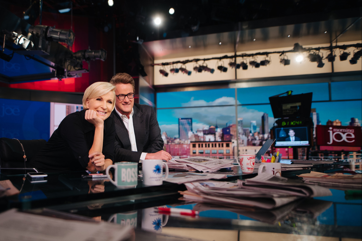
A consistent logo design
![]()
Despite its many scenic changes over the years, the one thing that has remained fairly consistent is the show’s logo design.
The logo includes a slightly chunky serif typeface, with the “o” in “Joe” replaced with what looks like a coffee ring. In addition, the tittle on the “j” looks like a splatter of coffee, an obvious reference to the vernacular use of “joe” referring to coffee.

The logo has, however, undergone a few minor tweaks — in some versions the tittle above the “j” is left untouched and is a plain circle. The logo also lost some of the “drip marks” around the “o” over the years and sometimes varies slightly when it appears in a single color.
The show’s overall color scheme has also gone through a deep brown and light tan one, undoubtedly inspired by the coffee themed name, to a bolder red palette today.

tags
30 Rock, 30 Rockefeller Plaza, Chris Licht, Imus in the Morning, John Ridley, Mika Brzezinski, morning joe, morning show, morning show set design, MSNBC, Scarborough Country, Studio 3A, willie geist
categories
Branding, Broadcast Industry News, Cable News, Heroes, Set Design