
CBC launching overhauled website designs
Weekly insights on the technology, production and business decisions shaping media and broadcast. Free to access. Independent coverage. Unsubscribe anytime.
It’s a busy time at the CBC — in addition to debuting a sophisticated overhaul to its signature evening newscast, The National, the Canadian network is also rolling out a new, consolidated website design.
The move is part of an effort to make the site more mobile friendly as well as realize efficiencies by consolidating its Web properties onto a common platform.
In addition, the network has overhauled its newsroom operations and workflows for both online and on air content, all of which play a factor into the website overhaul.

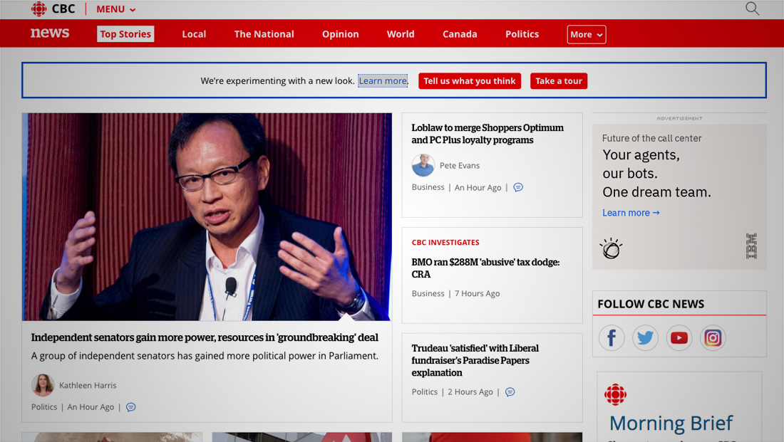
For now, the network is running two versions of most site pages at the same time and is testing the new look for select users while also letting users revert back to the old look (the image above, which is the old design, was taken at roughly the same time as the image at the top of the page, which shows the new look).
The new CBC design sheds its “boxed in” look and feel in favor of a more open look made up of boxed sections bordered with pale gray lines.
The site’s typography has been updated to use Open Sans mixed with, on news pages, Stag for headlines, a move that brings the online design more in line with the network’s on air look (for an in-depth look at the guidelines for the new site, check out the network’s public style guide).
In addition to the text changes, the new look also includes heavier use of thumbnail-style imagery, some of which is accented with an upward point negative arrow along the bottom.


The new design also includes a unique popup style navigation menu that covers almost the entire screen.

tags
CBC, web design
categories
Branding, Broadcast Design, Featured, Networks, Online and Digital Production