Hearst Orlando goes a bit straighter in new graphics package
Weekly insights on the technology, production and business decisions shaping media and broadcast. Free to access. Independent coverage. Unsubscribe anytime.
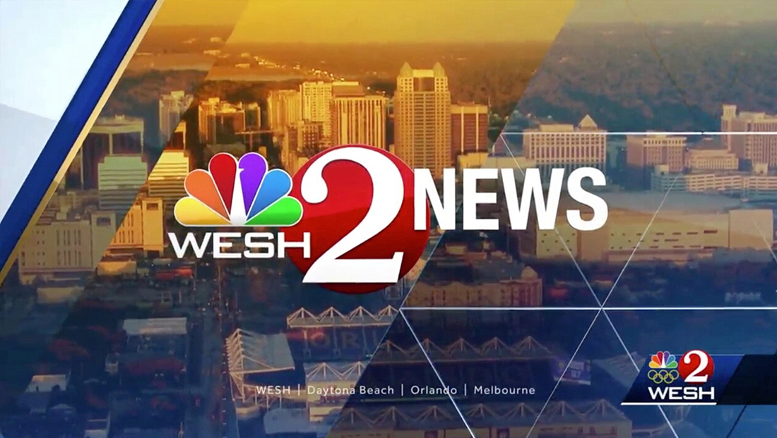
Hearst’s WESH, the NBC affiliate in Orlando, Florida, has switched to a new graphics package that draws on the group’s trademark “diagrid” angular pattern for inspiration — but also straightens out some of the lines in key areas.
The diagrid pattern is still visible throughout the package primary as a background element, with angled elements used elsewhere as a nod to distinctive angles of the familiar diamond shape inspired by the lines in Hearst’s skyscraper in New York City.
Designed by Hearst’s in-house group graphics team, which also happens to be based at WESH, the new look is also a bit flatter and less metallic than before, giving the package a cleaner feel.

The most significant update, however, is in the station’s lower third insert graphics.

The old supers heavily used the angular motif — with, in many cases, nearly every side of the lower thirds incorporating the angled look, though, in some cases, however, a gradient fade was used in place of the angle on one side.

The new look switches to a full width design that extends outside of the 4:3 safe area. The diagrid pattern is incorporated more subtly — namely through the use of subtle gradients and textures in the blue background, along with in the white top tier that is added in some cases.

It’s worth noting that in this application, the angle serves as a sort of “divider” within a rectangular band.
The station’s bug does retain the angular containers of the old look, though in a simplified version that, instead of “floating” in the middle of the screen, features a dark semitransparent rectangle that connects it to the right side of the screen.

In addition, for breaking news, a diagrid inspired polygon is added to the left of the bug.

Other elements of the rest of the new graphics package incorporate the angled and diagrid elements, though, here again, the use is often used as part of a larger rectangle.
A key advantage of the more rectangular design is that text is significant enlarged and fits better within the containers.
For a color palette, the new look retains blues, golds, silvers of the old look in slightly brighter shades. Red, like that found in the station’s distinctive Channel 2 logo, is added to the look for breaking news and an accent color used, most notably, in WESH’s “First Alert” weather branding.

In addition to the new graphics, the station is using a slightly different version of “Strive,” the group’s news music package.


tags
Diagrid, hearst, hearst television, news music package, orlando, Strive, wesh
categories
Branding, Broadcast Design, Broadcast Industry News, Graphics, Heroes, Local News