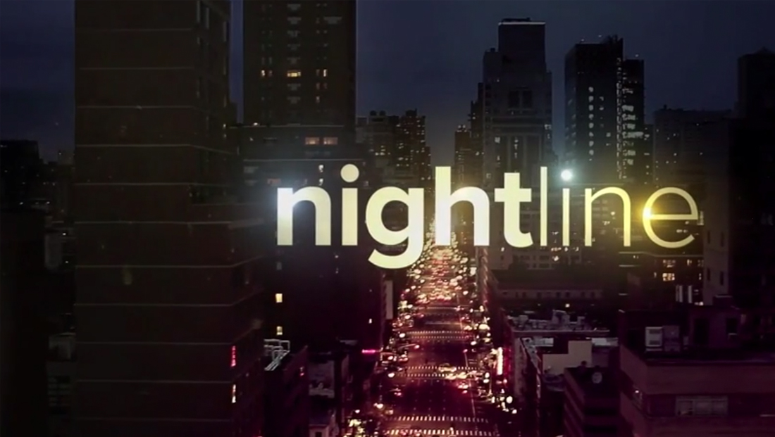
Venerable ‘Nightline’ sheds longtime logo motif

Subscribe to NCS for the latest news, project case studies and product announcements in broadcast technology, creative design and engineering delivered to your inbox.
ABC News‘ “Nightline” overhauled its logo design and graphics, dropping the basic design motif it has used since going on the air under its current name in 1980.
The show, which originally debuted as a special named “The Iran Crisis: America Held Hostage” hosted by Ted Koppel in 1979, would eventually be renamed “Nightline” in 1980, even as the 444-day long Iran hostage situation continued.

From the time the show was renamed until 2000, the show used a logo featuring the word “Nightline” in a narrow, all caps font. Inside the bottom portion of the letters was a stylized cityscape, while the “sky” above was filled with horizontal banding.
The logo did, over the years, go through some refinements and changes as the show’s graphics and set changed as well.
In 2000, the show overhauled its logo to drop the skyline and only utilized the horizontal line motif on, well, the “line” part of its name, but the overall look and feel was essentially the same.
Originally, the logo had slightly different letter shapes and did not appear in italics, the but the network would eventually switch to that look, which remained, under a variety of color schemes and slight variations, until Jan. 22, 2018.

For that day’s edition, ABC went basically in the opposite direction of the old look — opting for an all lowercase, wide typeface without any line accents in what appears to be Proxima Nova, a popular choice for TV news graphics.
The graphics were also updated to incorporate bright bursts in gold against heavily filtered city imagery.


Tease and story title graphics, meanwhile, were set inside a transparent band, while the insert graphics are simple white text in a condensed typeface that, interestingly, do not match the wider curved strokes in the logotype font.


Subscribe to NCS for the latest news, project case studies and product announcements in broadcast technology, creative design and engineering delivered to your inbox.


tags
ABC, ABC News, fonts, logo design, nightline
categories
Branding, Broadcast Design, Broadcast Industry News, Featured, Graphics