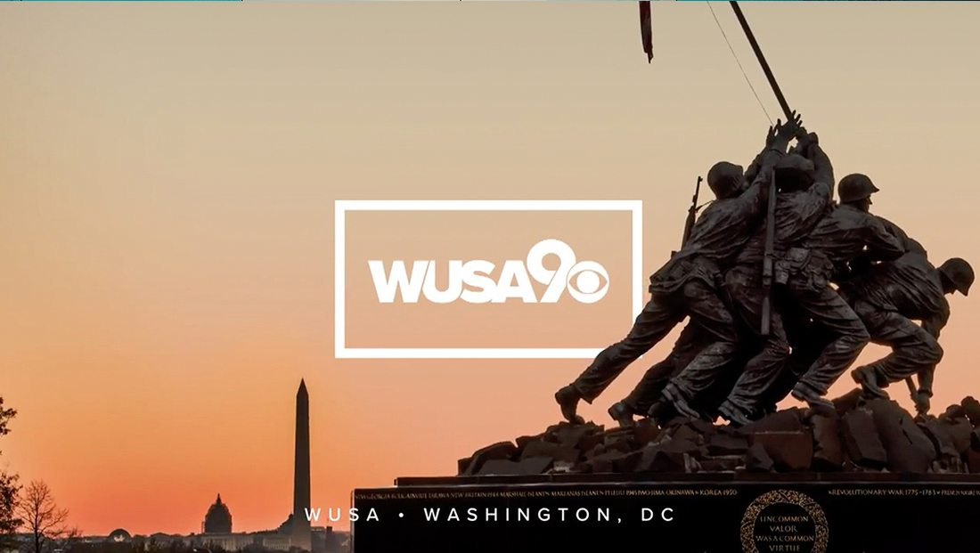
WUSA updates logo design

Subscribe to NCS for the latest news, project case studies and product announcements in broadcast technology, creative design and engineering delivered to your inbox.
Accompanying the debut of its new set and graphics, WUSA in Washington, D.C. also updated its logo to a similar look that many of its sister Tegna stations have updated to.
The new logo switches the all lowercase lettering to tightly spaced and overlapping letters with an updated “9” icon that sports a thin line where the circular part reconnects with the right hand stroke.


The new logo design also drops the emphasis on the “USA” part of the call letters, as well as the star icon.
Similar to other Tegna designs, the logo is often placed inside a thick rectangular box.
Subscribe to NCS for the latest news, project case studies and product announcements in broadcast technology, creative design and engineering delivered to your inbox.


tags
logo design, Tegna, wusa
categories
Branding, Broadcast Design, Featured, Local News