Second half of Phoenix duopoly gets makeover
Subscribe to NCS for the latest news, project case studies and product announcements in broadcast technology, creative design and engineering delivered to your inbox.

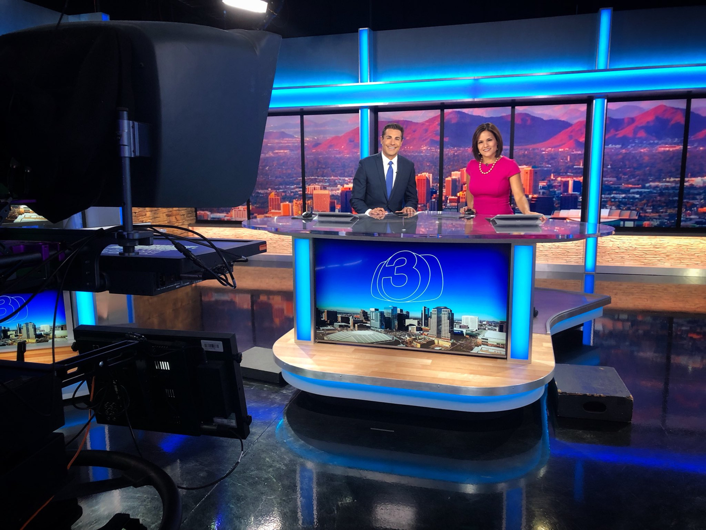
Boxed text is used in the graphics package open as well as on the set video walls to provide “top story” and “breaking news” images as well as daypart branding.

Both the on-set graphics and the on-air graphics package also use thin white outlines of letters or the station’s logo, though the logo still appears in full color in other applications, including the show title cards and bug.

The new lower third insert graphics are a bold blue with Proxima Nova typeface, though Myriad Pro is used in some iterations of newscast titles.

Advertisement

Subscribe to NCS for the latest news, project case studies and product announcements in broadcast technology, creative design and engineering delivered to your inbox.

tags
AZ, Eric Haugen, ktvk, Meredith Corporation, phoenix, Southwest Scenic Group, Z Space Creative
categories
Branding, Broadcast Design, Broadcast Industry News, Graphics, Heroes, Local News, Set Design