
NBC goes bolder, cooler for Macy’s fireworks logo design
Weekly insights on the technology, production and business decisions shaping media and broadcast. Free to access. Independent coverage. Unsubscribe anytime.
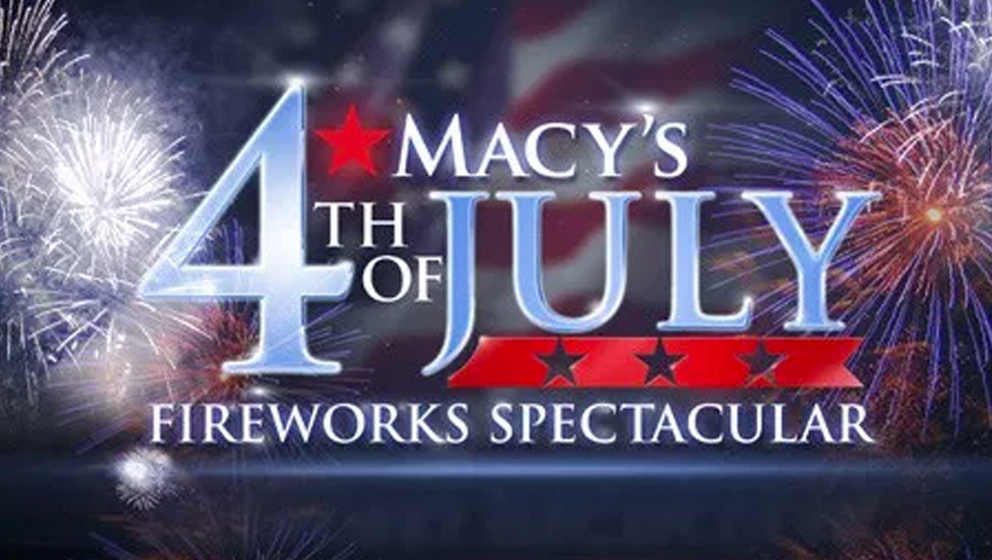
In the negative space between the “4th” and “July” are four thick red bars, a look that, when combined with the blue ordinal number, creates a graphical homage to the American flag.
All of this part of the logotype features a pair of thick bars above and below, with the words “Fireworks Spectacular” appearing under the bottom one in the wider typeface found atop the design.
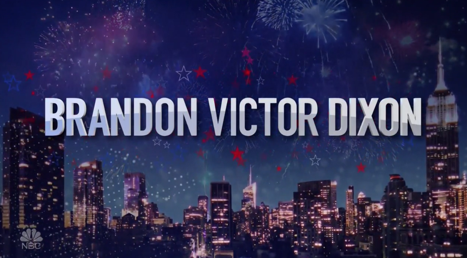
The typography is carried through in the show’s open, which, like the Thanksgiving day parade, features the names of performers.
Behind the text, stylized New York City skylines accented with both solid and outlined stars and faux fireworks are prominently featured.
The telecast’s lower thirds use a similar design with faded edges, including that used to introduce hosts Matt Iseman and Akbar Gbajabiamila from NBC’s “American Ninja Warrior.”

Notably, this year’s fireworks typography is similar to the typeface used in Iseman and Gbajabiamila’s show, though the Independence Day fireworks font lacks the angular accents found in the “Ninja Warrior” design.

![]()
Last year’s Macy’s fireworks look was in a thicker, serif font with diagonal, extruded stars and a red banner.
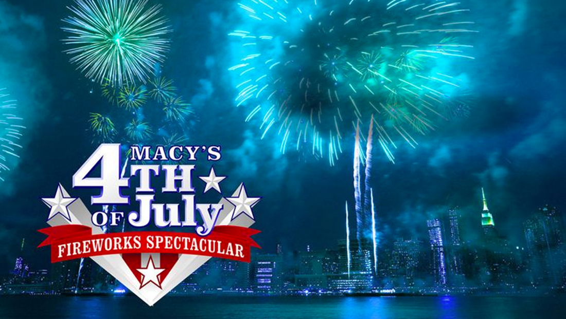
The 2017 logo.
For 2016, NBC went with a marquee and lighted billboard inspired look for the fireworks’ 40th anniversary.
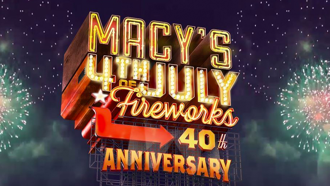
The 2016 logo.
Going back to 2015, NBC went with an elegant look that relied on the popular Trajan font and a light blue and red metallic look.
The 2015 logo.
The 2018 look, meanwhile, feels a bit more sterile, removes the elegance of a serif font and, unlike the 2015 look, has a colder metallic look, and lacks some of the nostalgia and friendliness found in 2016 and 2017, respectively.
NBC has a multiyear deal with Macy’s to be the official broadcaster of both the July 4 fireworks and the Macy’s Thanksgiving Day Parade.

tags
Akbar Gbajabiamila, American Ninja Warrior, logo design, Macy's, Macy's Fourth of July Fireworks Spectacular, Macy's Thanksgiving Day Parade, Matt Iseman, NBC
categories
Broadcast Design, Broadcast Industry News, Graphics, Heroes, TV News Graphics Design, TV News Graphics Package, TV News Motion Graphics Design