
‘Miss America 2.0’ logo design goes bold, simple
Subscribe to NCS for the latest news, project case studies and product announcements in broadcast technology, creative design and engineering delivered to your inbox.
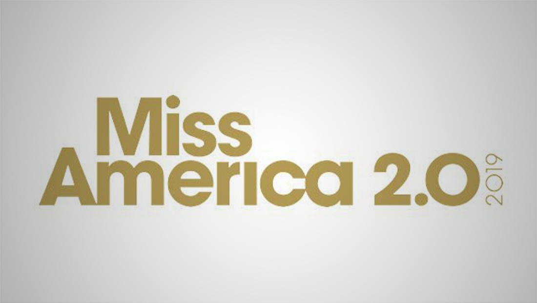
The venerable Miss America pageant — which is no longer being called a pageant — added a “2.0” to its logo to emphasize the makeover the entire event has received.
Contestants are no longer contestants — they’re “candidates” — and the swimsuit competition is gone, replaced by an interactive question and answer segment.
For its telecast logotype on ABC, the show is using a dull gold toned, bold sans serif typeface similar to Avant Garde, though it appears some letters have been customized.
The “2.0” part of the logo features an elegant “curve” on the downward stroke.
To the far right of the logo, the year “2019” appears, rotated 90-degrees counter-clockwise in a lighter weight of the font.
Subscribe to NCS for the latest news, project case studies and product announcements in broadcast technology, creative design and engineering delivered to your inbox.

tags
ABC, logo design, Miss America
categories
Branding, Broadcast Design, Broadcast Industry News, Featured