A look at the 70th Emmy Awards logo designs, key art

Subscribe to NCS for the latest news, project case studies and product announcements in broadcast technology, creative design and engineering delivered to your inbox.
As the 70th Annual Emmy Awards kick off, here’s a quick look at the logo designs and key art for the broadcast.
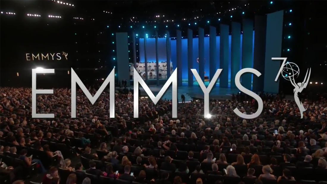
There are actually logos being used — one featuring the words “Emmys” in a clean sans serif typeface with a “7” perched in the upper right and the globe in the Emmy statuette serving as a zero to form the “70.”
This version is used within the actual telecast.
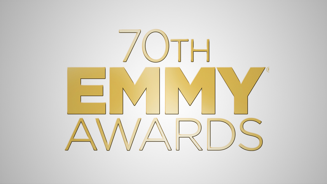
NBC’s key art, meanwhile, uses Gotham in two weights in gold with a subtle gradient.

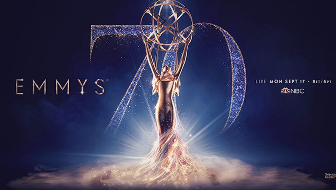
Another version of key art uses the broadcast typography set against a blue-violet background with a glittery serif “70” in the background and a dramatized version of the Emmy statuette in front of it.

Subscribe to NCS for the latest news, project case studies and product announcements in broadcast technology, creative design and engineering delivered to your inbox.


tags
Emmy Awards, logo design
categories
Branding, Broadcast Design, Broadcast Industry News, Featured