
CBS goes narrow in updated graphics package
Weekly insights on the technology, production and business decisions shaping media and broadcast. Free to access. Independent coverage. Unsubscribe anytime.
CBS has updated its on air brand identity package used for promoting programming with a narrower logotype.
The new look, designed by design studio Sibling Rivalry, features a steely blue color palette, gradients and new typography.
Like its immediate predecessors, CBS’s new branding design sticks with a sans serif typeface, but one that’s much narrower.
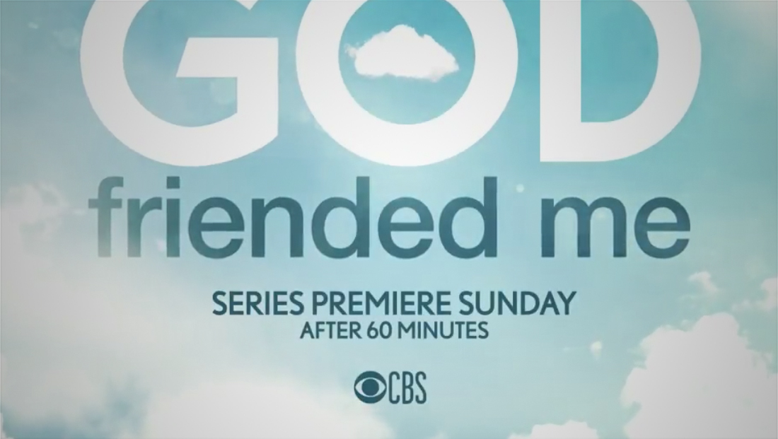
In some applications, the typography takes on subtle rounded accents, giving a friendlier, almost playful look.
While the logotype has been swapped out in most promos and snipes the network originates, the network has not updated to the new logo in all cases, including, as of this writing, its website.
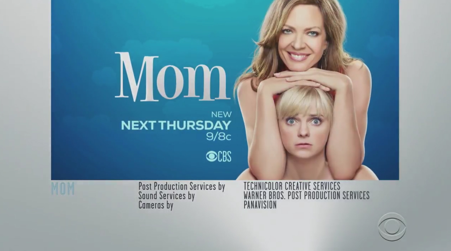
The narrow typography is also used in the end credit graphics frames the network inserts around promos at the tail end of shows.

The new look also includes “push up” snipes that can run along the bottom of programming — replacing the previous dark gray and white look with oversized CBS eye cutouts that floated above the picture.
In addition, CBS has added a steely blue color to its palette, used in typography, background elements and inside of the CBS eye logo itself. In many cases, the color is applied with a gradient effect.
![]()
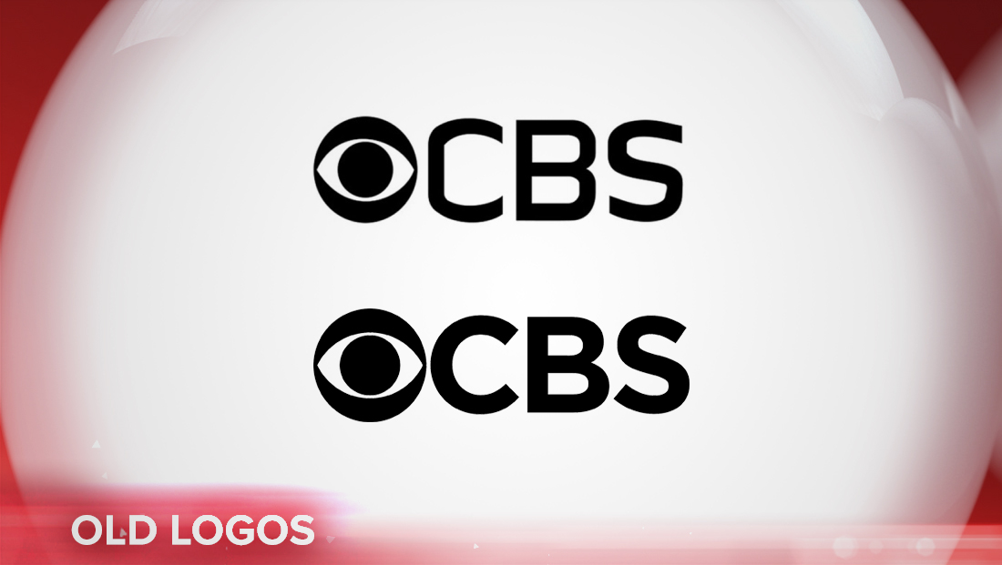
Previously, CBS dropped its “classic” logo design that uses a customized version of the font Didot, in favor of an assortment of wider sans serif typefaces over the past few seasons.
CBS or Sibling Rivalry did not respond to requests for comment.

tags
Branding, CBS, logo design, Sibling Rivalry
categories
Branding, Broadcast Design, Broadcast Industry News, Graphics, Heroes, Network Branding