NBC unveils Tokyo Olympics logo design

Subscribe to NCS for the latest news, project case studies and product announcements in broadcast technology, creative design and engineering delivered to your inbox.
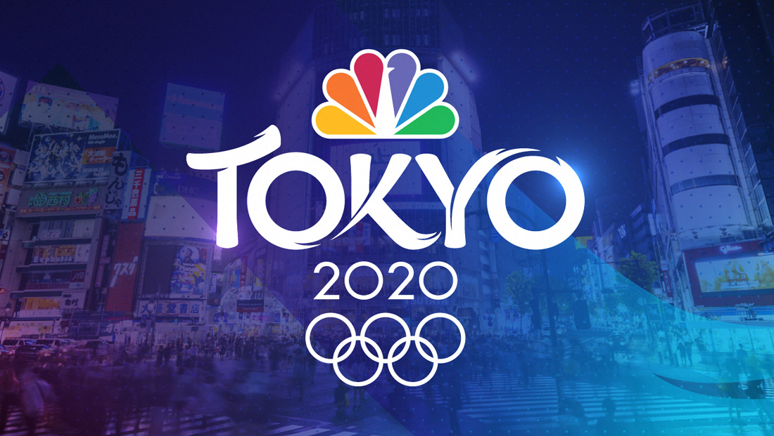
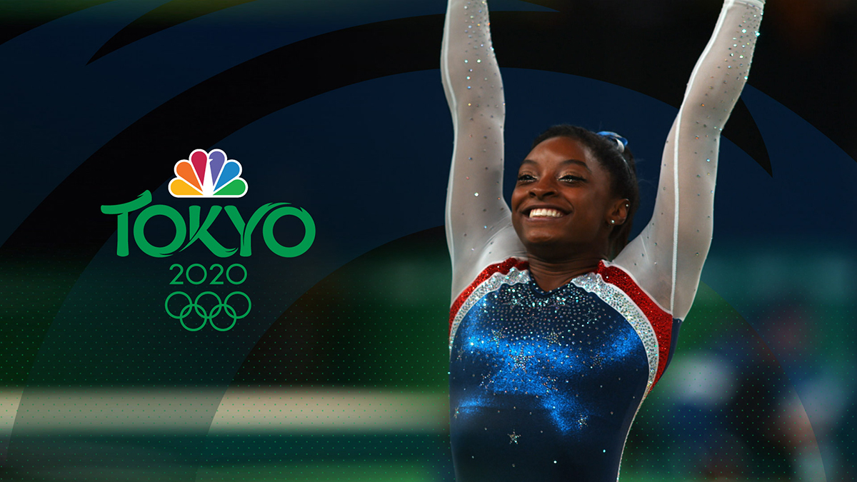
NBC has released the official logo design for its coverage of the 2020 Summer Olympics in Tokyo — a design that uses bold lettering and dramatic flourishes.
The logo features the word “Tokyo” in distinctive custom typography with flowing letters inspired by Japanese traditions and energy of the Olympics.

The capital “T” features a distinctive left-to-right upward “swish” that catches the eye and is also the first look at the logo’s distinctive flourishes — “tails” and notches — in the design.
While the two “Os” in the logo are based on a circular foundation, the first one is uses negative space to continue the dramatic right to left downward stroke in the “K,” which mirror the flourishes
The right “arm” of the “Y,” meanwhile curves into an arc that blends into the shape of the last “O,” which itself features a single, elegant flourish.
Perched above the custom logotype is the NBC peacock, while the year “2020” is displaying in a clean, geometric font with circular zeros to match the “Os” in the city name above.
Both the thickness of the numbers and circular zeroes are a good match to the Olympic rings, which can be placed below the lockup.
Subscribe to NCS for the latest news, project case studies and product announcements in broadcast technology, creative design and engineering delivered to your inbox.


tags
2020 Summer Olympics, david barton, logo design, Mark Levy, Mocean, NBC, NBC Olympics, Tokyo
categories
Branding, Broadcast Design, Broadcast Industry News, Graphics, Heroes, Olympics