Q&A: Inside Formula One’s broadcast rebrand from Drive Studio
Subscribe to NCS for the latest news, project case studies and product announcements in broadcast technology, creative design and engineering delivered to your inbox.
Formula One entered 2018 with a revitalized on-air offering lead by Fox Sports veteran David Hill.
Hill was tasked with upgrading camera angles, broadcast design, sound and energy of the broadcast production, bringing his deep background from Fox Sports while helping catapult the motorsports series OTT offering.
Part of this overhaul included a high-energy opening title sequence seen around the world as each week’s race begins, completed by | drive | studio along with new theme music from Hollywood composer Brian Tyler.
We recently had a chance to speak with Nick DiNapoli of | drive | studio about the design direction.
What were the overall design direction and goals from David Hill?
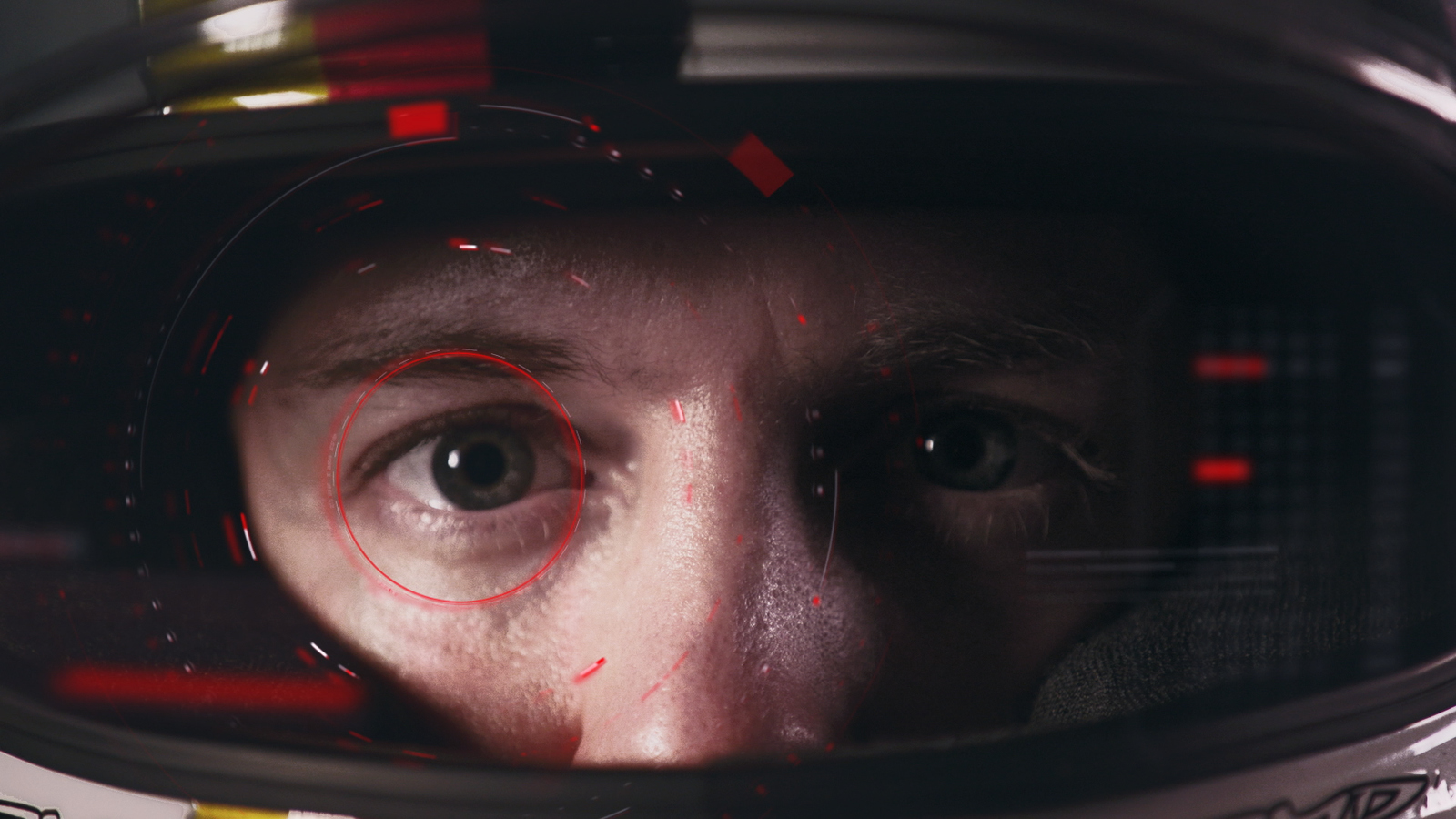
The overall design direction established for Formula One’s 2018 intro sequence was to Capture the Man vs. Machine nature of Formula 1 & unleash the spirit and energy of the greatest racing spectacle on the planet.
While most sports are moving flatter in the design, why does this concept embody gloss, 3D and slick surfaces?
We wanted to create a contrast between the natural/human form of the drivers and the technical 3D metaphors. It was natural to utilize this 3D stylistic approach because of the highly sophisticated and technical background of Formula 1 racing. The metaphors personify the aspects of tire treads spinning, oil boiling, and flags waving and juxtapose these scenes against the personalities of the drivers.
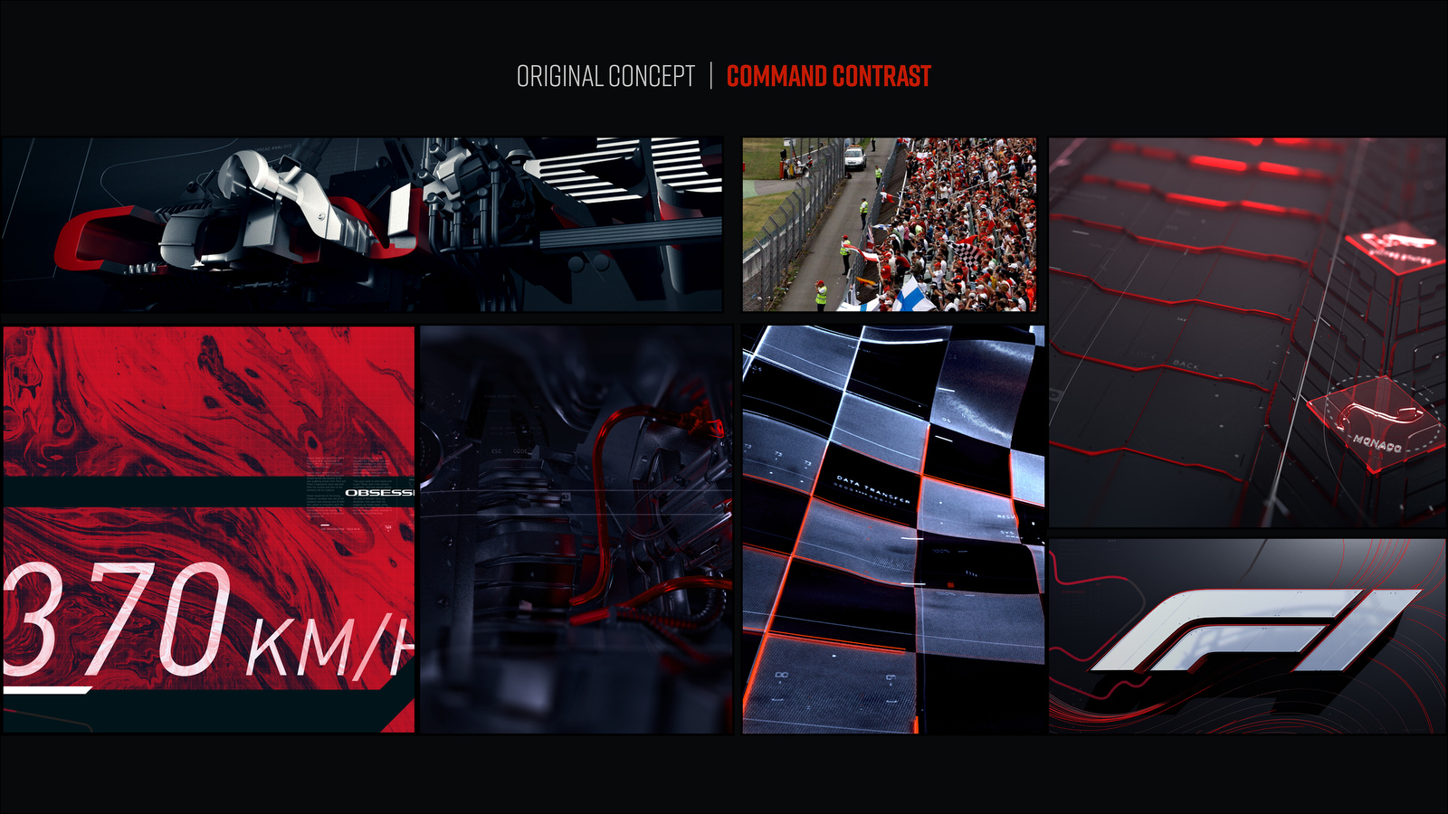
Original concept mood board for “Command Contrast” theme.
What are the hallmarks of the new design? How did you encapsulate the ideas of innovation and speed?
The new design embraces the humanity of F1 while celebrating the high-tech energy of the world’s most popular motorsport.
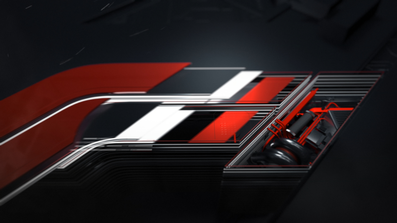
Speed is indicated through the progressive use of the red line and a staccato editorial style. The red lines become 3D and symbolize the competitive mentality of the sport and eventually “cross the finish line” and simultaneously capture engine elements to form the F1 logo.
Talk a bit about working in the personalities of the sport. F1 has not really done that in the past with its openers and branding.
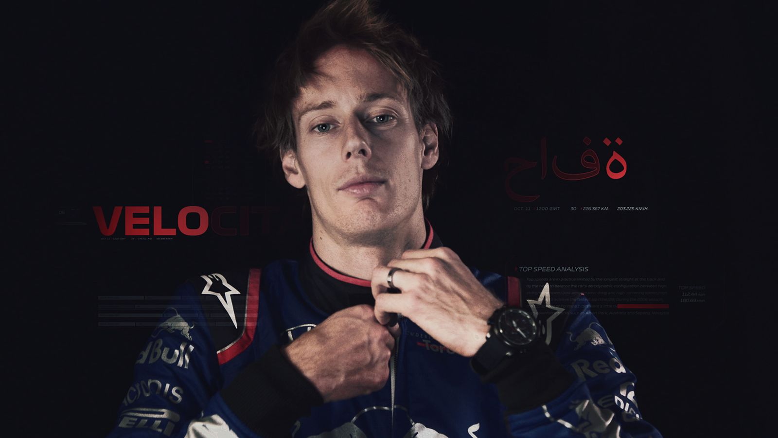
David Hill and the team at F1 wanted this intro to not only resonate with the super fans of the sport, but also attract the casual or new fan. Bringing the drivers front and center was based on our focus on this group and giving them what they are excited about.
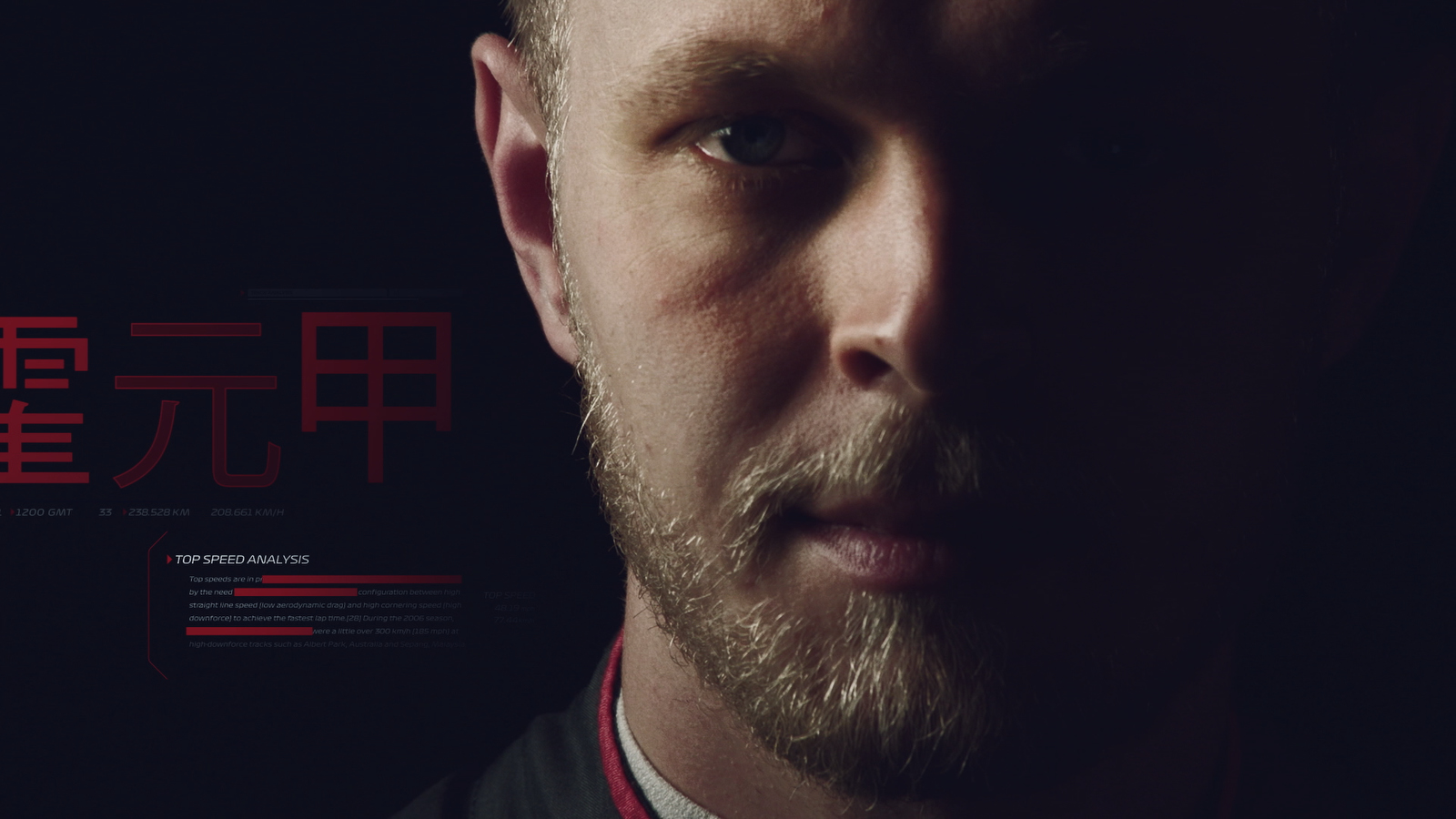
This sport is personality driven and from the fan perspective, there is great passion for their respective drivers and the country of origin they represent. It became a natural conclusion that the drivers should be front and center and become an integral part of the open.
How did the new music from Brian Tyler fit in?
David brought Brian on board to compose the music. It was a brilliant move to tap into the musical creativity and style that have made him so successful (Avengers, Fast & Furious, & Iron Man). It matched up well with the audience that F1 is speaking to and the energy that we aimed to create with this intro.
View more of the concept design and finished product on the | drive | studio website.
Subscribe to NCS for the latest news, project case studies and product announcements in broadcast technology, creative design and engineering delivered to your inbox.




tags
David Hill, Drive Studio, f1, Formula 1, formula one, Liberty Media, Nick DiNapoli, sports broadcast design
categories
Broadcast Design, Executive Q&A, Graphics, Heroes, MoGraph, Sports Broadcasting & Production