
Steve Kornacki’s ‘Big Board’ gets big update for 2018 midterms
Weekly insights on the technology, production and business decisions shaping media and broadcast. Free to access. Independent coverage. Unsubscribe anytime.
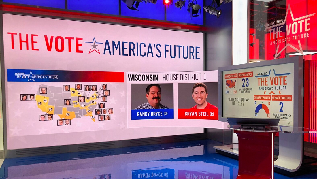
Steve Kornacki’s name has become almost synonymous with his famous “Big Board” — an interactive digital touchscreen used to plot and chart election data — and his high tech toy is getting a big update for the 2018 midterm election.
Kornacki’s use of the board — and enthusiastic gesturing — even earned him a nod on “Murphy Brown” last week.
"Well, someone's found his inner Kornacki," says #MurphyBrown. cc: @SteveKornacki pic.twitter.com/cTcwtIo1mN
— TVNewsMix (@TVNewsMix) November 3, 2018
So, with the “historic” 2018 midterm elections upon us, it’s no surprise NBC decided to up the ante with the “Big Board.”
The board has relaunched with an all-new look using cutting-edge software developed by E.J. Fox, Michael Small and the NBC News Digital product and technology teams.

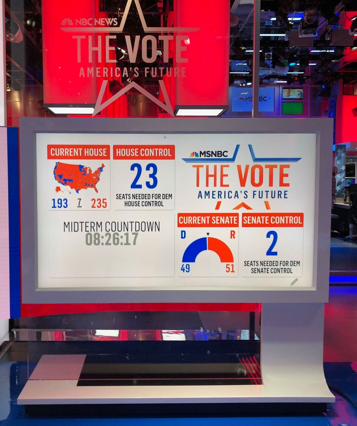
On election night, Kornacki will use the interactive map-board for breaking down the details of key races and polls.
Improvements include:
- The ability to smoothly zoom using multi-touch (pinch) interactions. Previously the application was locked to country and state-wide views. Some of the most important districts in this election are some of the geographically smallest, so this lets us get a better look at them by being able to zoom in all the way to the tiniest districts.
- Added the ability to pull up any historical race in any office (house, senate, or governor) in any county, state, or district in the last 10 years — from anywhere in the application.
- More labeling, including more cities and have added county name and district number labels when zoomed in.
MSNBC's @SteveKornacki's #BigBoard is getting an upgrade — with all sorts of new #DataViz options (1/2) pic.twitter.com/7ZCvhFP2wg
— NewscastStudio (@newscaststudio) November 6, 2018
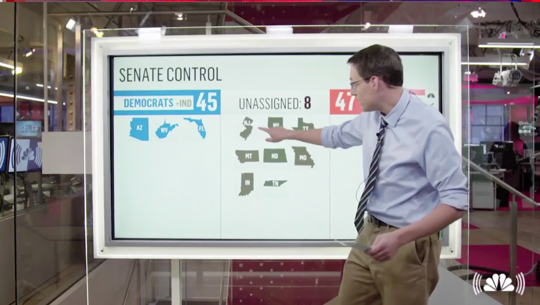
- A new “Kornacki scorecard” view which is a visualization of how 60 of the most important races are doing over the course of the night.
- Kornacki’s house scorecard also includes the built-in ability to launch “what if” mode as election results roll in — allowing Kornacki to game out different scenarios of how the night will go across up to 60 of his most important races.
- The scorecard also has the ability to display different “buckets”— places where Trump won by less than 10 percent, places where incumbents are leaving and other key races, allowing Kornacki to visualize many different stories that may emerge on election night.
- A new “Data Cross-Filter” mode created by Shirley Wu, who is well-known in the data visualization industry. This feature is a multi-filter map that can pull in past election data and census data to graphically show where different types of people live and how they voted in past elections. Specifically, it’s now tuned to show data from the 2016 presidential election — with the ability to have more data added in the future.
Here are more of @SteveKornacki's options for displaying and breaking down election data (2/2) pic.twitter.com/nBnFUZU7MB
— NewscastStudio (@newscaststudio) November 6, 2018
All of this has been built using web technologies such as HTML, CSS, JavaScript and D3, something NBC believes is an industry first.
This allows the visualizations to be used on air as well as embedded on the network’s web properties.
Although the network isn’t offering a full fledged version of the tool to viewers, it is offering what it’s calling a “miniature” version on the NBCNews.com website that lets viewers “flip” districts on the House map to see what’s required to bring the minority party into power or to keep the controlling party in power.


tags
2018 Midterm Elections, EJ Fox, Michael Small, Steve Kornacki
categories
Broadcast Design, Broadcast Industry News, Elections, Featured, Graphics