
USA creates distinct new look for Harry Potter
Weekly insights on the technology, production and business decisions shaping media and broadcast. Free to access. Independent coverage. Unsubscribe anytime.
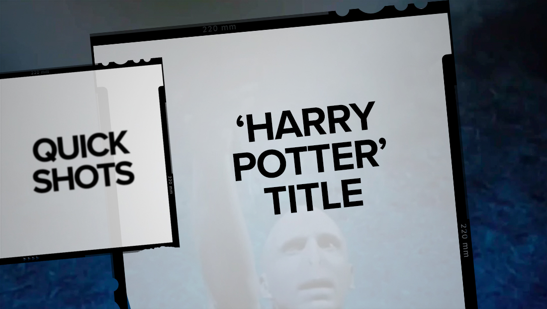
As part of an ongoing deal to broadcast the “Harry Potter” films, USA Network is promoting the broadcasts with redesigned title cards.
The network is using the thin linear elements found in its branding package to reveal scenes from the movie in the promos.
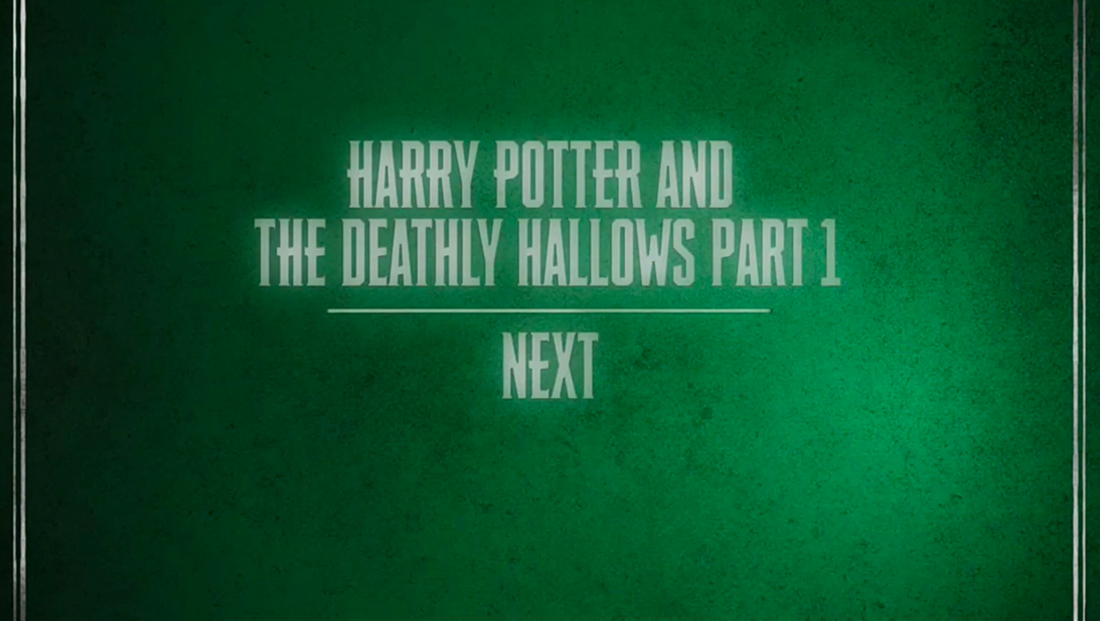
Vertical, more hand-drawn style versions of these lines were also used on either side of the title screen, which featured a mixture of dark and light texture and condensed font with “carved” look.
![]()
The network notably did not use the iconic Harry Potter logotype shared by the original U.S. book releases and Warner Bros. produced films. This look was typically rendered in a heavily metallic look — whereas USA’s new look is more textural and even a bit grungy.
Newer and non-U.S. version of the books, meanwhile, use a variety of different logotypes.
The font USA used is a close match to several typefaces, including Cheddar Gothic Sans, Teniers and PT Fusion Slab.

tags
Harry Potter, usa network
categories
Broadcast Design, Broadcast Industry News, News Promos and Sports Promos