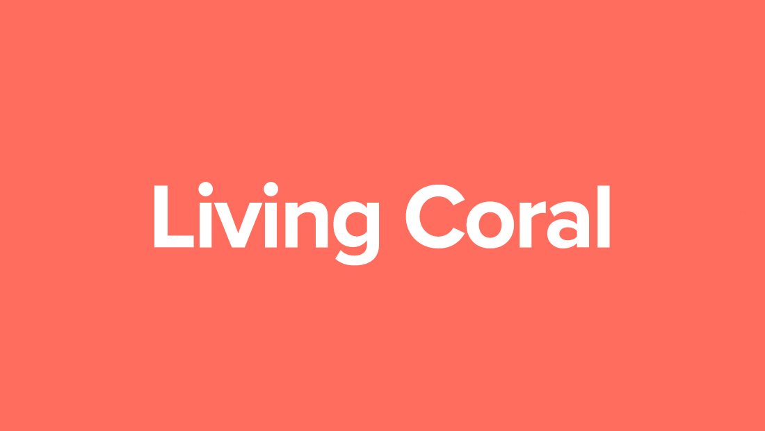
‘Living Coral’ isn’t a popular color in broadcast design — but could it be?
Weekly insights on the technology, production and business decisions shaping media and broadcast. Free to access. Independent coverage. Unsubscribe anytime.
Pantone’s annual pick for color of the year, “Living Coral,” is a bright and vibrant shade that is one part of the color spectrum that hasn’t made its mark on broadcast design — but could it?
“Vibrant, yet mellow Pantone 16-1546 Living Coral embraces us with warmth and nourishment to provide comfort and buoyancy in our continually shifting environment,” reads the Pantone announcement for its pick of color of the year.
It’s that vibrancy and friendliness that could make it an interesting pick for news and broadcast graphics.
On one hand it could easily convey the urgency of breaking news while remaining a bit “toned down” and fresh.
On the other, its brightness and uniqueness could also lend itself well to morning or lifestyle programming design.
Living Coral also meshes well with the so-called “flat design” color palettes that have become popular over the past few years — including on broadcast network and TV news websites.
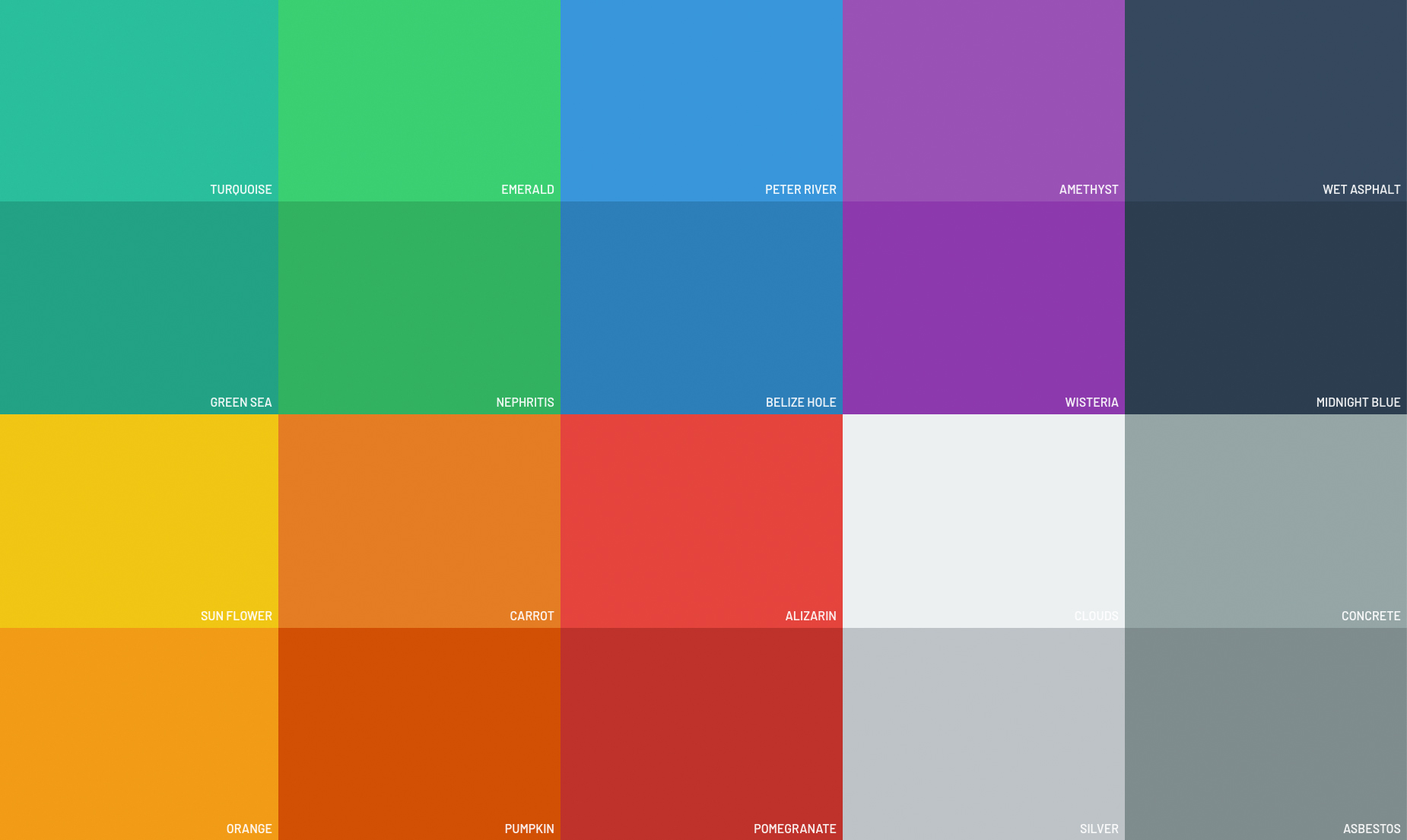
An example of the so-called ‘flat’ color palette, courtesy of FlatUIColors.com, a site that profiles a variety of color palettes in this general style — and makes them easily accessible to designers.
“Pantone 16-1546 Living Coral emits the desired, familiar and energizing aspects of color found in nature,” Pantone’s statement continues.
It’s particularly interesting to note the use of the words “familiar” and “desired” — two traits that most broadcast designs try to convey.

“In its glorious, yet unfortunately more elusive, display beneath the sea, this vivifying and effervescent color mesmerizes the eye and mind. Lying at the center of our naturally vivid and chromatic ecosystem, Pantone Living Coral is evocative of how coral reefs provide shelter to a diverse kaleidoscope of color,” says Pantone’s statement.
In that light, Living Coral becomes a fresher take on so-called “earth tones,” that tend to be more subdued and even “muddy.”
In the broadcast design world, Tegna’s group graphics package, which is rolling out across more and more of its stations, is probably the closest example to using a the “flat color palette” — though it tilts more toward the blue, gold and violet shades.
Notably, a violet shade known as “Ultra Violet” was Pantone’s pick for 2018’s color of the year.
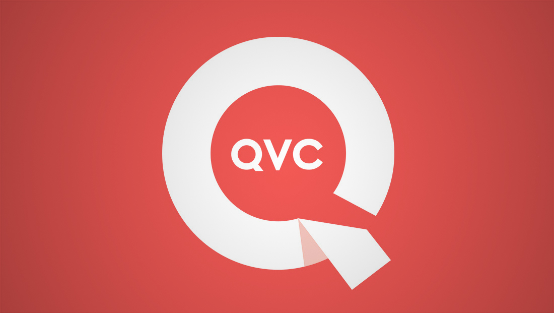
To date, one of the most notable examples of a coral-like shade used in a broadcast design package is QVC’s logo and branding package it introduced in 2015.
However, it’s harder to find more notable examples of the shade in broadcast design world, though orange is a popular color in the broadcast design and it’s not a stretch to imagine coral being subbed out for that shade.
Orange shares many of the same traits as coral — it’s bright, vibrant and attention getting, but it’s also a bit harsher.

tags
Broadcast Design, color, Living Coral, Pantone
categories
Broadcast Design, Featured, Graphics