
The Facebook ‘aging challenge’: TV station logo edition
Weekly insights on the technology, production and business decisions shaping media and broadcast. Free to access. Independent coverage. Unsubscribe anytime.
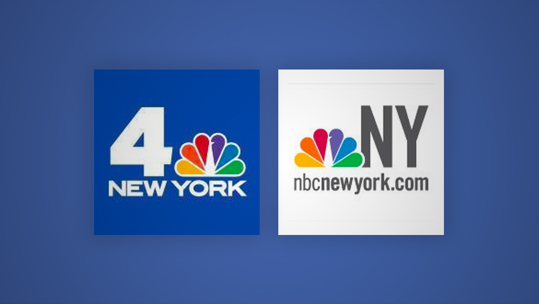
Here’s what NBC’s flagship O&O in New York City station WNBC’s challenge post would look like, at least as far as the digital record goes:
The “original” logo is an interesting flashback to when NBC first started rolling out the “NBC (City or region name)” branding across its owned stations.
As illustrated by the profile photo, the branding change emphasized a matching domain name — instead of the station’s call letters or other variation — as well as the removal of the channel number.
Scrolling through WNBC’s profile photo gallery also gives you a glimpse at the rather odd detour the station took through using a heavy geometric font for a time across its online branding.
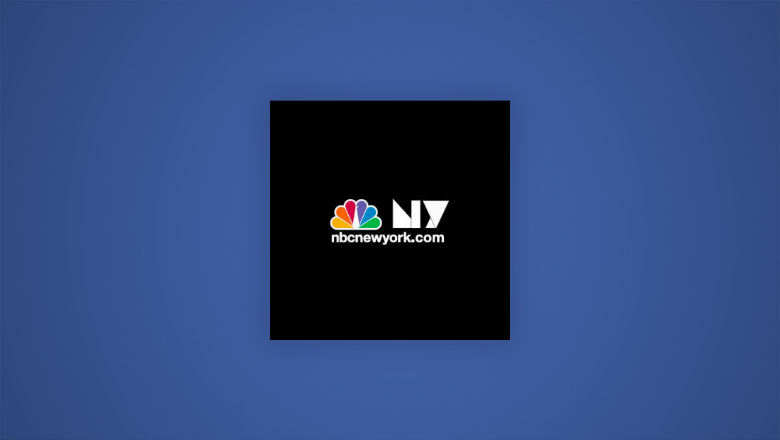
The gallery also shows the addition of the Olympic rings to the logo, something many NBC affiliates do in the periods around the summer and winter Olympics.

tags
Chicago, Facebook, KWTV, logo design, new york, oklahoma city, orlando, wesh, wls, WNBC, wncn
categories
Branding, Broadcast Design, Broadcast Industry News, Featured, Local News