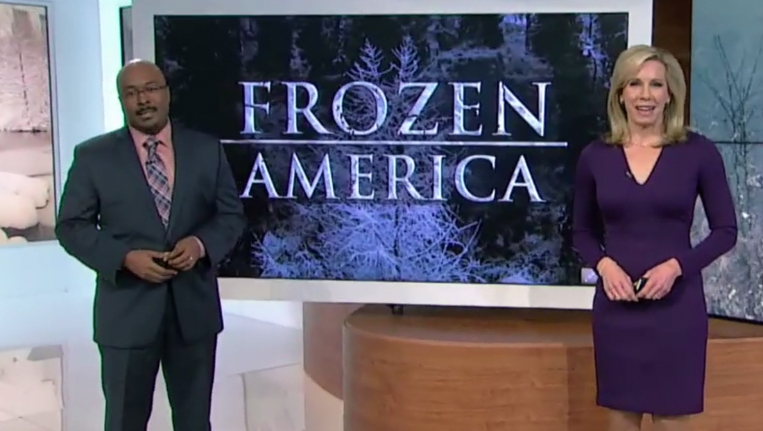
Weather Channel’s ‘Frozen America’ logo looks a lot like, well, the ‘Frozen’ one
Weekly insights on the technology, production and business decisions shaping media and broadcast. Free to access. Independent coverage. Unsubscribe anytime.
The Weather Channel has brought back its “Frozen America” branding that includes a logotype that has some interesting visual similarities to the logo design of Disney’s hit film “Frozen.”
The Weather Channel previously used the “Frozen America” branding and logo in 2018.
The design uses the iconic font Trajan, which is also known as the “horror movie font.”
Frozen’s logo, meanwhile, is a custom drawn logotype that appears to be based on Friz Quadrata, which, in turn is also known as the “Law & Order font” for its notable use in all “Law & Order” franchises’ title cards.
Both logos, however, have an icy, “cracked” texture applied to them, though the film’s is typically in a brighter blue shade.
Friz Quadrata and Trajan have many similarities, however, namely that both are inspired by stone carved lettering found on government buildings (Trajan is actually named for Trajan’s column, a first century column in Rome with extensive carving work).
Both fonts also have a distinctive “Q” and “R.”

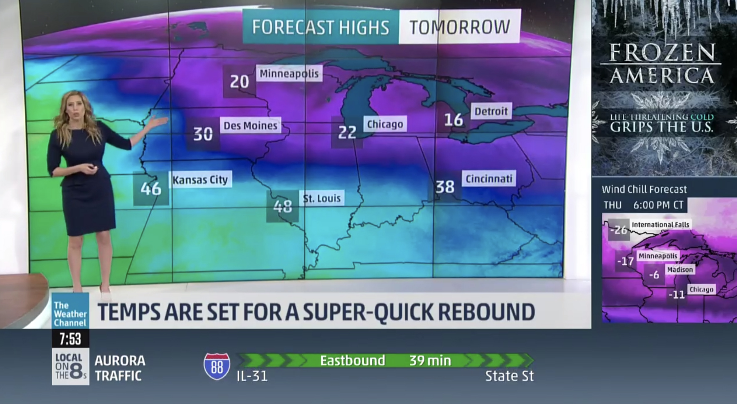
The Weather Channel, meanwhile, is also using the logo in the upper right of the L-bar, with the subtitle “Life threatening cold grips the U.S.”

tags
fonts, The Weather Channel
categories
Branding, Broadcast Design, Broadcast Industry News, Featured, Weather