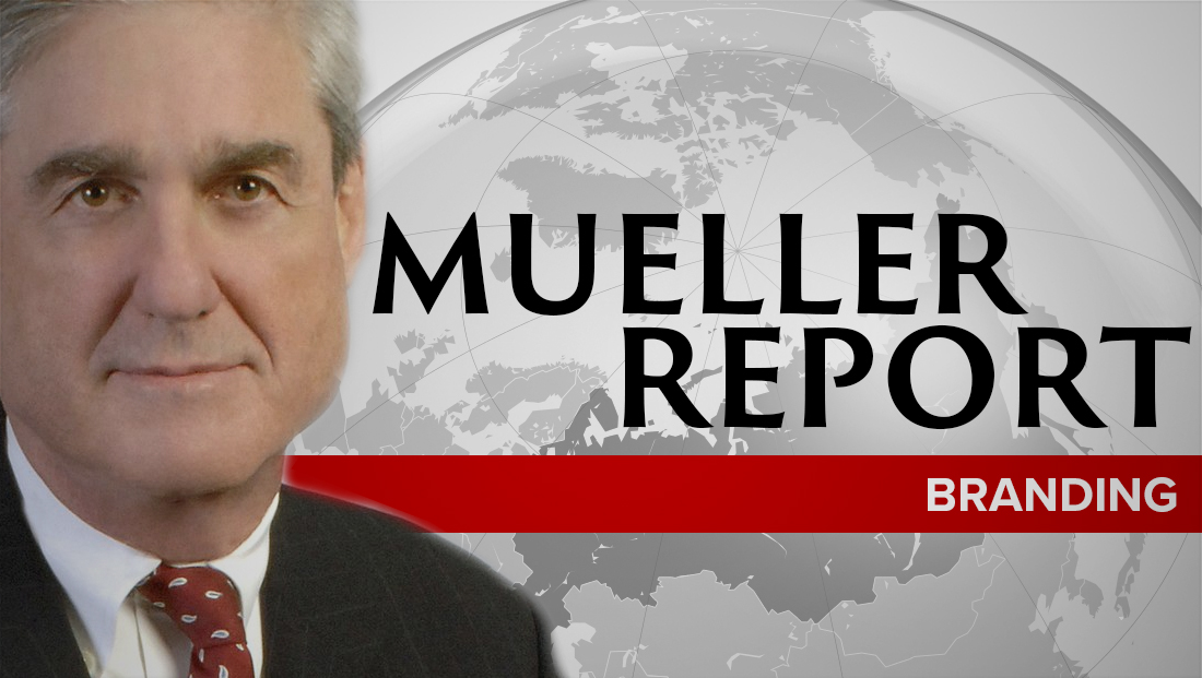
Networks go with the obvious when branding Mueller Report coverage — though looks vary
Subscribe to NCS for the latest news, project case studies and product announcements in broadcast technology, creative design and engineering delivered to your inbox.
In a rare case of consistency, all three major broadcast networks and three major cable news networks all used an identical name for coverage of Robert Mueller’s report being turned over to the attorney general — but used significantly different interpretations of the the words to create unique branding.
All six networks used the simple, straightforward and rather obvious title “The Mueller Report.”
While it seems network producers at America’s major news outlets all felt going short, sweet and to the point was best, it’s a bit unusual, though not unheard of, to have all five of them using the same name.
Instead of using naming to stand out and differentiate from each other, each network did have its own artistic interpretation of the title.
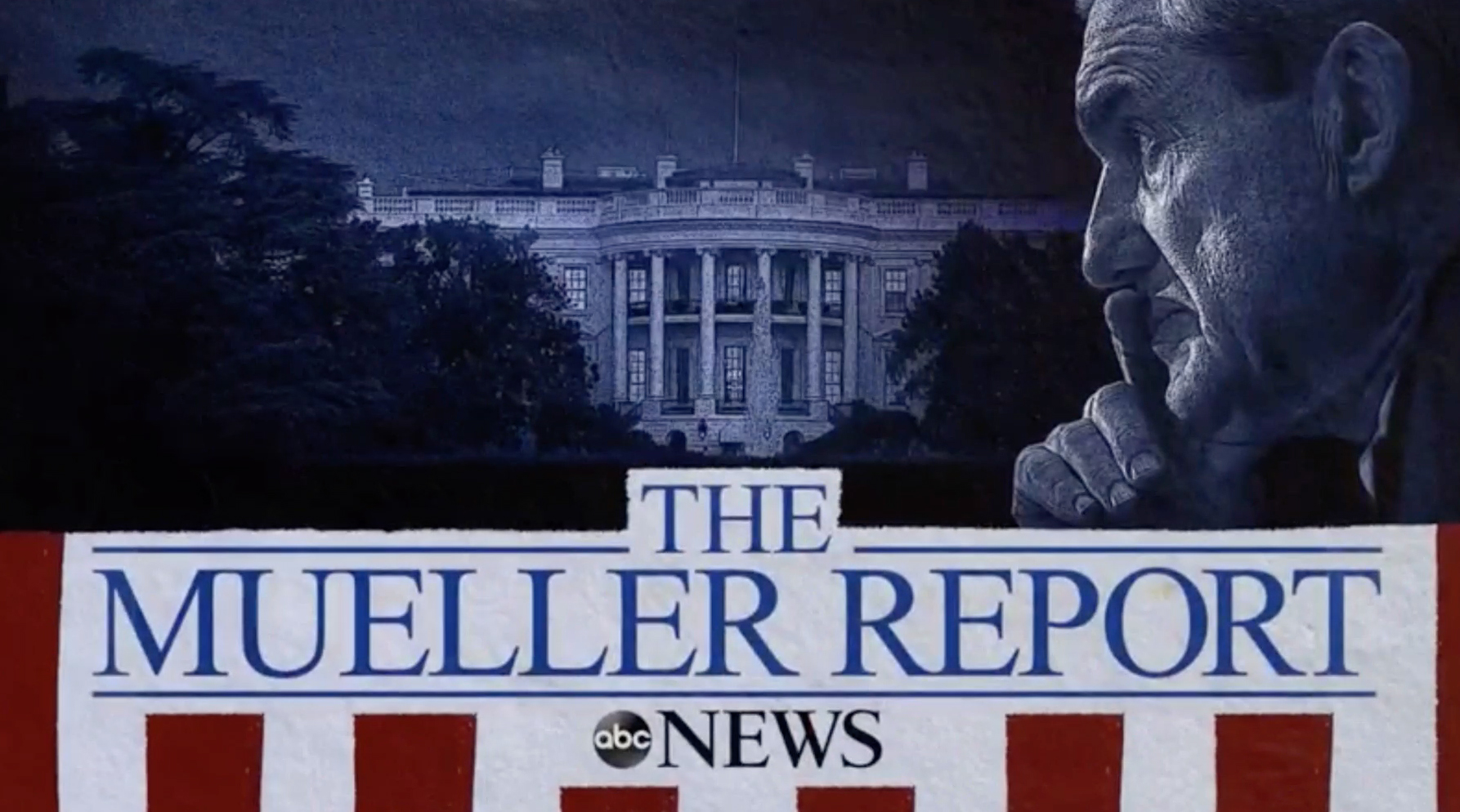
In an usual move for the network, ABC’s look was surprisingly clean — with the title set in a Times New Roman-esque font. The words ‘Mueller’ and ‘Report’ had thick lines running above and below, the a gap allowed ‘the’ to be tucked in above. The network also used vertical stripes, similar to its election look, in a darker, textured style along with a highly stylized image of the White House and a profile of Robert Mueller, who appears to be keeping a watchful eye on the building.
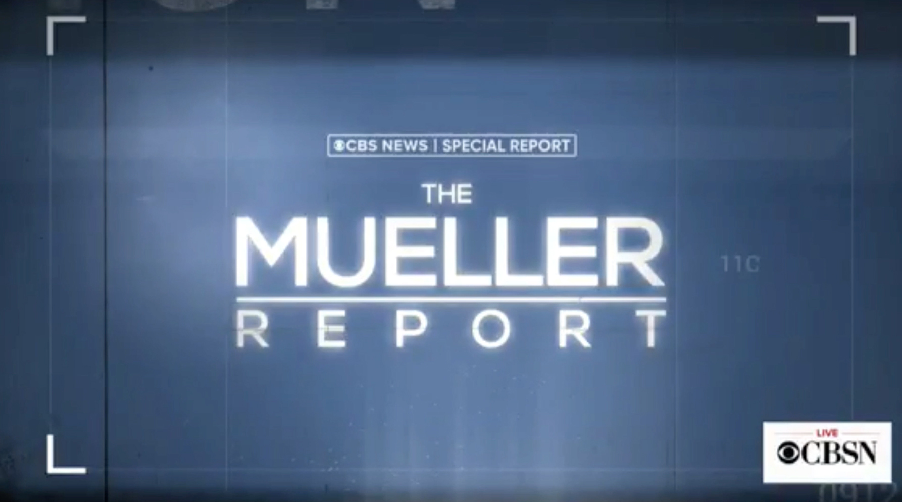
CBS’s look was clean and simple — with a blue-gray background and the three words of the title stacked on top of each other. ‘The’ appeared in small type centered at the top of the logotype, with ‘Mueller’ being larger and, separated by a line, ‘Report’ appearing with wider letter spacing to match the width of the word above it.
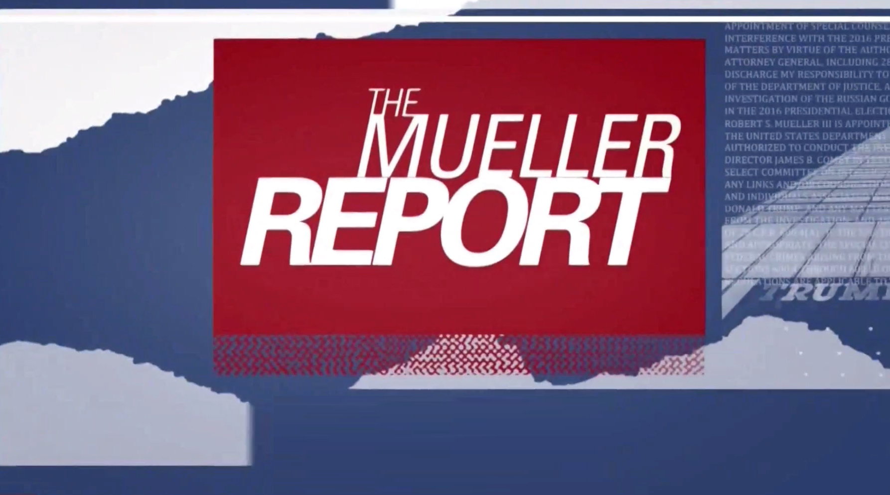
NBC and MSNBC shared a similar look, with slightly variations between the two networks and from show to show, but the logotype included a all caps italic logotype. ‘Report’ was set in the largest, boldest type with tight letter spacing. The word ‘Mueller’ was stacked, with almost no line spacing, to the upper right of the word below it, while ‘the’ was placed to the far left of this, again with almost no line spacing. The logo was probably the most distinct, if not unexpected, of all networks, though it did look slightly unbalanced. NBC typically accompanied the look with ‘torn pages’ textures as well as microtext of the directive creating the special investigator role. Typewriter style microtext repeating ‘The Mueller Report’ could also be found in some variations, while key dates relating to the investigation and imagery of Mueller, Donald Trump and Trump Tower were also used prominently. Meanwhile, stars were also added as both a pattern and accent.
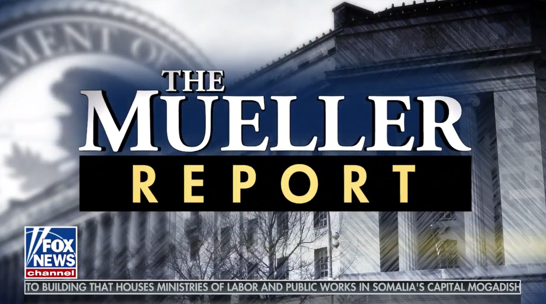
Fox used what appears to be the font Minion for ‘The’ and ‘Mueller,’ with the latter in small caps and the former tucked in to the right of the slightly larger ‘M.’ The network’s standard lower third font was used to spell the word ‘Report’ — which was in a black box underneath. Imagery, at least immediately following the March 22 completion, centered mainly around the Justice Department seal and building.
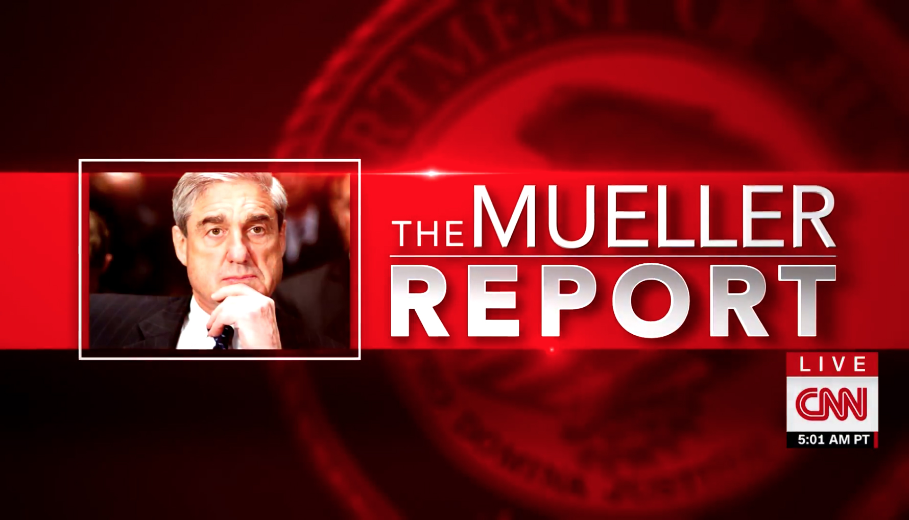
CNN, meanwhile, opted to stick with its trademark red. It placed Mueller’s photo in a box with offset white outline and the words ‘The’ and ‘Mueller’ appearing in all caps on the top line, with ‘The’ less than half the height of Mueller’s last name. a thick line separated this from the word ‘Report,’ which was in a heavy typeface with gradient effect. A blurred Department of Justice Seal was used as a background element.
It’s worth noting that, not surprisingly and what is a standard practice for major upcoming events, at appears most, if not all, of these graphics had been prepared well in advanced of the report’s release to the attorney general. Because the exact date was unknown, it made good sense for the networks to have a look ready.
Some of the graphics, such as the animated fullscreen explainers and infographics, had certain elements added at the last minute — namely updated imagery and digital versions of the letter sent to Congress — but these easily could have been planned for and simply added to prepared animation “templates.”
Subscribe to NCS for the latest news, project case studies and product announcements in broadcast technology, creative design and engineering delivered to your inbox.


tags
ABC, ABC News, CBS, CBS News, CNN, MSNBC, Mueller Report, NBC, Robert Mueller
categories
Branding, Broadcast Design, Broadcast Industry News, Cable News, Featured, Graphics, Networks