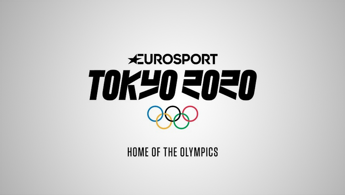
Eurosport Tokyo Olympics logo design looks to Manga typography

Subscribe to NCS for the latest news, project case studies and product announcements in broadcast technology, creative design and engineering delivered to your inbox.
Eurosport looked to the popular comic book format Manga for inspiration for its 2020 Tokyo Olympics logo design.
The lockup combines the Europsport logo, Olympics rings and a custom drawn Magna-influenced typeface.
Seeking a design that would be versatile, intertwined with the need to build a common story around all sports featured at Tokyo 2020, Eurosport’s creative inspiration centres on Manga – a unique style of Japanese comic book aimed at both adults and children.
The logo unites the Eurosport logo, Olympic rings and Manga-influenced Tokyo 2020 typeface, thus bridging the gap between western and eastern cultures and ushering Manga into a new era.
“Our Olympic Games journey started with PyeongChang 2018,” said J.B. Perrette, president and CEO Discovery International, which owns Eurosport, in a statement. “We have set our ambition for Tokyo even higher.”
“We wanted our Tokyo 2020 brand identity to create a unique symbol that incorporates and respects Japanese culture and the iconic Eurosport logo, to become instantly recognisable and resonate with millions of people watching the Games across Europe,” said George Aivazoglou, vice president of marketing at Eurosport.
Eurosport inked a deal with the International Olympics Committee in 2015 for the multimedia rights in select countries for the 2018 to 2024 Olympics.
The deal does not include Russia or France from 2018 to 2020.
Eurosport will be the official broadcaster in the U.K. in 2018 and 2020.
Subscribe to NCS for the latest news, project case studies and product announcements in broadcast technology, creative design and engineering delivered to your inbox.


tags
2020 Summer Olympics, eurosport, logo design, Olympics
categories
Branding, Broadcast Design, Broadcast Industry News, Featured, Olympics