‘The Jump’ gets bold new look inspired by basketball court floor

Subscribe to NCS for the latest news, project case studies and product announcements in broadcast technology, creative design and engineering delivered to your inbox.
ESPN’s daily NBA show “The Jump” debuted a new graphics package that combines bold colors and geometric patterns that draw inspiration from the markings on basketball courts.
The look, from ESPN Creative Services, uses a unique blend of teal, gold, dark blue, red and tan to form a variety of shapes and layers inspired by the straight lines and curves on professional basketball courts.


In many of these sequences a certain layer “opens” to reveal a layer below. Other reveals include “flipping” and rotating segments and and segments that rise or fall.
Other accents include hashmarks and a 3D basketball element.
Thew new look also features typographic poster style graphics for each NBA team that feature team names that repeat both diagonally and stacked.
This “repeating” style is also used in other elements, including with the show’s logo as a fullscreen transitional background.
Similar looks can also frame cutouts of players along with oversized versions of their names and team logos behind them as OTS-style graphics.
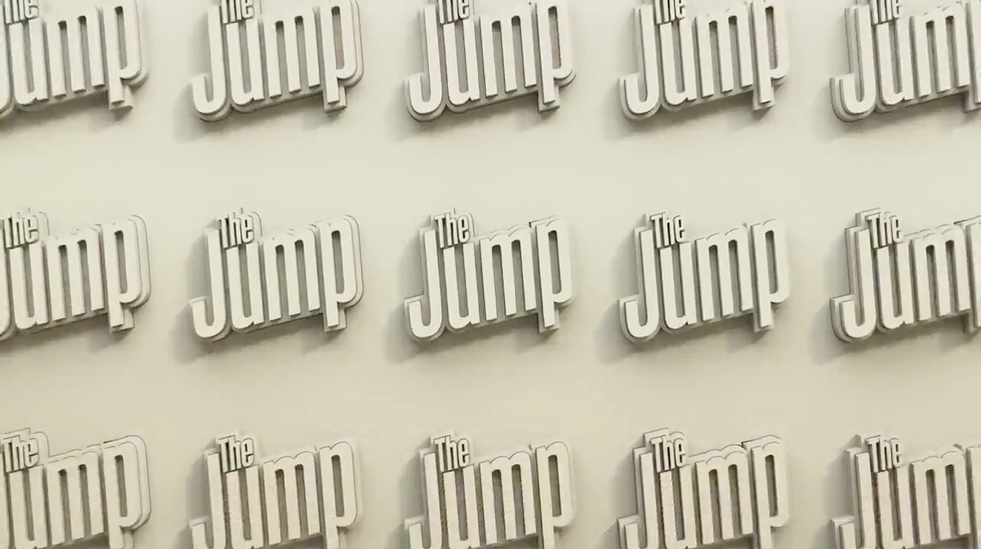

While the look is new, the show has retained its condensed logotype.
Rachel Nichols continues to host “The Jump,” with the show now serving as the pre-game show for the network’s weekly marquee NBA game.
It continues to be produced from the network’s Los Angeles facilities, which were recently updated to include a “Los Angeles-centric” look.
“The Jump” continues to use the set it debuted in 2016.
Subscribe to NCS for the latest news, project case studies and product announcements in broadcast technology, creative design and engineering delivered to your inbox.






tags
ESPN, ESPN Creative Studio, NBA, Rachel Nichols, The Jump
categories
Branding, Broadcast Design, Broadcast Industry News, Heroes, Sports Broadcasting & Production