NBC peacock gets elaborate treatment in ‘Making It’ promo
Subscribe to NCS for the latest news, project case studies and product announcements in broadcast technology, creative design and engineering delivered to your inbox.
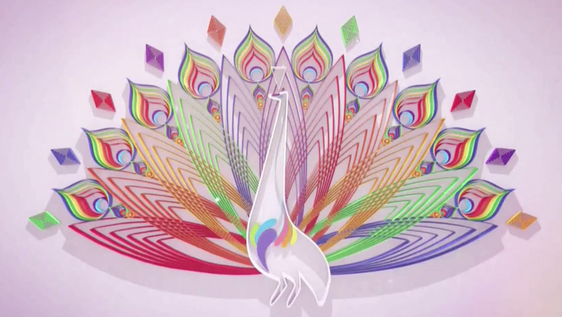
NBC’s summer craft and design competition show “Making It” is back — and along with it comes an intricate take on the network’s iconic peacock logo.
When it debuted this summer, the limited series used a stop action style promo.
Now, the show is back for a winter run and with it a new series of promos.
These spots feature more live action of hosts Amy Poehler and Nick Offerman and are packed full of the puns that quickly became a mainstay of the series.
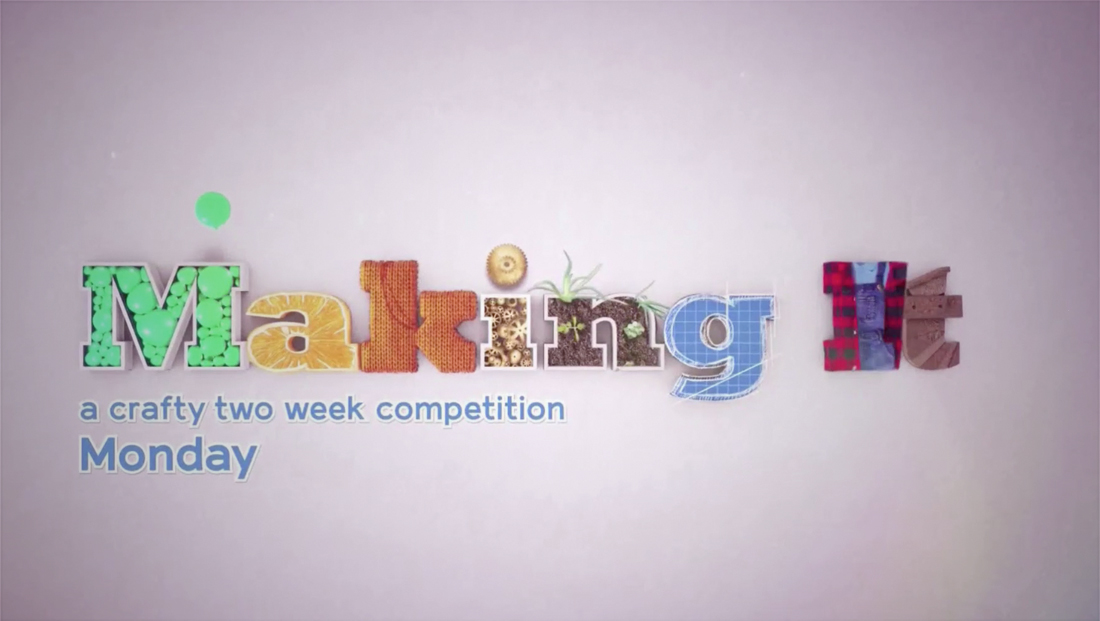
The new series of promos also uses a “lay flat” style title card made of various crafting and design (plus food) materials.

At the end of select versions of the promo, the scene switches to a brief view of an elaborately crafted peacock.
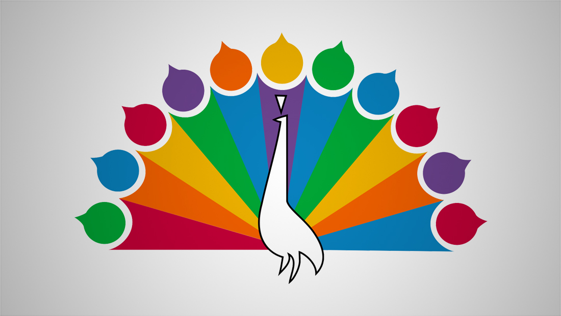

The design appears to be inspired by the 1956 version of the network’s logo, which was simplified in stages over the years to become the six feather version we know today.
The peacock itself only appears on screen briefly and feather shaped elements are used to animate the design into a view of the traditional NBC peacock logo — where the feathers become paint drops that fill in the colors.
In other versions of the promo, only the colored feathers are shown — very briefly — on screen.
NBC frequently uses the feather shape as a design element and has also announced its upcoming streaming service will be named “Peacock.”
Subscribe to NCS for the latest news, project case studies and product announcements in broadcast technology, creative design and engineering delivered to your inbox.




tags
Amy Poehler, Making It, NBC, Nick Offerman, promos, TV Promos
categories
Broadcast Design, Broadcast Industry News, Featured, News Promos and Sports Promos