
With merger complete, here’s the rather unimaginative ViacomCBS logo
Weekly insights on the technology, production and business decisions shaping media and broadcast. Free to access. Independent coverage. Unsubscribe anytime.
With its massive merger complete, Viacom and CBS are once against part of the same corporate family — and its new logo is, well, very corporate.
The new design basically features the combined name of the two companies in an all caps, bold version of Gotham set in two different shades of blue.
Interestingly, the shade of blue used for “Viacom” is similar to the current shade of blue used in the lower thirds at its owned stations — while the “CBS” shade is more along the shade those same stations are slowly mixing in.
About the only unique thing about the new logo is that the “C” in “CBS” overlaps the “M” in “Viacom” a bit, resulting in a curved “cutout” removed from the “M.” Super creative, we know.
But hey, at least the new logo sort takes Pantone’s color of the year and sort of splits the difference.
Viacom’s old logo certainly had some quirks, but at least it was unique.
CBS has used Gotham next to its iconic eye logo off and on over the years. However, in 2018, the network introduced a new branding identity that switched to a narrower sans serif.
The news division had used the elegant font Didot for years and it was also mixed in at the corporate level and entertainment branding over the years.
It’s also interesting to note that the new ViacomCBS logo design does not use the CBS eye — unlike when Comcast took over NBCUniversal.
The company proudly slapped the peacock atop its new logotype, which was viewed by many design community as the latest in an odd series of typographic choices for NBCUniversal.
![]()

Both the NBC peacock and CBS eye typically rank high of lists of most recognizable branding elements in the U.S.
Meanwhile, in the digital realm, ViacomCBS.com appears to be registered to someone (or an entity) named “JamesPark” (though the “park” could be a reference to domain parking) with a South Korean address.
So, the new company went with the address ViaCBS.com — which is a bit odd since it could be read as “via (the word) CBS.”
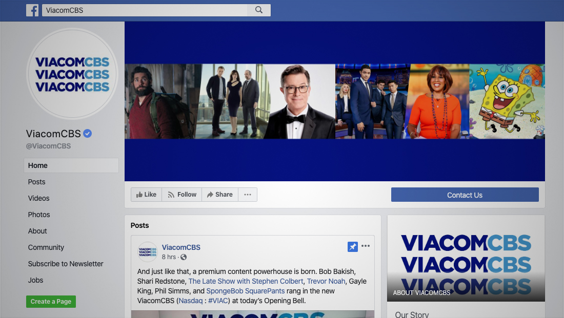
The company did manage to snap up @ViacomCBS on Facebook, Twitter and Instagram at least.
In some instances, particularly social media, the company opts to stack three identical versions of its new logo on top of each other.
The same lockup was also used on “CBS Evening News” during a brief segment when the broadcast made the obligatory announcement of its own parent company’s corporate marriage.
A division of CBS, CBS Domains Inc., also applied for and was granted the rights to the new top level domain extension .cbs, though it hasn’t been actively used yet.
Having control over this could mean that the company could, for example, create domains like news.cbs or watch.cbs — or maybe even, to get around that pesky ViaCBS.com issue, viacom.cbs.

tags
Branding, CBS, domain names, logo design, Viacom, ViacomCBS
categories
Branding, Broadcast Industry News, Featured