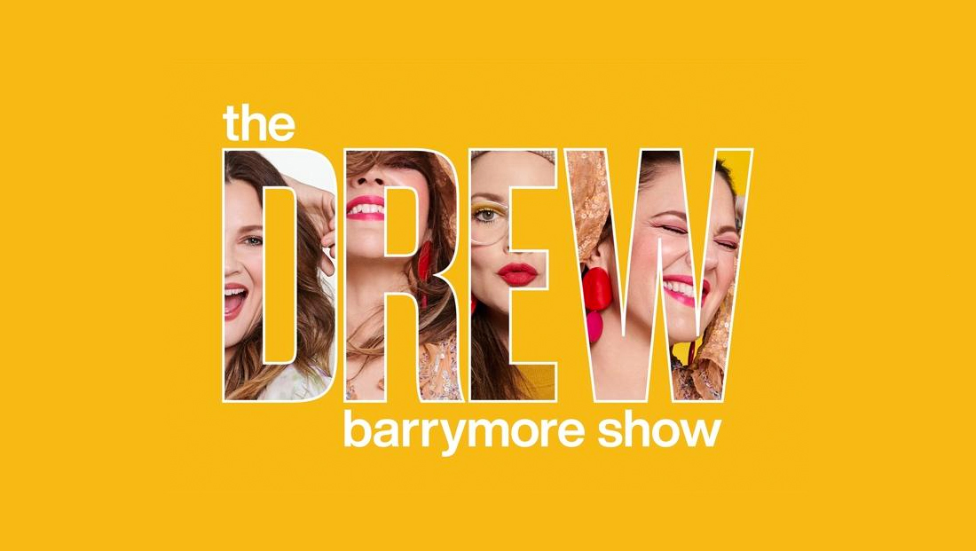
‘Drew Barrymore’ logo down to earth but lacking any extra flair

Weekly insights on the technology, production and business decisions shaping media and broadcast. Free to access. Independent coverage. Unsubscribe anytime.
CBS Television Distribution is preparing for a new talk show starring actress Drew Barrymore.
The self titled “The Drew Barrymore Show” is expected to debut in early September 2020 in first run syndication.
For a logo design, the show uses a mix of capital letters and all lowercase presentation that draws the eye to the host’s first name.
While the all caps is bit strong, the look is softened a bit by the lowercase letters found elsewhere, including the last name “Barrymore” with its ascender tucked between the negative space that lies in the middle of the “D” and “R.”
In some ways, it appears the show is attempting to brand Barrymore with a standalone first name, just like Ellen DeGeneres and Wendy Williams‘ shows often go by simply their hosts’ first name (this is also becoming more commonplace among viewers as “The Kelly Clarkson Show” settles in, though the show typically doesn’t style it as such — and there’s a potential name collision with Kelly Ripa’s popular singular moniker and the “Live with Kelly and Ryan” name).
While Barrymore herself is perhaps most widely known for her child acting role in “E.T.” and being the daughter of actor John Barrymore, fewer viewers today are likely to know her from that role or have heard of her dad, particularly those in the younger part of the 18 to 49 demographic often sought after by TV shows.
From a typographical standpoint, none of the letterforms are particularly memorable and the use of Helvetica-ish typefaces with little modification also fails to make the look stand out.
In addition to “Live,” DeGeneres’ show also uses a Helvetica-ish font, but styles it in completely lowercase letters and takes advantage of the rounded curves of the “e” and “n”s as well as the strong vertical “l”s. These shapes are carried through to other elements of the show, including the default background on the large sliding video walls DeGeneres typically enters through and uses for her monologue.
Williams uses a friendlier more humanist typeface in her logo with a custom “tail” on the “y” making it more distinct.
The “Drew” logo also has some visual similarities, particularly in the use of the all caps bold condensed typeface, with Ripa’s show’s logo.
Another common branding element is the use of a golden yellow tone — a color that stands out fairly well amid the talk show scene ranging from “Ellen” and her blue look to Kelly Clarkson’s bold splashes of color.


tags
Drew Barrymore, ellen degeneres, logo design, The Drew Barrymore Show
categories
Branding, Broadcast Design, Broadcast Industry News, Featured