NBC News rolling out drastically different inauguration look
Subscribe to NCS for the latest news, project case studies and product announcements in broadcast technology, creative design and engineering delivered to your inbox.
NBC News has apparently decided that with a new administration it should have a new look for its inauguration branding.
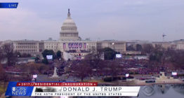
The network used a bold red, white and blue American flag motif look shown here with the geometric sans serif Brandon Grotesque used for Donald Trump’s first inauguration in 2017, following the 2016 general election, as well as nationwide addresses and State of the Unions.
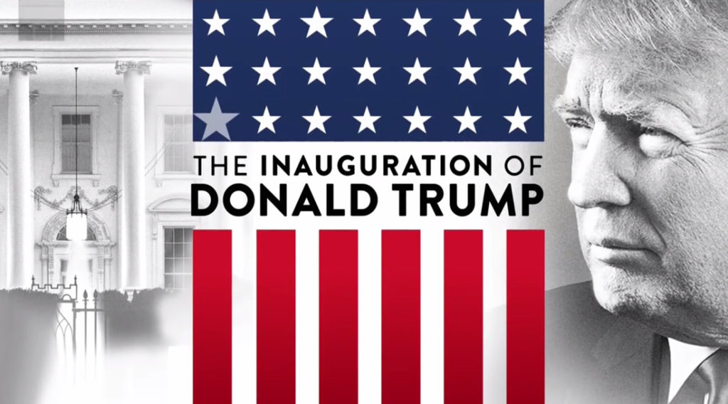

The NBC 2017 inauguration look.
Like with most special coverage, the look was duplicated across NBC and MSNBC.
The overall look projected a bold, strong and clean look that also had a bit of elegance to it — perhaps due to its relatively clean lines and limited color palette.
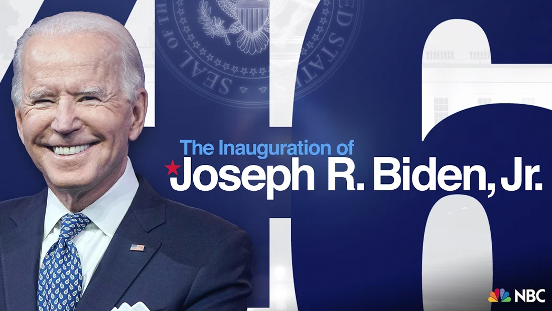
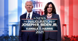
For Biden’s event, the design is a bit more casual and puts the emphasis on other elements.
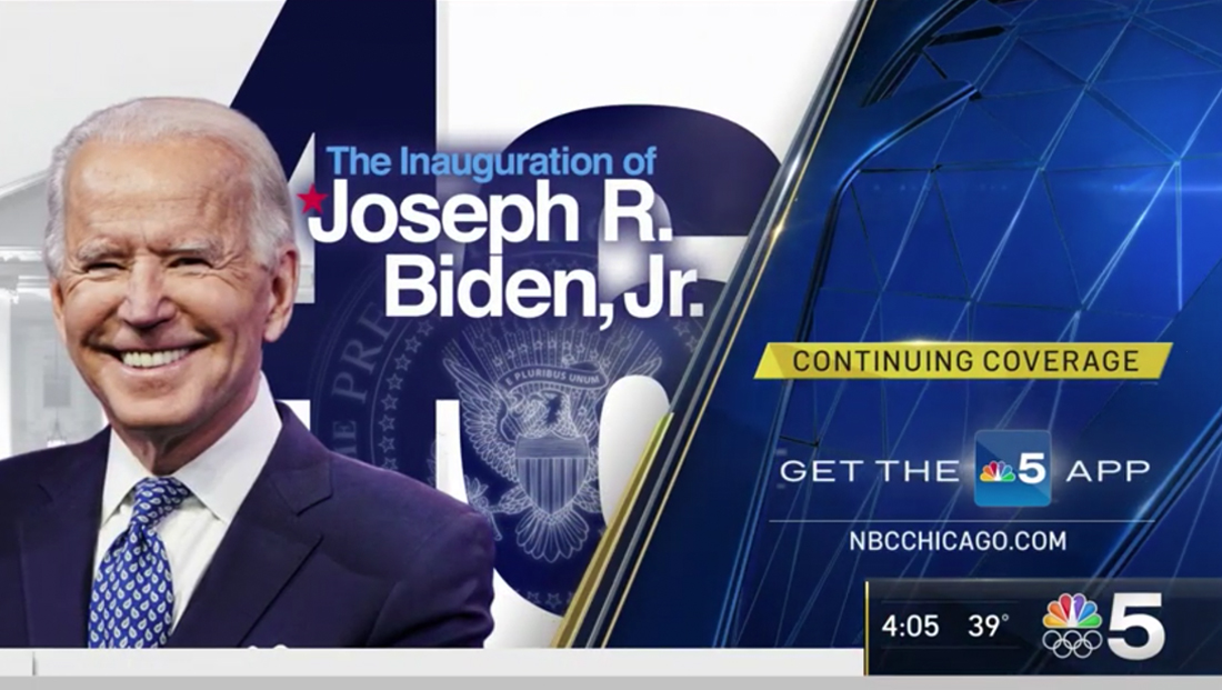

The stacked version of the NBC Biden inauguration logo as seen on WMAQ in Chicago.
The logotype is set in a standard Helvetica-ish font and reads “The Inauguration of Joseph R. Biden, Jr.,” with the first three words typically in a light blue.
There’s a red start perched on top of the left “hook” of the capital “J” as well.
The number “46” is also used prominently (Biden will be the 46th president), namely as a bold blue background element that allows imagery of the presidential seal to shine through. Also mixed in are full color photos of Biden himself and ghosted White House imagery.
Often the horizontal bar of the “4” is tightly integrated with the “6.”
In some lockups, that strong dark blue horizontal band serves as a place to park the logotype itself.
While the horizontal lockup of the look is bit plain, a stacked version, which is being used in MSNBC countdown bugs and shown above, includes the ascender of the “d” reaching up to almost touch the descender of the “p,” perhaps with some custom type tweaking going on behind the scenes.
This does add a bit of visual interest to the otherwise plain text, but also, arguably, creates some “trapped white space” that is sometimes considered a no-no in graphic design.
What will the networks' 2021 #InaugurationDay looks be like? The promos provide some clues… https://t.co/RA7JtJdW7l
— NewscastStudio (@newscaststudio) January 18, 2021
Meanwhile, other networks have begun airing promos that give hints, to varying degrees, on what branding they’re using this year.
In addition, MSNBC has also been using the branding “Transition of Power” for coverage leading up to the inauguration and has stingers and lower third flags to match.
NBC’s new look is likely to stand out — since it eschews many of the more traditional (and perhaps, one could argue, overused, parts of political broadcast graphics).
It’s not immediately clear if the look will stick around for other Biden events NBC covers in the future.
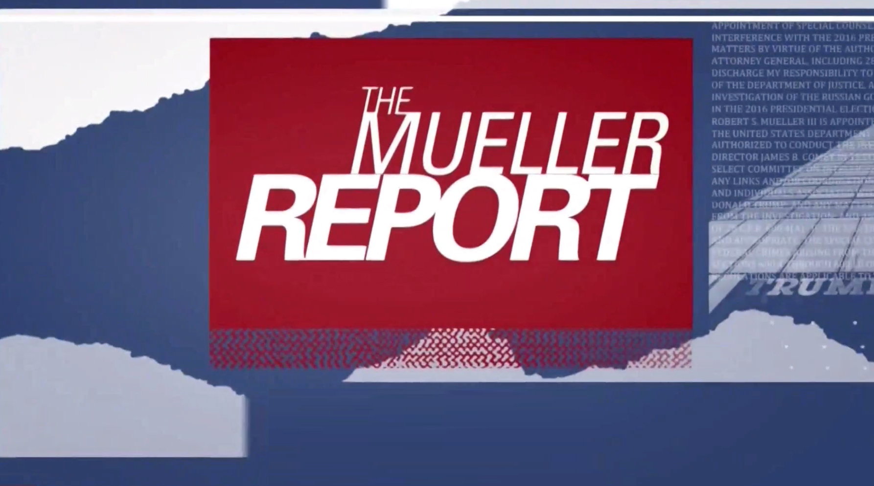

NBC 2019 Mueller Report branding title card.
In some ways, the look is reminiscent of the Mueller Report look NBC News used back in 2019 — though this look involved all capital letters and some rough textures to contrast with the typography and boxes’ cleaner lines.
Correction: An earlier version of this story misidentified the year NBC started using its previous inauguration look. It is 2017.
Subscribe to NCS for the latest news, project case studies and product announcements in broadcast technology, creative design and engineering delivered to your inbox.




tags
inaug, inauguration, Joe Biden, Joe Biden Inauguration 2021, NBC News
categories
Branding, Broadcast Design, Broadcast Industry News, Featured, Graphics, Network Special Reports