
CBS Sports rolls out new branding, graphics with Super Bowl coverage
Subscribe to NCS for the latest news, project case studies and product announcements in broadcast technology, creative design and engineering delivered to your inbox.
The Super Bowl represents the time for broadcasters to deploy the latest in broadcast technology, from high-speed cameras to advanced augmented reality graphics. It’s also when most networks in the United States debut new graphics.
This was the case for the coverage on CBS which has been slowly updating every piece of its branding, from new division logos to network promos and snipes.
For CBS, the design is expected to filter down to all sports properties across its networks, becoming the new graphics of CBS Sports, CBS Sports HQ and CBS Sports Network.
All three properties received updated logo designs in the days before the Super Bowl using the new CBS font, TT Norms, with CBS Sports HQ already updating all of its wrap-around graphics along with refreshing its studio space in Florida.
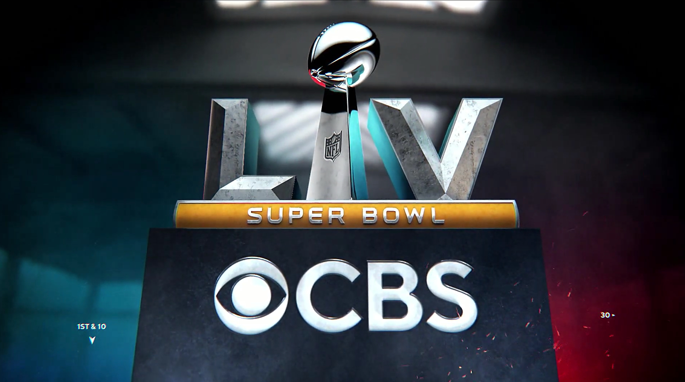
The basis for the new sports design package is the CBS eye logo, which creates the primary device in which branding and team elements can appear.
“Our focus for the redesign at the Super Bowl was now heavily influenced by the bigger rebrand [at CBS]. We were sort of a rebrand within a rebrand at that point,” notes JP LoMonaco, VP of on-air graphics & design at CBS Sports in an interview with NewscastStudio. “It was great. We had parallel conversations with CBS network … while internally crafting our own personality within that design. And then obviously trying to elevate everything because it’s the Super Bowl.”
The eye shape includes a variety of extruded layers and revealing elements when used in 3D that create levels of visual interest.

Shadows, a design motif appearing on the news side with the graphics of the “CBS Weekend News,” is also present in the new sports look along with a hand-drawn stroke effect that appears under team names and keywords.
This is offset by heavy use of outlines including both the CBS eye and team logos, micro text and hash marks, tieing the look into the overall brand strategy.
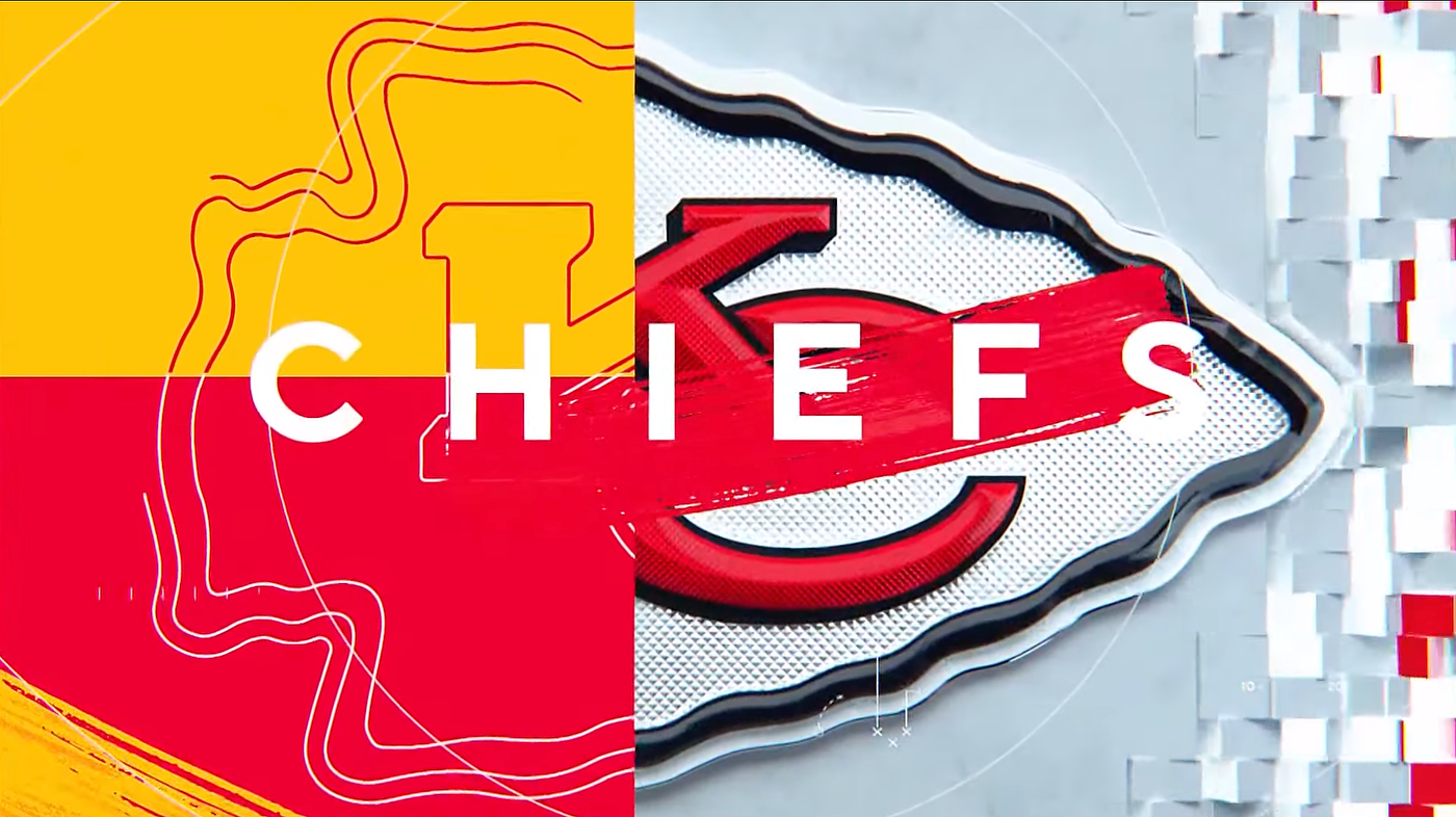
Those team logos also appear extruded with textures reminiscent of a football’s pigskin to add depth to the design, eschewing a completely flat design style seen on other networks.
The score bug and other standard insert graphics have also been updated.
CBS did embellish the new look with some beach vibes adding sand effects and textures to represent the host city of Tampa Bay, with the colors of the design also tweaked to represent the Super Bowl’s branding.
This was on full display during the main opening sequence when an augmented reality football player made from sand ran onto the field, transforming into the game logo.
“This year we really loved their mantra for the Super Bowl, which was sea, sand and siege [representing the host team of the Buccaneers],” said LoMonaco.
“It was a very colorful, very dramatic approach to sort of that Buccaneer pirate motif that Tampa Bay gives off… We started dreaming up the particles. Right away the particles all come into your head and you’re like, how am I going to use these?”
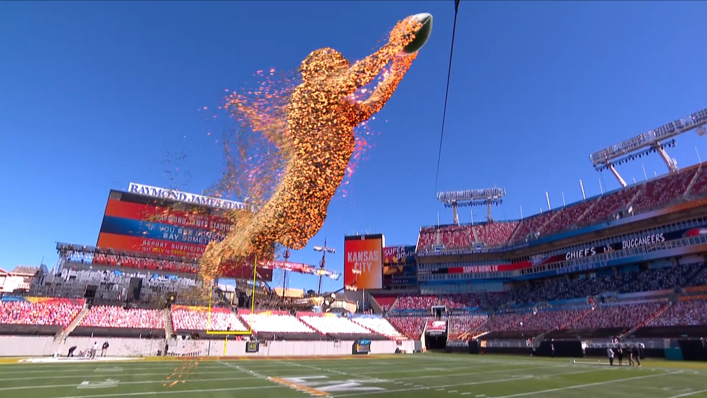
The particle effect, which became sand and cannons firing on screen, was made possible by Pixotope using the Unreal Engine for rendering with motion capture from Silver Spoon Animation. The effect was layered onto the network’s Skycam with Ncam for camera tracking with SMT data.

“What a great way to introduce a little bit of high-end technology,” said LoMonaco. “The Unreal Engine driving those graphics was the only way that we could have accomplished that. Nothing else has that kind of power in a real-time type environment.”
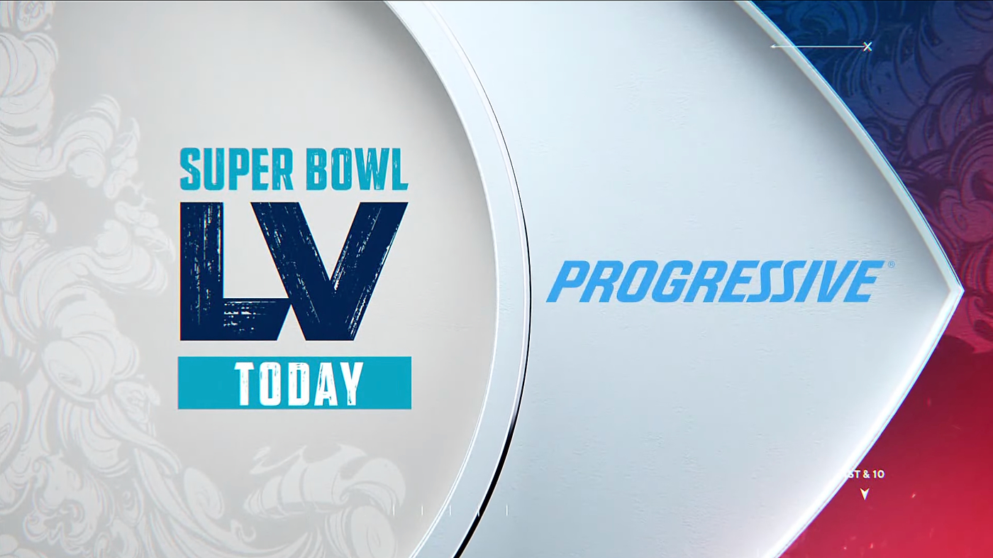
Like the other divisions, CBS Sports also gained a new sound signature, or mnemonic, as part of the larger rebrand strategy. More upbeat with added guitars, the sound debuted at the Super Bowl through a variety of snipes and a new promo campaign for CBS Sports.
That campaign highlights the network’s marquee properties, including the Masters and NCAA Tournament, before ending with “this is Passion” and the new mnemonic.
Subscribe to NCS for the latest news, project case studies and product announcements in broadcast technology, creative design and engineering delivered to your inbox.

tags
CBS, CBS Sports, CBS Sports HQ, CBS Sports Network, insert graphics, Ncam, NFL, nfl on cbs, Pixotope, Silver Spoon, Skycam, smt, sports broadcast design, sports graphics, super bowl, Super Bowl LV, the nfl today
categories
Branding, Broadcast Design, Graphics, Heroes, Sports Broadcasting & Production