A look back at the history of MSNBC’s logo

Subscribe to NCS for the latest news, project case studies and product announcements in broadcast technology, creative design and engineering delivered to your inbox.
On March 29, 2021, MSNBC unveiled its latest logo design — its fifth distinct design in its history.
The new logo uses a custom typeface known as Wordmark, according to NewscastStudio sources, and retains the tradition of the last three logos of placing the NBC peacock icon to the left of the typography.


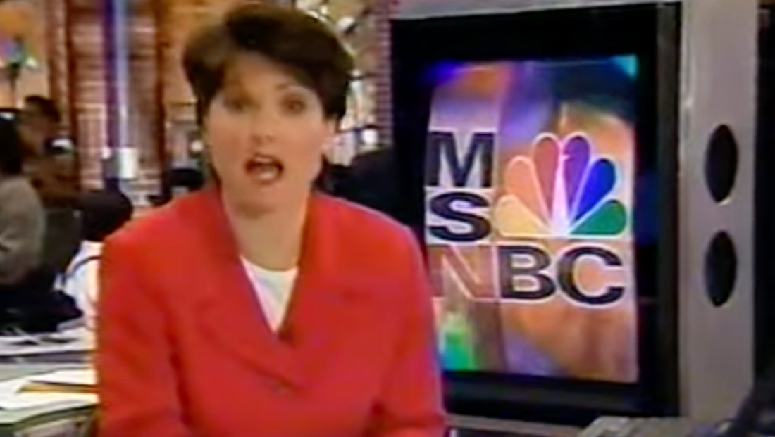
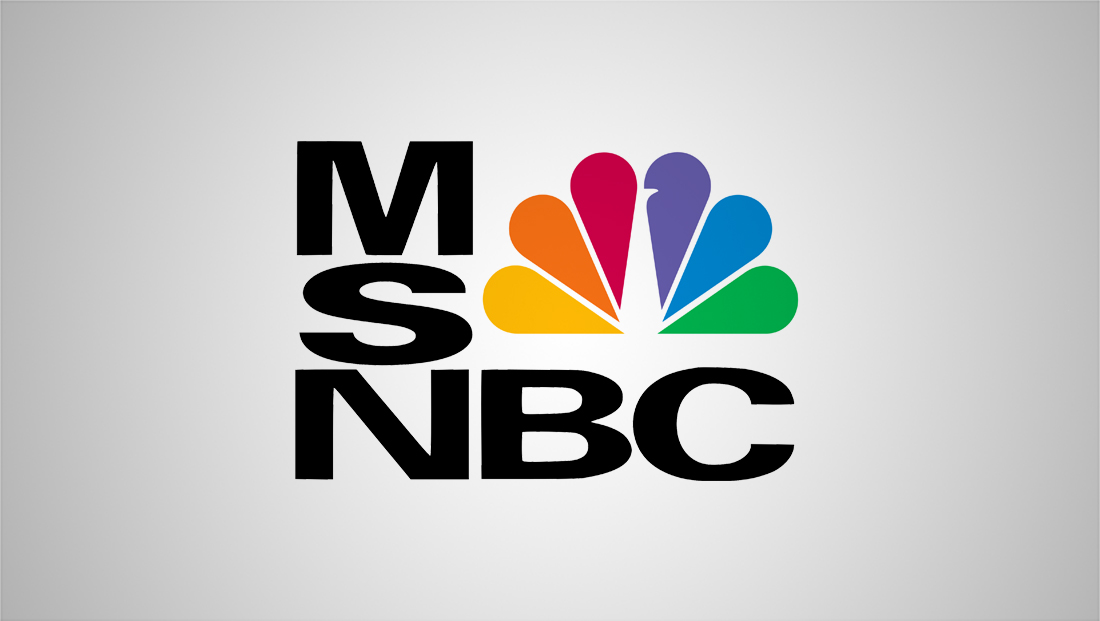
When it debuted in 1996, MSNBC used the square-ish logo shown above that features “M-S-N” stacked on top of each other with “B-C” tucked under the peacock.
There were two other variations of the logo — including where the “N” was switched to a red shade. The network wold later add the word “News” below and then, in another variation, box it with the “NBC” to emphasize the “NBC News” part of the brand.
These logos all used an extended width sans serif typeface that has some similarities to the longtime logotype used for sister network CNBC, though the two are not exactly the same.
When MSNBC was founded, the “MS” stood for “Microsoft” — since the network was a joint venture of the tech company and NBC.
As originally envisioned, MSNBC was slated to take advantage of using the power of the internet combined with television to deliver multimedia news — a concept that never fully caught on. Microsoft would eventually divest from the venture and it became wholly owned by NBCUniversal. Hence, the “MS” no longer officially stands for anything.


Next up on the logo front was a horizontal lockup of the logo. The same font was used, but all five letters were in the same row — a tradition that continues to the latest iteration. This version debuted around 2006.
Then, in 2009, the network took a softer approach with a lowercase logo type in a font that featured gentler curves, giving it a friendlier, more approachable feel.
The letterstrokes in this version also more closely aligned with the curved ends of the “feathers” in the NBC logo, which remained a prominent part of the look.
In 2015, the network changed back to all caps and shrunk the peacock ever so slightly. This version would stick around until 2021, when the current look debuted.
Correction: An earlier version of this story was unclear about how many distinct logos MSNBC has had since its inception. The story has been updated to reflect that it is now on its fifth distinct logo, for a total of four before this release.
Subscribe to NCS for the latest news, project case studies and product announcements in broadcast technology, creative design and engineering delivered to your inbox.


tags
logo design, MSNBC
categories
Branding, Broadcast Industry News, Cable News, Featured