
‘New Day’ gets updated look that mixes circles, squares and light, dark elements
Weekly insights on the technology, production and business decisions shaping media and broadcast. Free to access. Independent coverage. Unsubscribe anytime.
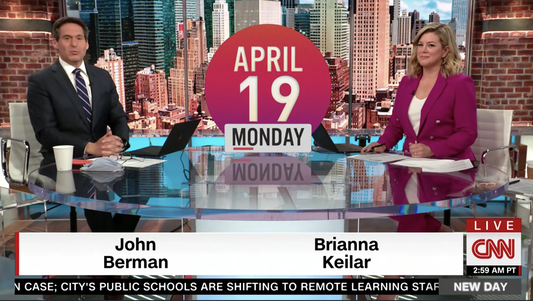
As NewscastStudio previous reporting suggested, CNN’s “New Day” got an updated look to accompany the debut of Brianna Keilar as co-anchor alongside John Berman Monday, April 19, 2021.
Keiler’s move to the chair followed a flurry of anchor changes at the network, with her replacing Alisyn Camerota, who reportedly requested the move to an afternoon gig.
In order to accommodate some of Keilar’s trademark segments and style, the network previously indicated it would be tinkering with the approach and format of the show.
The more serious, “no B.S.” and straightforward approach is evident in the new look that attempts to combine, somewhat successfully, a darker, more sophisticated look along with brighter morning motifs.
Updates include a mix of square and circular elements displayed in the form of thick and thin outlines, hashmarks and solid shapes along with microelements such as arrows and brackets in animations.
The show title also often animates in as two separate lines, allowing the word “New” to stand alone briefly before it’s “pushed aside” to make room for “Day,” which often starts oversized and shrinks down to fit in the box.
Anchor scripts also work in references to the show name, such as “on this new day…,” creating a clever double meaning that could be read as referring to the day itself or the show title.

As previously reported, the show’s logo is no longer displayed in the glass 3D box or even the flat, solid red box — it’s instead been converted to a outline with the show’s title in the middle in the same arrangement as before.
The box is now “transparent,” mostly allowing whatever is behind it to show through — whether it’s the imagery in the open or the updated video wall cityscape.
The show used three distinct opens — one for each hour — with the first one focused on color imagery of field reporters and black and white photography of Berman and Keilar as well as a New York City skyline. A similar skyline is repeated on the LED ribbon above the anchor desk inside Studio 19Y.
James Earl Jones’s voice, known for his iconic “This is CNN” idents and who was recruited to record opens for previous incarnations of “New Day” is no longer heard.
The mostly pre-produced cold open is also gone, instead replaced with anchors on camera with topical graphics appearing next to them.
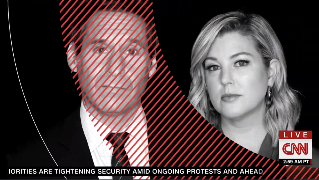
The second open uses only black and white imagery of the co-anchors both on set, in beauty shots and conducting interviews.
Finally, the third one once again mixes correspondents with the co-anchors and, at least on the April 19 edition, ended with a Washington, D.C. image instead of NYC.
Musically, the opens include new theme music from Stephen Arnold Music with an urgent, driving beat laced with string instruments and punches of horns.
Perhaps the most noticeable addition to the graphics is the use of circular elements — which could be seen as a visual reference to the sun.
In the opens, CNN seems most successful in mixing the two elements, but the purple and red gradient OTS-style graphics used for teasing upcoming stories near the top of the hours seem a bit out of place and perhaps a bit too “pop up video” for a serious newscast.
Another successful implementation is only visible in extreme wide views of the studio such as the sweeping push ins used at the top of each hour when, if one looks closely, there’s a large thick curved red arc that spans the entire three LED video panel segments behind home base and matches the shape of the “transom” at the top of the set’s central video array.

The LED panels in the floor of the anchor desk riser also sport a black, white and red design with a circle inset.

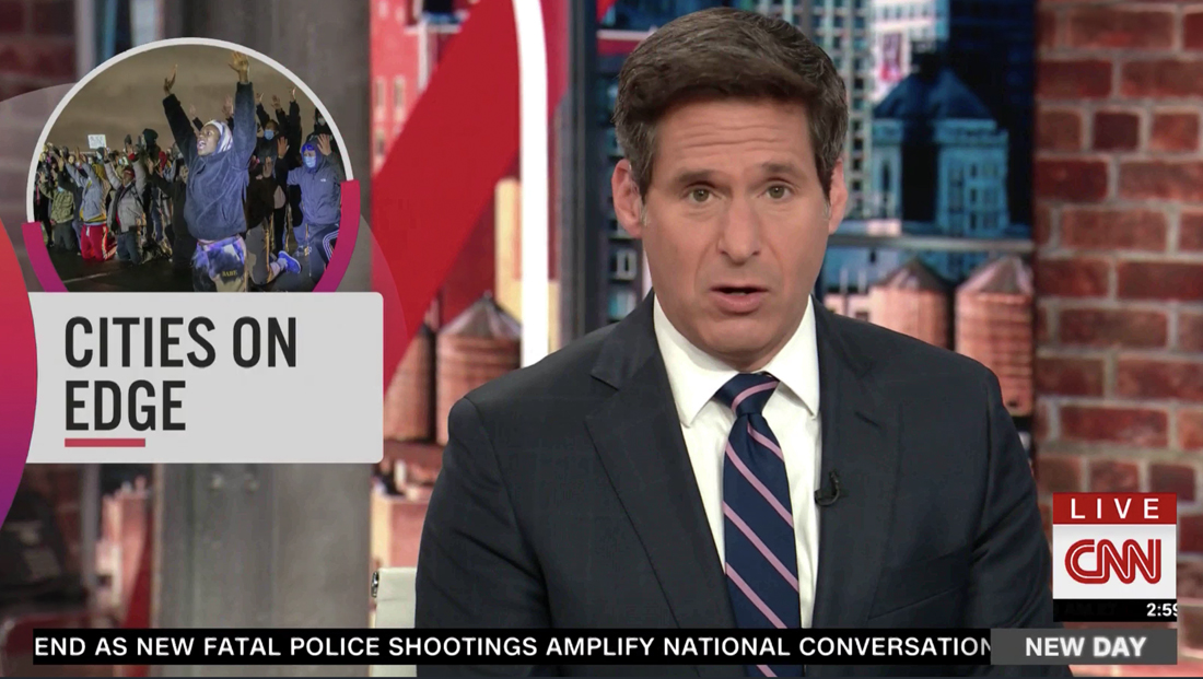
The network uses another circular element overlaid between the anchor two-shot to showcase stories as well. It’s worth noting this is not being fed to the video wall behind the anchors — it’s centered in the frame which, as you can see in the screengrab above, is slightly off-center with more of the faux brick column showing behind Berman camera left.
The network also adds a faux reflection effect, but the graphic wouldn’t reflect in that manner if it were on the video wall since it’s farther away from the anchor desk.
That same violet and red gradient also show up in the large circles used to display the date, as shown at the top of this article.
Meanwhile, red and violet circles with subtle gradients and beveled edges appear in many full-screen graphic backgrounds.
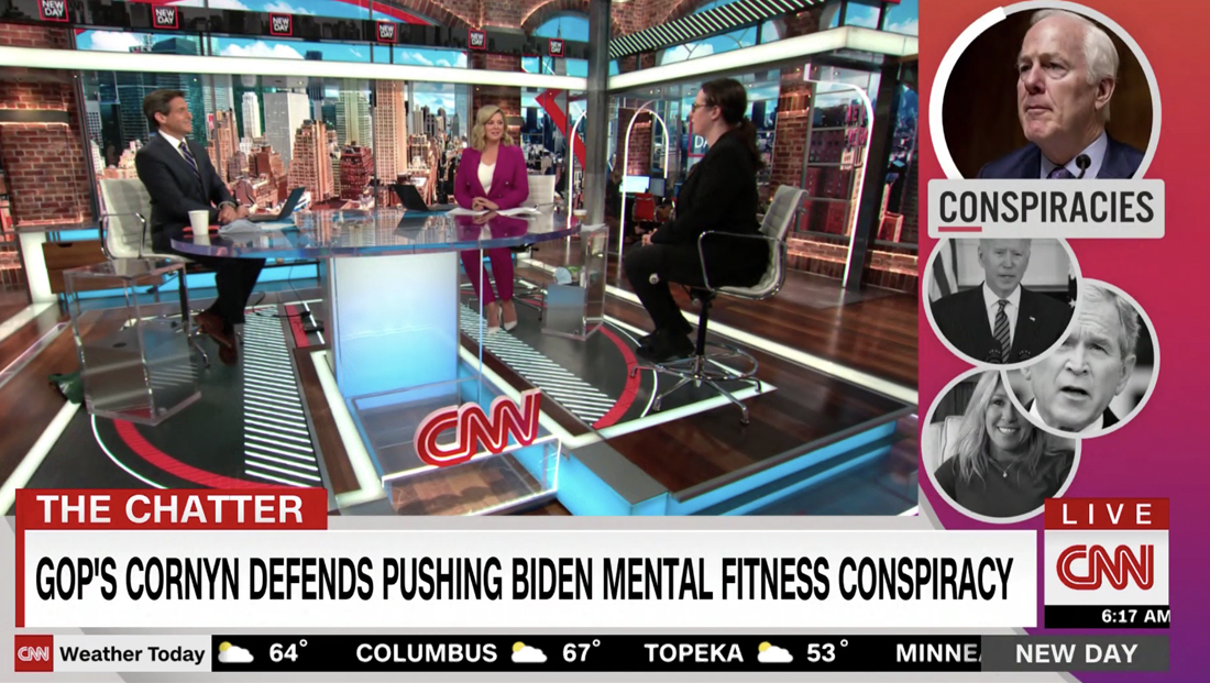
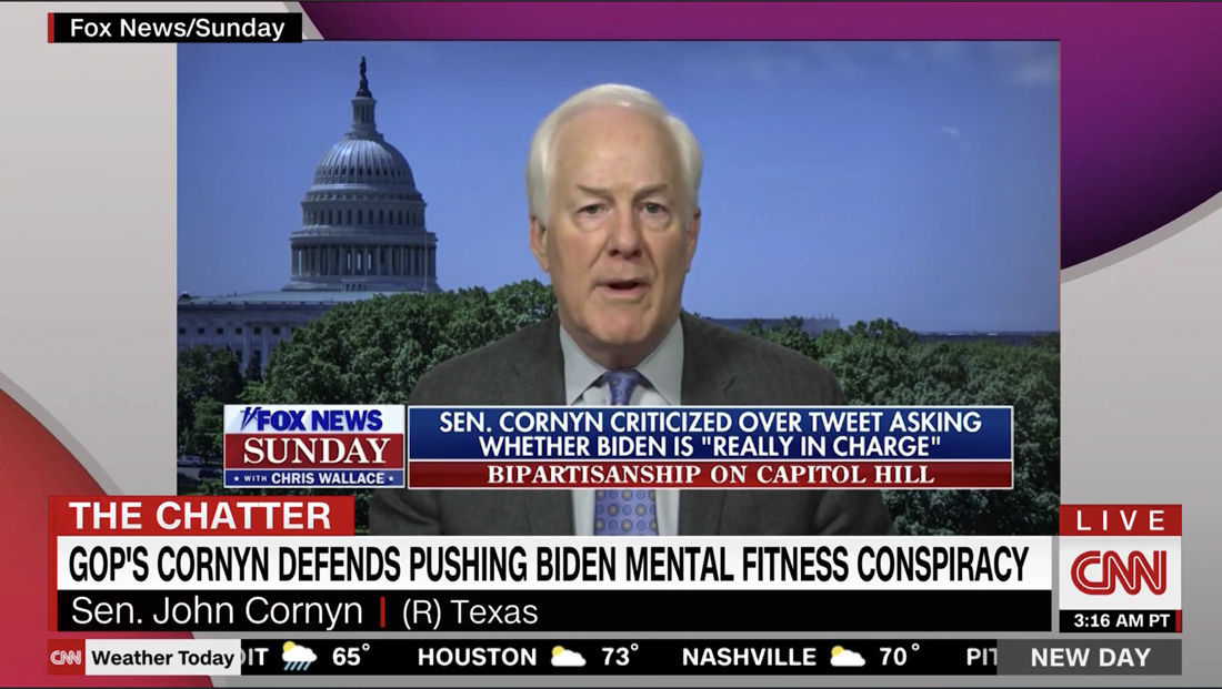
The circles also make an appearance in the L-bar style squeeze back used during “The Chatter” which is a sort of rundown style feature, with the circular photo of the current topic being discussed appearing larger and in color with a short cutline below.
The show’s “Reality Check” segment got some updates as well, including the addition of a circular element over the network’s political look and an augmented reality panel that, combined with one of the studio’s wall-mounted video walls, allows more data and information to be shown to viewers.

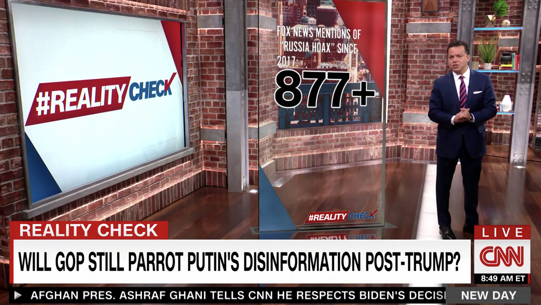
The network inserts the appearance of a freestanding glass panel with projected imagery during ‘Reality Check.’
Another change is the elimination of the blue-gray weather bar that sat atop the news ticker. Now, weather conditions from around the country now are simply inserted into the main ticker with a “CNN Weather Today” label.
The debut edition of the new format had a few bumps — there were several times when an anchor remained on screen just a bit too long after a read, a camera adjustment appeared on-air and even one of the centered circular graphics “locking up” during what appeared to be a transition before it was abruptly removed from air.

tags
Brianna Keilar, CNN, john berman, new day, Stephen Arnold Music
categories
Branding, Broadcast Design, Broadcast Industry News, Cable News, Heroes