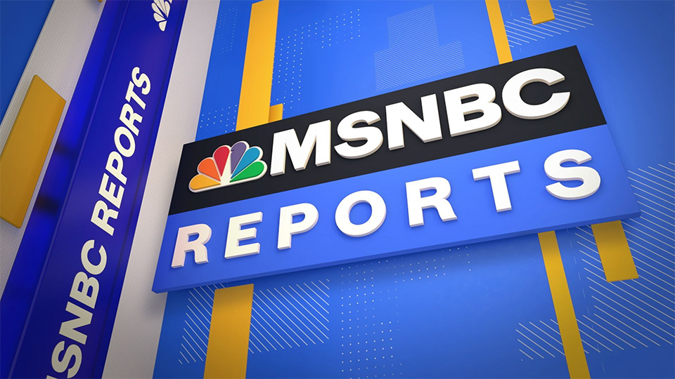
After a rollout delayed by news cycle, here’s a look at the new ‘MSNBC Reports’ graphics
Subscribe to NCS for the latest news, project case studies and product announcements in broadcast technology, creative design and engineering delivered to your inbox.
Back on March 29, 2021, MSNBC debuted updated graphics and music across all of its programming — but it took a while for the viewers to get a full look at many of the changes.
Part of that was because March 29 also happened to be the start of the Derek Chauvin murder trial. MSNBC carried the opening statements live, meaning most of its dayside programming was essentially pre-empted.
Over the coming days and weeks, the trial continued to dominate the dayside hours, meaning many of the “MSNBC Reports” blocks previously known as “MSNBC Live” exclusively featured trial coverage and the network’s orange and black look for the trial.
After the verdict was handed down April 20, 2021, the network slowly began to go back to its normal schedule, meaning a more complete picture of the look began appearing on air.
As previously reported, the new look is dominated by a bright and dark blues along with white and yellow and takes on a flatter, in the sense that it’s not overly glassy or shaded, and more linear look rather than the red, white and blue glassy ring look used for “MSNBC Live” and “Andrea Mitchell Reports” previously.


Much of the design centers around isometric-style scenes positioning various extruded text and logos and rectangles at various angles.
For opens, imagery of anchors, landmarks and more are mixed in, often “floating” within the 3D space along with rectangular boxes holding text that slowly move around the screen. Diagonal hashmarks, arrows, dots and other accents are also used throughout the look.
Rotation-like effects as well as shifting vantage points are used to shift between scenes and looks in the opens.
‘Stephanie Ruhle Reports’ (9 a.m. eastern)
‘Hallie Jackson Reports’ (10 a.m. eastern)
‘Craig Melvin Reports’ (11 a.m. eastern)
‘Andrea Mitchell Reports’ (noon eastern)
‘Katy Tur Reports’ (2 p.m. eastern)
‘Ayman Mohyeldin Reports’ (3 p.m. eastern)
Mohyeldin’s hour typically forgoes the slightly longer open with his imagery and instead runs a brief, more stinger-style open.
‘Alex Witt Reports’ (weekends)
‘Yasmin Vossoughian Reports’ (weekends)
‘Reiser & Gibson’ Report (weekends)
The opens also use a cut from “We Are Forever” from VideoHelper’s “Win or Go Home” album.
While MSNBC’s afternoon and primetime analysis programming such as “The ReidOut,” “The Rachel Maddow Show,” “The Last Word,” “All In” and “The 11th Hour” got the updated lower third banners — tinted to match their respective looks, they don’t regularly use the other elements of the “MSNBC Reports” graphics package or music.
The redesign also included updating a variety of other graphics used throughout the rolling live news coverage under the “Reports” name.
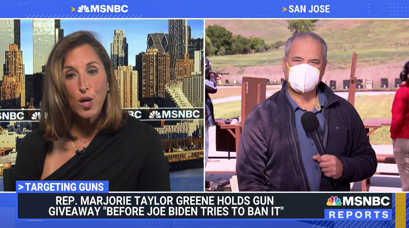

The new two box layout uses the same color scheme with each location cited along the top of the screen with a yellow arrow. Other box layouts are also used, but typically forgo the locators.
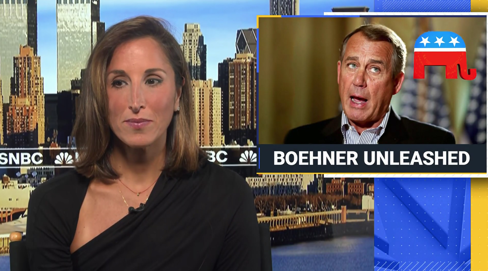

New OTS graphics include an extruded NBC peacock and yellow bar along with a wide space for topical imagery that’s framed by blue, yellow and white elements.
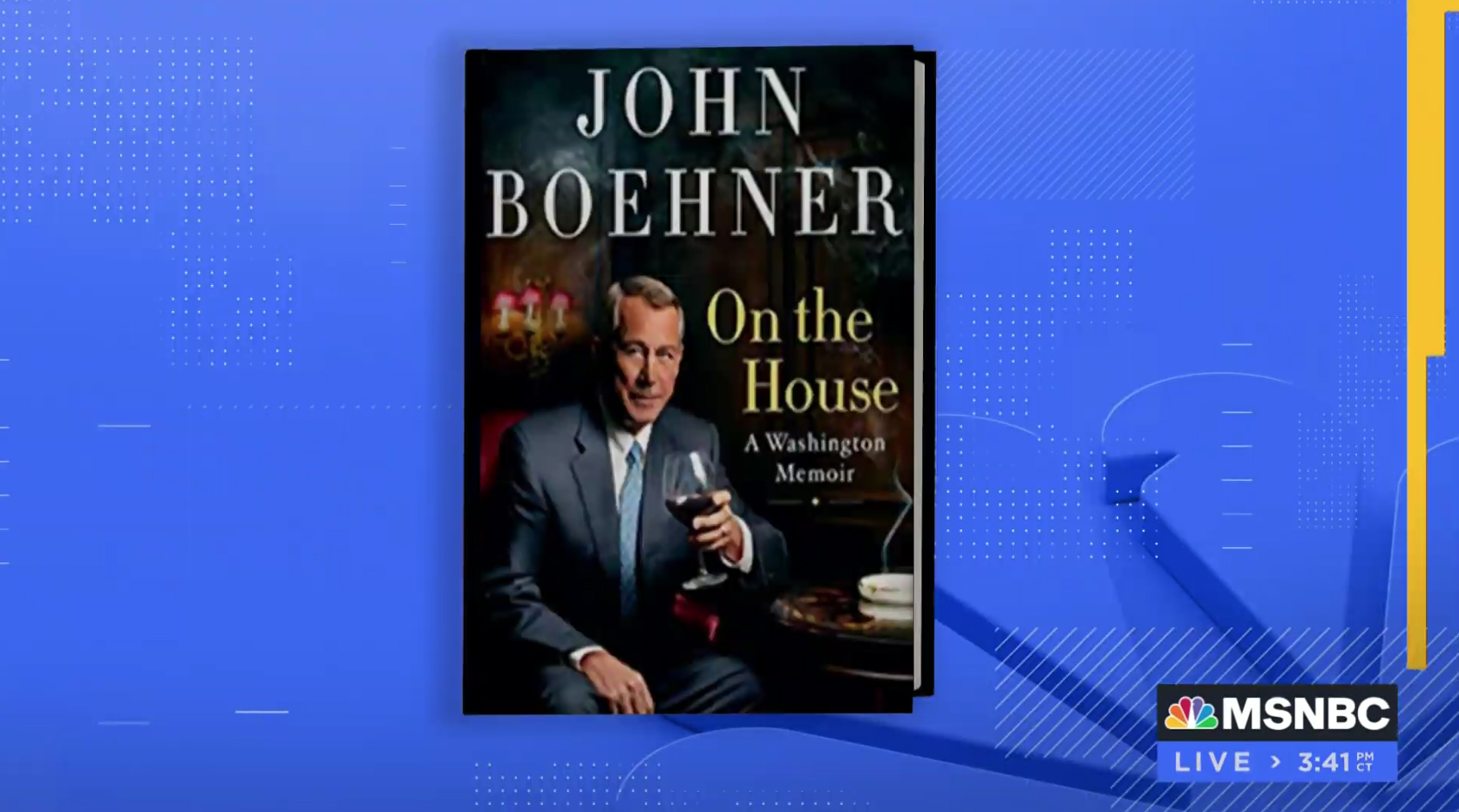

This fullscreen graphic showcasing a guest’s book cover illustrates many of the accent patterns and elements used throughout the package.
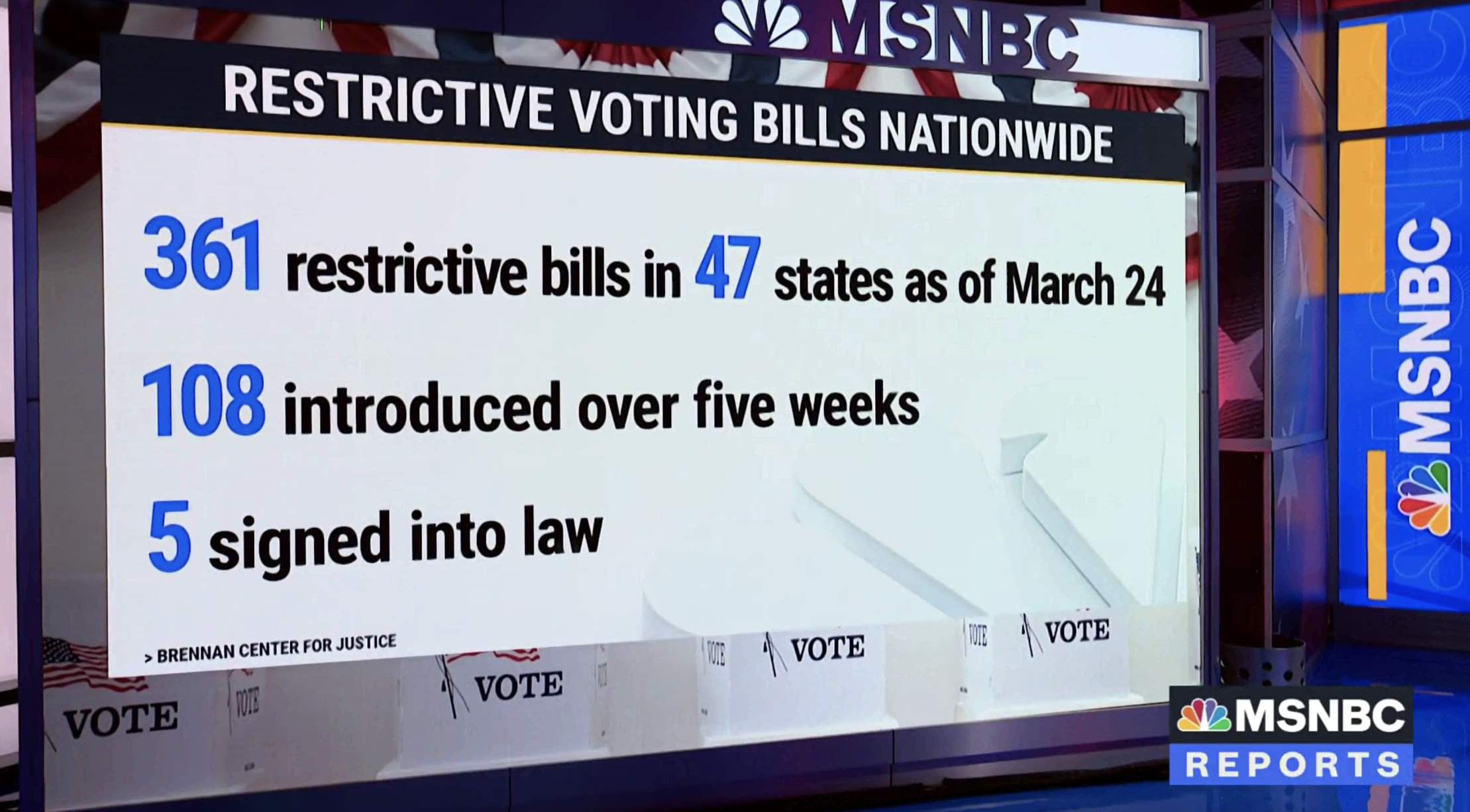

The updated look can also be used for video on video graphics and on set graphics, as visible on the video walls on the left and right sides of this capture, respectively.


Photography can serve as the background of fullscreen data graphics, with the graphics package elements used as an ‘overlay.’
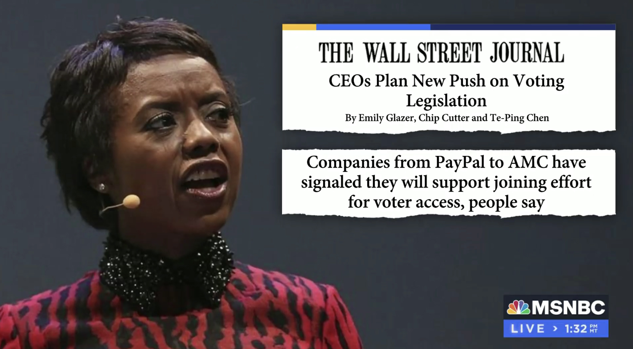

Similarly, when showcasing headlines and quotes from publications, a ‘ripped’ effect is used along the bottom of the text boxes, which can be capped with blue and yellow bars.
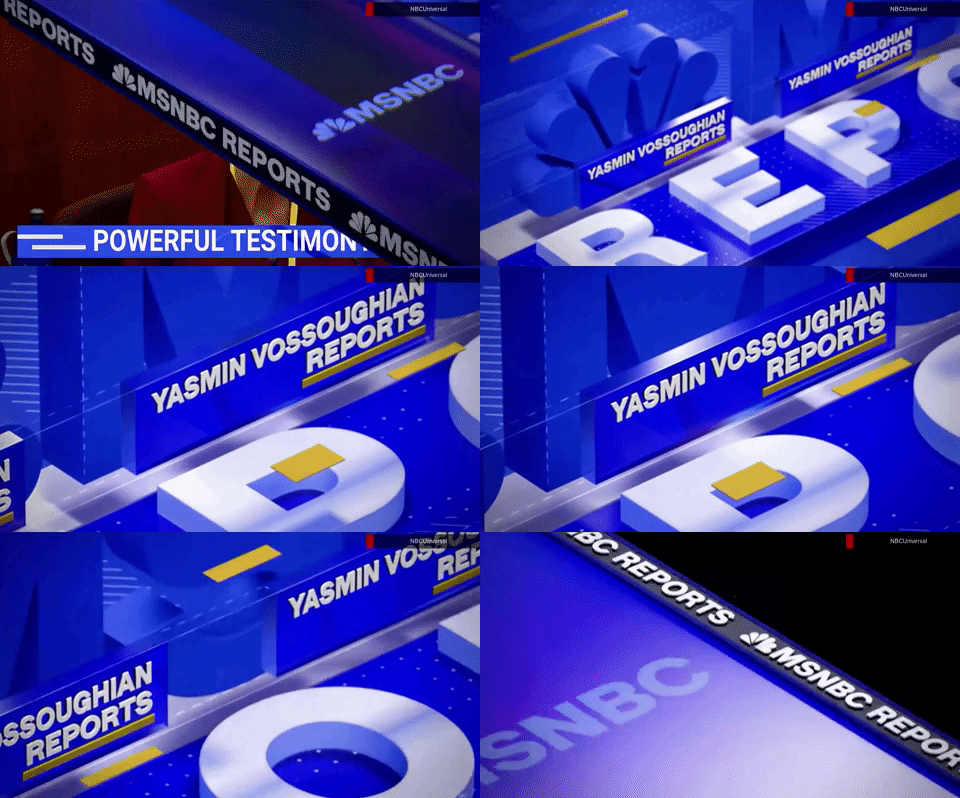
The new look also features an impressive array of wipes and transitions that are also used as bumps, stingers and rejoins, most of which are based on that isometric theme and take advantage of the angles formed by the layout as both a “window” for video (or black when headed into breaks) and as inspiration for the motion paths.
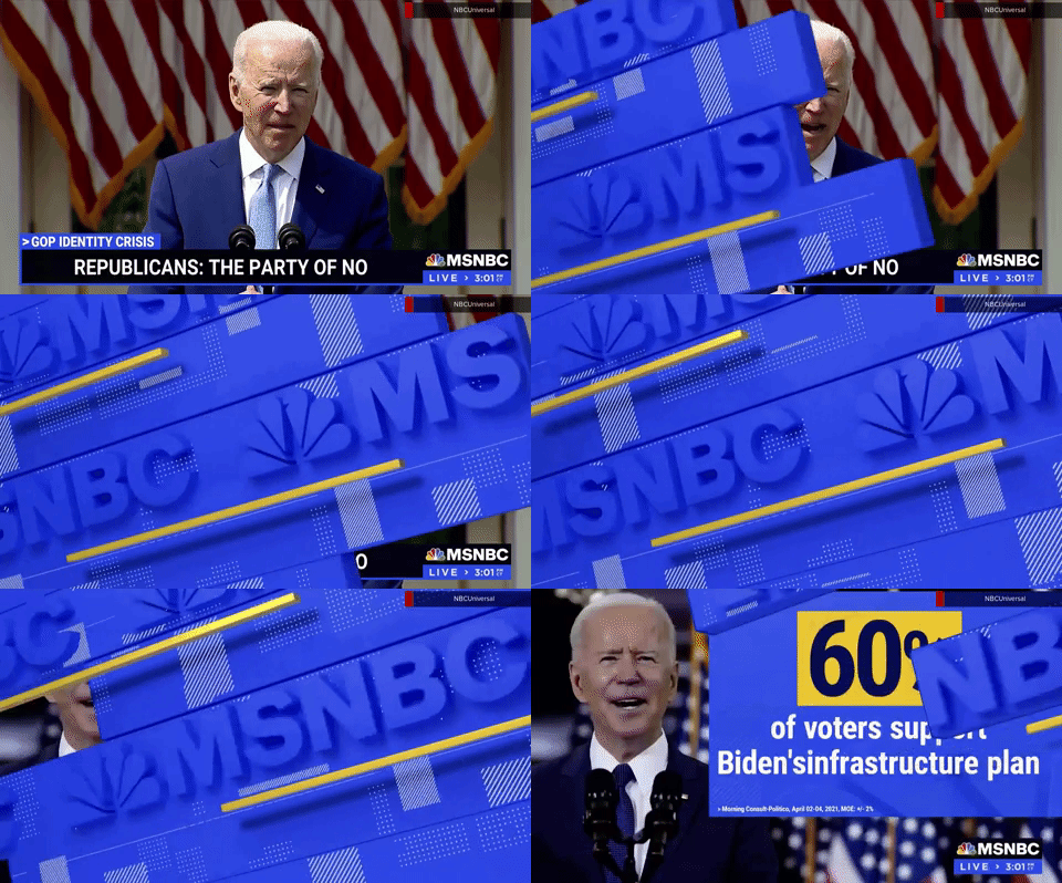

Many of the wipes are centered around the blue look used elsewhere in the package.
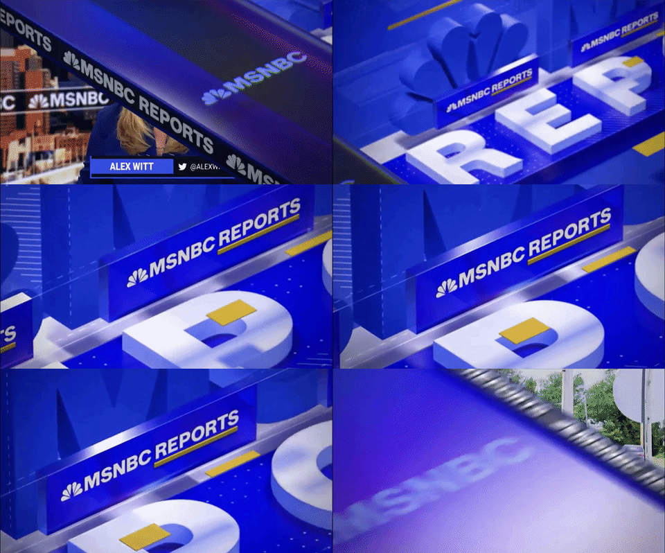


Animation isn’t restricted to side to side — there are also elements that “flip” up.
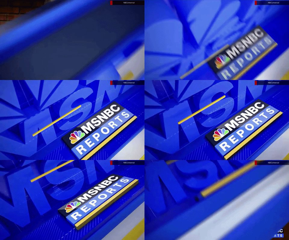

A variation of the side to side motion is a “spin” effect of sorts.


While most of the transitional style elements are generic, containing only references to MSNBC or “Reports,” there are some that contain anchor names, which are also used as abbreviated opens in some cases.


Not all of these elements use the blue angular look; one variation uses the off-white and yellow colors along with a peacock along with a step-like matte.


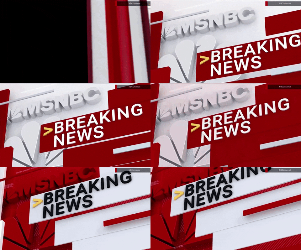
There’s also a red breaking news wipe with multiple red rectangles with hash and other accents that swipe across the screen.


This is often used with a breaking news stinger that uses a variation of the NBC chime mnemonic that was previously used during election coverage when an import projection was about to be announced.

Subscribe to NCS for the latest news, project case studies and product announcements in broadcast technology, creative design and engineering delivered to your inbox.




tags
MSNBC, MSNBC Reports
categories
Branding, Broadcast Design, Broadcast Industry News, Cable News, Graphics, Heroes, TV News Graphics Package