
Chicago Telemundo makes switch to Look S graphics package
Weekly insights on the technology, production and business decisions shaping media and broadcast. Free to access. Independent coverage. Unsubscribe anytime.
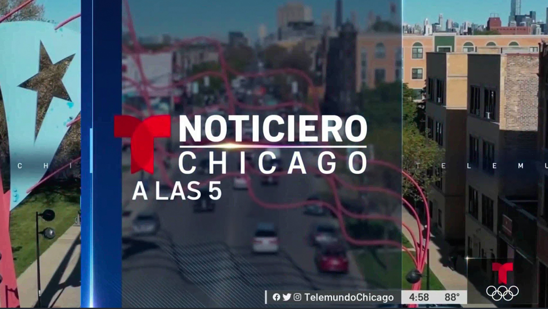
WSNS, the NBCUniversal owned Telemundo station in Chicago debuted the shared “Look S” graphics package Monday, July 19, 2021.
The move comes almost a month after its sister NBC station, WMAQ, debuted the look in June 2021. Both stations operate out of the NBC Tower in downtown Chicago.
The package, which has two distinct versions — one for NBC stations and one for Telemundo ones — will eventually be rolled out to all 36 stations between the NBC Owned Television States and Telemundo Owned Stations groups, which are both owned by NBCU.
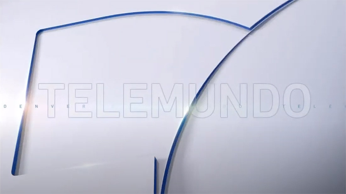
The Telemundo version of Look S first debuted on KDEN in Denver, Colorado in June 2021 and WSNS’s look is nearly identical.
For the opens, there is generally a general, sweeping view of the Chicago skyline (including an impressive view of the NBC Tower) followed by imagery from the “Little Village” neighborhood, a largely Mexican-American part of the community.
As noted previously, the Telemundo version of Look S trades the “T” logo for the most places the NBC peacock is featured in the NBC iteration.
It also uses a darker blue accent on lower third banners, which can also be switched to red for breaking news. The rainbow gradient that appears when the graphics insert is dropped in favor of blue (or red for breaking news).

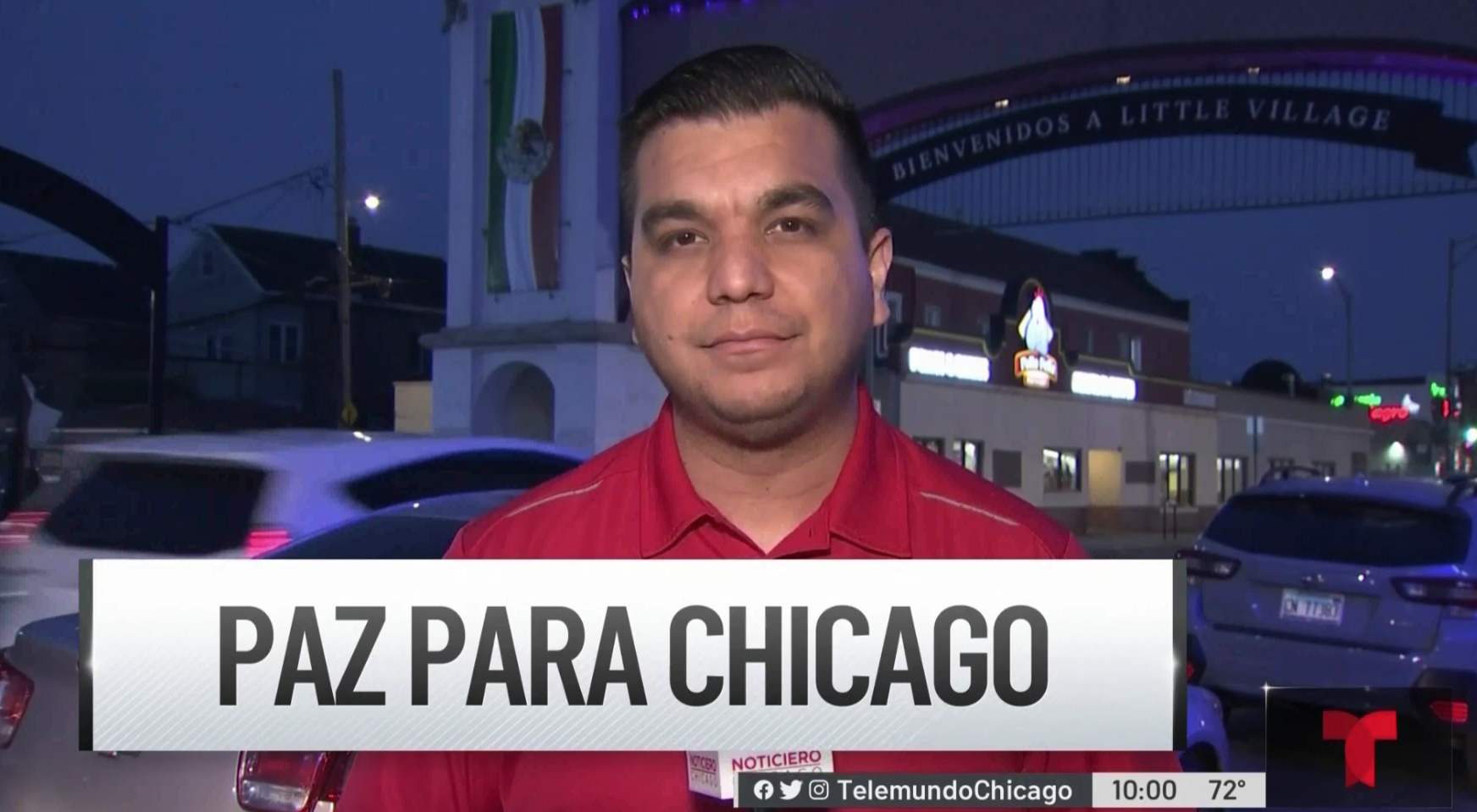
The Telemundo version also notably features a slightly different layout for tease headlines — which are large white boxes with black text.
Prior to Look S, NBC and Telemundo owned stations used two distinct but similar graphics package but Telemundo’s was considered its own “look.”
The Telemundo one had the distinction of using curved accents instead of the NBC version that was mostly right angles — whereas the two Look S versions have more in common.
Like its NBC counterpart, Telemundo’s Look S was created by NBC Arthouse.

tags
Chicago, Look S, NBC Arthouse, NBC Owned Television Stations, NBC Tower, NBCUniversal, Noticias Telemundo, Telemundo Owned Stations, wsns
categories
Branding, Broadcast Design, Featured, Graphics, Local News