
NBC boxes in Parade of Nations graphics
Subscribe to NCS for the latest news, project case studies and product announcements in broadcast technology, creative design and engineering delivered to your inbox.
American broadcaster NBC took a bit of a different approach to its geographical and data driven graphics used during the Olympics‘ Opening Ceremony Parade of Nations Friday, July 23, 2021.
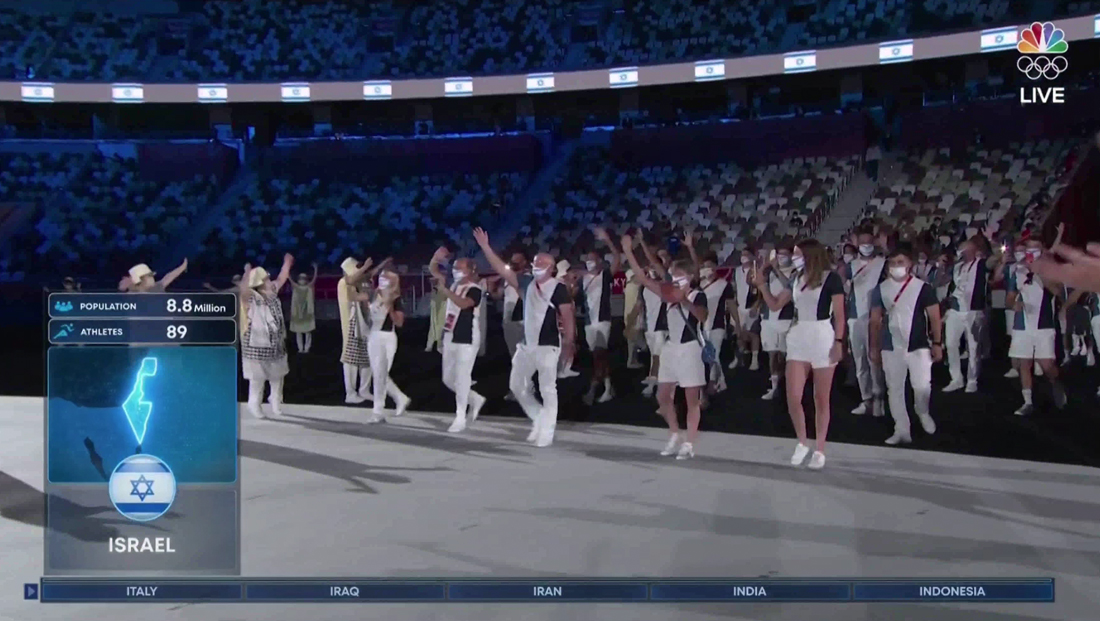
As it has for years, the network, which holds broadcast rights in the U.S., showcased the name of each country as the team entered the stadium — along with details including a map, population, number of athletes and flag bearers’ names.
However, this year saw a smaller map and all information placed inside a box on the left side of the screen instead of the flowing, blended effects used in recent years.
As usual, the network also included a “rundown” style graphic running along the bottom of the screen to show the next five countries to march.
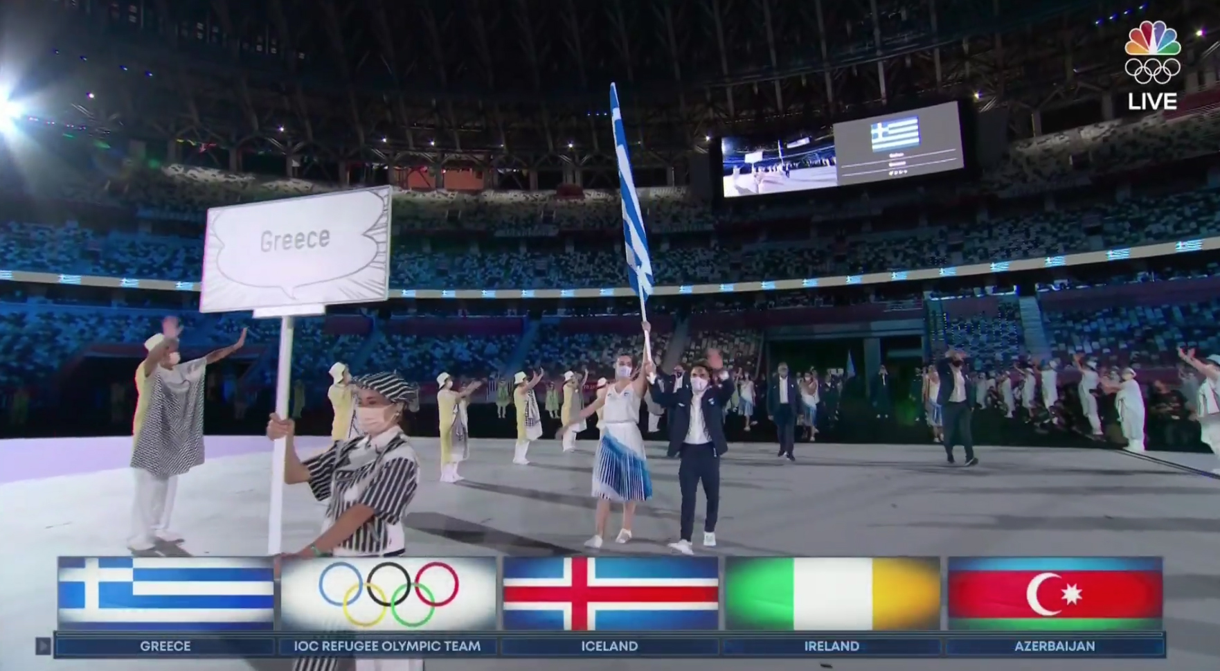
At select times, a line of the country flags would appear above their names when the timeline entered the screen.
Countries entered in alphabetical order according to the host country’s language, but NBC, as an American network, converts the names back to English (the exceptions to the ordering are Greece, which always goes first, the refugee team, which is second and host country, in this case Japan, which always moves to the end).
In line with the look that’s started to pop up on pre-opening ceremony coverage, NBC appears to be using a more “boxy” approach to its on screen insert graphics this year, with blue being a dominant color.
Most boxes are also “smoothed out” with rounded corners.
When a country entered the stadium, NBC would briefly flash its name in the timeline before a counterclockwise light burst would switch out the circular icon of the nation’s flag along with the English name below. The entire rundown would also slide over.


The graphic would then “grow” to show world map animation that zooms in on the country’s location and highlighting its borders with a glowing, bright blue outline.
The semitransparent blue backgrounds featured a very subtle circular texture that’s being used in other graphics.
Overall population, athlete count and flag bearer names were shown in additional boxes atop the map, which eventually collapsed back into itself to show just the flag icon and name again before being replaced by the next country.

The design has several big departures from the look NBC used in PyeongChang, South Korea, in 2018. First, the gradients and soft blends of color that have been part of the network’s opening ceremony look for some time are gone, since all information is boxed in.
The map has been reduced in size significantly and no longer appears on the right side of the screen.
South Korea’s look saw rectangular inspired flag icons instead of the circular emblems seen in Tokyo.
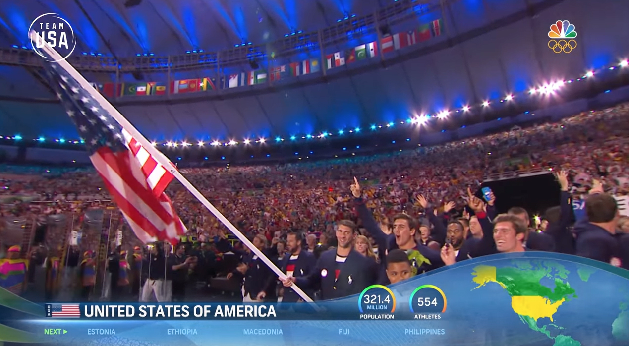
Prior to that, 2016’s Rio games incorporated the vibrant flowing look NBC used across its broadcasts to create a space for the maps, also on the right side of the screen.
The curved space devoted to it was evocative of Brazil’s Sugarloaf Mountain (albeit a wider aspect ratio) and also helped suggest the curve of the Earth.

Rectangular flag icons along with small textual abbreviations were used, along with circular “meter” style graphics for population and athlete count.
2020’s graphics also removed the small “next” designator, seemingly replacing it with a single, “play button” style arrow.

Subscribe to NCS for the latest news, project case studies and product announcements in broadcast technology, creative design and engineering delivered to your inbox.

tags
2016 Summer Olympics, 2018 Winter Olympics, 2020 Summer Olympics, NBC
categories
Broadcast Design, Broadcast Industry News, Featured, Graphics, Olympics