NHL drops new Stanley Cup logo with bespoke typography inspired by history

Subscribe to NCS for the latest news, project case studies and product announcements in broadcast technology, creative design and engineering delivered to your inbox.
The National Hockey League has introduced a new logo for the Stanley Cup Playoffs and Stanley Cup Final.
The new design drops the more line art style design with clunky typography and replaces it with a more elegant rendering of the cup trophy itself and bespoke typography.
A shield-like emblem, which is a common motif in sports broadcasting design and branding, remains as the container for the new rendition of the Stanley Cup trophy that’s more metallic and detailed.
In addition, more of the trophy, which is known for being almost comically large, is visible without interruption inside of the steely gray-blue border that forms the shield shape, which NHL Creative Services and its partner agency Fanbrandz Design refer to as “The Banner,” in reference to the rafter championship banners that hang from arena ceilings.
Numerals on either side of the top of the trophy spell out the year in split format. “20” will be on the left side for the foreseeable future, while the right side will update each year with the final two digits of the year, in this case “22.”
Below the shield the word “Stanley Cup” appears in the custom font Victoria SC Serif, which is inspired by the letterforms found in the engraving on the bowl and collar of the trophy.
Below this, either “Playoffs” or “Final” can be displayed in the geometric sans serif Windsor Sans, which has it typographic roots int he facade of the Window Hotel in Montreal, Quebec, where the NHL was founded in 1917.
Both fonts are in stark contrast to the typography that has become stereotypically associated with sports brands — often featuring angled letterforms with exaggerated curves and flairs added to tips of glyphs.
In digital applications, the commercially available fonts Prometo and DIN Condensed Web are used, which share some visual similarities with Victoria SC.
Finally, the NHL shield logo sits centered below the other elements between two rules.
“This reimagining of the Stanley Cup brand is a culmination of several years of creative work intended to celebrate our symbol of hockey excellence,” said NHL Chief Brand Officer and Senior Executive Vice President Brian Jennings in a statement.
“This modern brand identity and logo system is being introduced at this exciting time in the NHL’s history where new and historic teams led by a generational group of superstar players compete for the Stanley Cup, the hardest trophy to win in all of sports,” Jennings added.

The previous Stanley Cup Playoffs logo used a shield-banner design that’s also suggestive of hockey sticks, but covered much of the simplified illustration of the trophy and used typography commonly found in sports branding.
The new logo design is slated to start appearing throughout the postseason in a variety of applications, including outdoor and indoor arena signage, merchandise and digital and social platforms, as well as on TV broadcasts and on the rink itself.

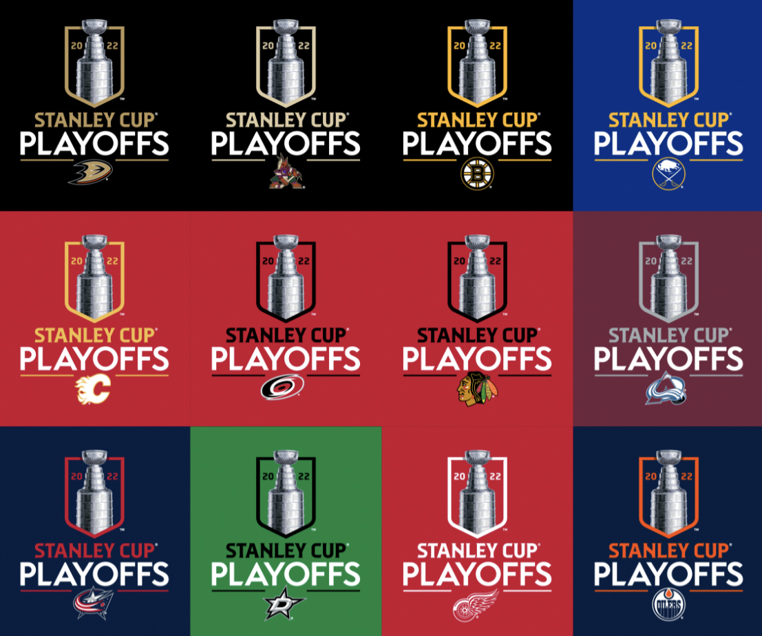
The new Stanley Cup logo can be modified to match individual team colors when they advance into the playoffs, with the NHL shield replaced with the corresponding member club’s logo. Some examples of the 32 possible options are shown here.
NHL has also created a microsite introducing the new mark and brand story.
Subscribe to NCS for the latest news, project case studies and product announcements in broadcast technology, creative design and engineering delivered to your inbox.


tags
hockey, nhl, Stanley Cup
categories
Branding, Broadcast Industry News, Featured, Sports Broadcasting & Production