CNN+ special report look stands out with light and bold design

Subscribe to NCS for the latest news, project case studies and product announcements in broadcast technology, creative design and engineering delivered to your inbox.
CNN+’s special report lo0k uses a combination of clean white backgrounds with red and off-white accents, angled elements and rounded corners to create a design that’s decidedly distinct but also with some nods to its mother network’s look.
The intro for such reports starts with a white screen with subtle bursts of light, dark and even reds suggested by what appears to be a heavily blurred and outsized CNN+ logo layer with a crisp version of the logo in red.
This is a notable and purposeful departure from the normal vanity card that runs before most CNN+ productions that features a rich red background with a white logo.
The logo slowly reduces in size while a series of angled elements enter the screen, serving as a wipe element of sorts to make the CNN+ logo disappear in favor of the words “Special Report” set in bold black with a slight 3D and shadow effect that become flatter over the brief time it takes to move into place.
The angled elements appear to roughly match the angle of the downward strokes in the iconic CNN logo and take on a variety of looks ranging from thin lines in white and black to thicker ones in red. Others have a glassy effect with reflective effects that manage to repeat morphed portions of the “Special Report” title set in CNN Sans.
Some of them also become layered with shadows behind them, allowing for an oversized version of the plus icon to occupy much of the right third of the screen.
Meanwhile, the design also makes use of several arrays of dotted matrices in both light gray and white.
The open’s announce is the voice of correspondent and anchor Christine Amanpour and features an urgent musical bed.
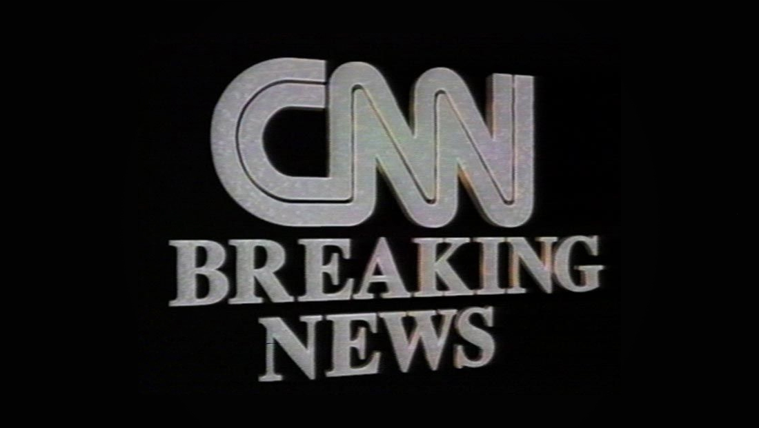
It’s noteworthy that CNN opted to call interruptions to its normal live streams (or cut-ins that air when nothing is live) a “special report” as opposed to the “breaking news” banner used on its primary feed.
In a way, it makes sense, because both CNN and MSNBC have long titled periods where programming shifts entirely to a single developing story with that name. Fox uses a mix of the “Alert” branding and, during select programming, “breaking news” as well.

For years, CNN was known for its black and gray breaking news open that featured music only.
That approach did, however, make it easy for viewers watching the network muted or only just listening to know that an important news update was coming.

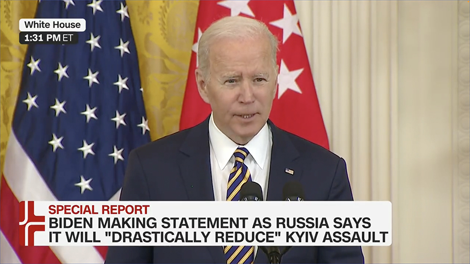
During the CNN+ special reports themselves, the streamer inserts white lower banners with rounded corners and a slightly truncated right arm of the plus symbol filling a portion of the far left.
The words “Special Report” is set in red on the top line, still inside the main white box, with two lines of black text below.
The network appears to have opted to leave space on the far right to accomodate the standard CNN bug should coverage be simulcasted or use elements from the main feed.
Locator lines also get the rounded corner treatment and can, much like on CNN proper, two white and black tiers.

In some cases, they move to the upper right of the screen allow for a red live bug in the upper left. During live regularly scheduled programs, CNN puts a “Streaming Live” bug here.
For fullscreen layouts the network has a background features many elements from the open, though with added elements of a large CNN+ logo running vertically up the left side and the added textural background element of a collage of multiple small plus icons.

While the CNN+ special report look features angled elements and similar colors to CNN’s breaking news design (except for the heavier use of black), the rounded corners and use of the plus sign are unique. It also flips the angles to tilt in the opposite direction and eliminates the repeating microtext for a bit of a cleaner, fresher look.
CNN’s breaking news stinger open typically uses an announcer these days.
When CNN+ special reports wrap, the network has an outro version available that uses a bit more upbeat music and no voiceover.
Unlike most network special report outros, the design does not include any social media icons or copyright lines.
Some have been left scratching their heads as to why CNN+ produces special reports when much of its other programming appears centered on taped long form content or scheduled, live shows that later become available on demand.
Unlike many other news streamers, there’s no 24 hour loop of anchored or anchor-less coverage (even if it’s just fullscreens of photos with on-screen text captions) and reporting live breaking news could be seen as detracting from the cable feed.
However, CNN execs have been quick to point out that breaking news on CNN+ has the advantage of featuring ongoing coverage of a specific topic while the primary network feed can continue to cover other news of the day as well.
In that way, CNN+ appears to selling its special reports as targeted more at those viewers who not only are willing to pay for its streaming service but also want to follow a primary story in more depth.
Subscribe to NCS for the latest news, project case studies and product announcements in broadcast technology, creative design and engineering delivered to your inbox.


tags
CNN, CNN Plus, OTT, streaming
categories
Broadcast Design, Broadcast Industry News, Graphics, Heroes, Streaming