
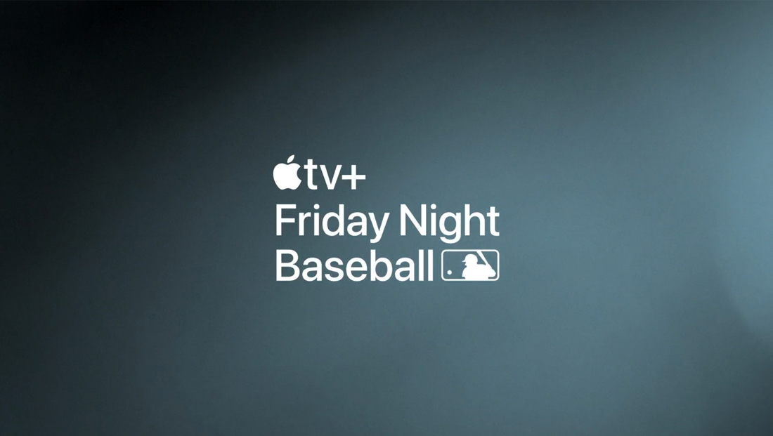
Apple brings its familiar aesthetic to a sports graphics package
Weekly insights on the technology, production and business decisions shaping media and broadcast. Free to access. Independent coverage. Unsubscribe anytime.
Apple has brought a take on its trademark familiar look to its new “Friday Night Baseball” streaming coverage.
Apple TV+ streamed the April 8, 2022, MLB matchups between the Houston Astros and Los Angeles Angels and New York Mets and Washington Nationals for its debut run, which are available for free without a subscription for a limited time.
The tech giant, known for its sleek user interface design, covered its first two Major League Baseball games April 8 as part of the Apple TV+ service it launched in 2019.
That clean aesthetic that users of various Apple gadgets have come to know was blatantly obvious — including the use of the company’s bespoke font introduced in 2014.
That typeface family, known as San Fransisco or SF, has become the standard typography across newer versions of iOS, iPadOS, tvOS, watchOS and macOS.
And now, it’s made its way into a full sports graphics package that also incorporates other familiar design elements from Apple’s design language.
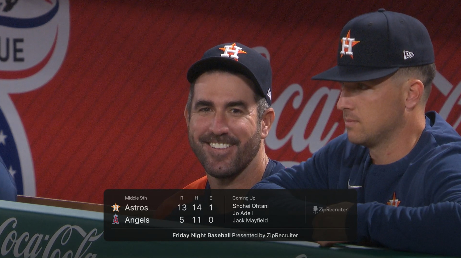

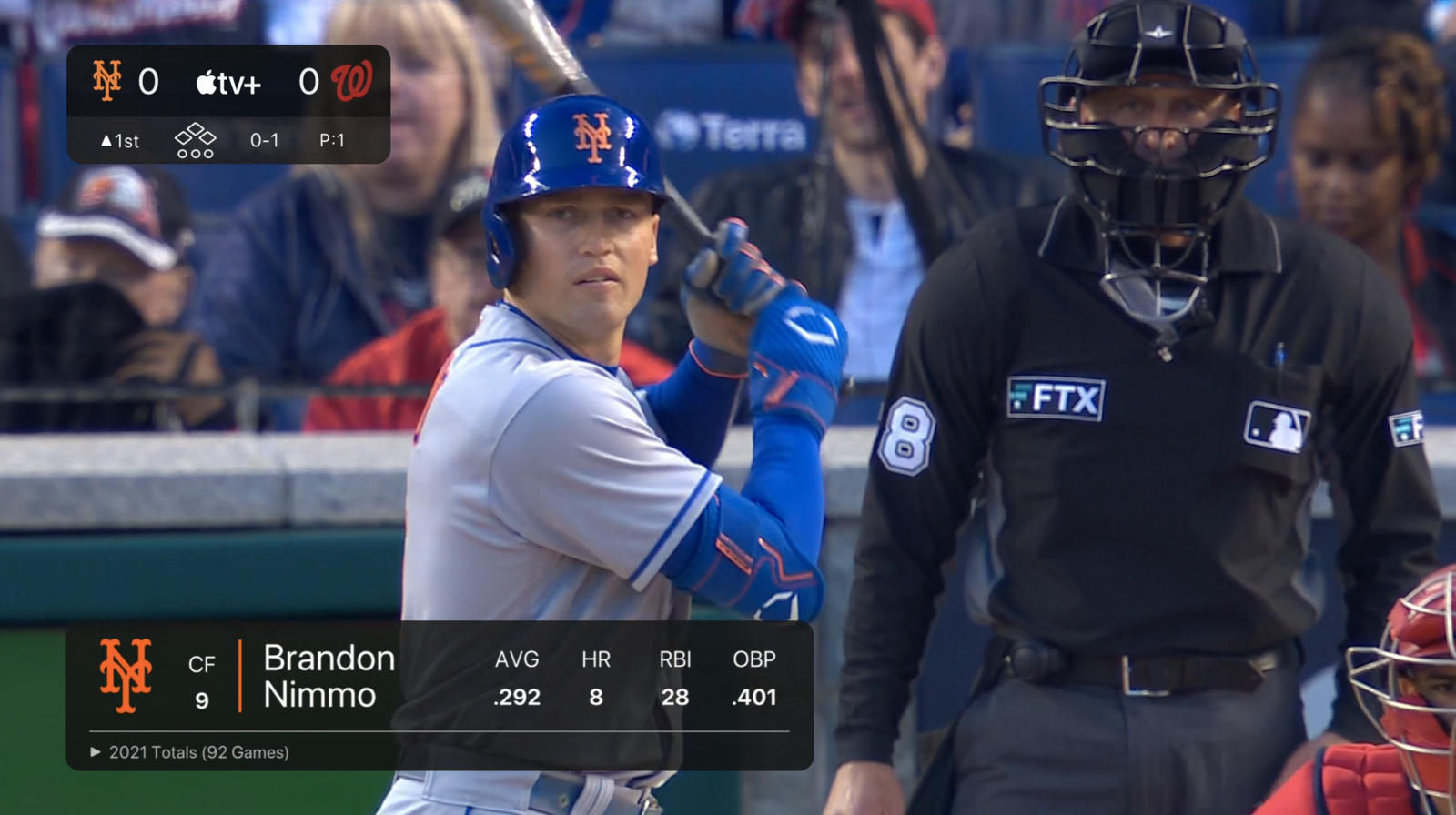
Insert graphics, including lower thirds, score bugs and other statistic graphics, are typically framed by dark, semitransparent rounded rectangles.
The use of a darker palette is reflective of the “dark mode” approach that has become popular with rich web applications and native apps for being easier on the eyes and allowing users to focus on content, particular of the video variety, so it makes sense that Apple used this approach in this graphics package.
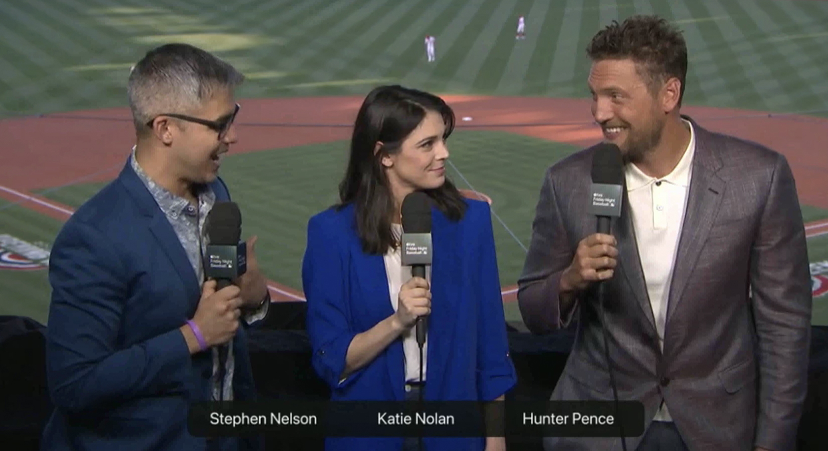
This included wide bars that could identify multiple people appearing on screen.
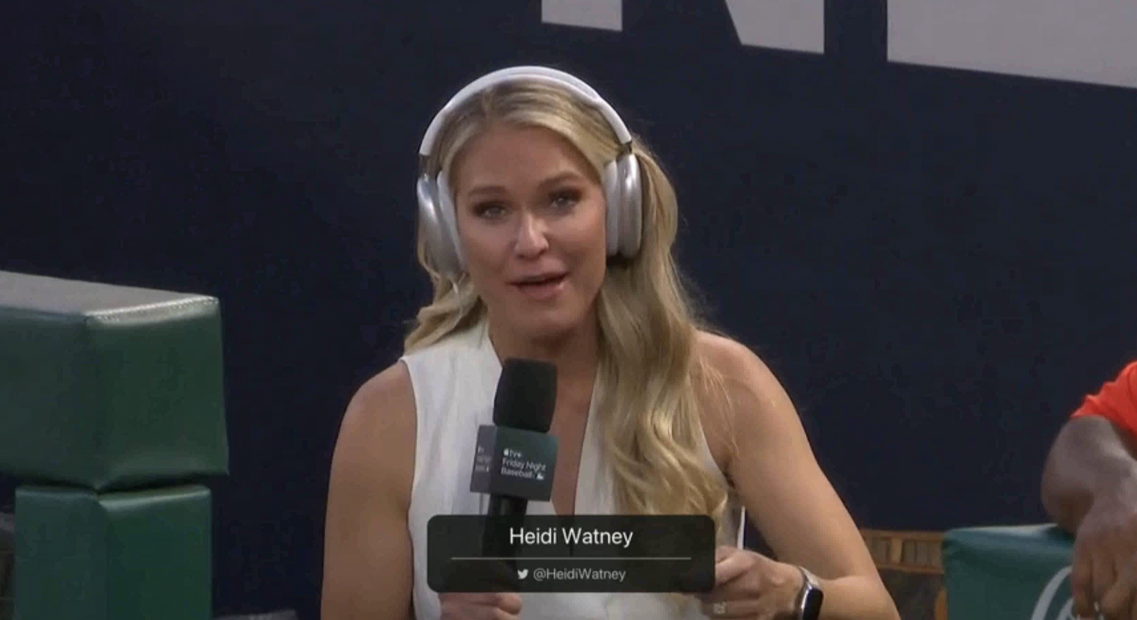
Single name bars, meanwhile, were centered and included a thin white horizontal rule with social media handle space below.
Quite naturally, field reporters were outfitted with Apple AirPods Max headsets instead of the normal clunky headphone and mic combo.
For audio, on screen talent carried black mics with a black cube mic flag that attempted to jam the entire “Friday Night Baseball” logo onto it rather than just the iconic Apple or, perhaps, the Apple and “tv+” logo.
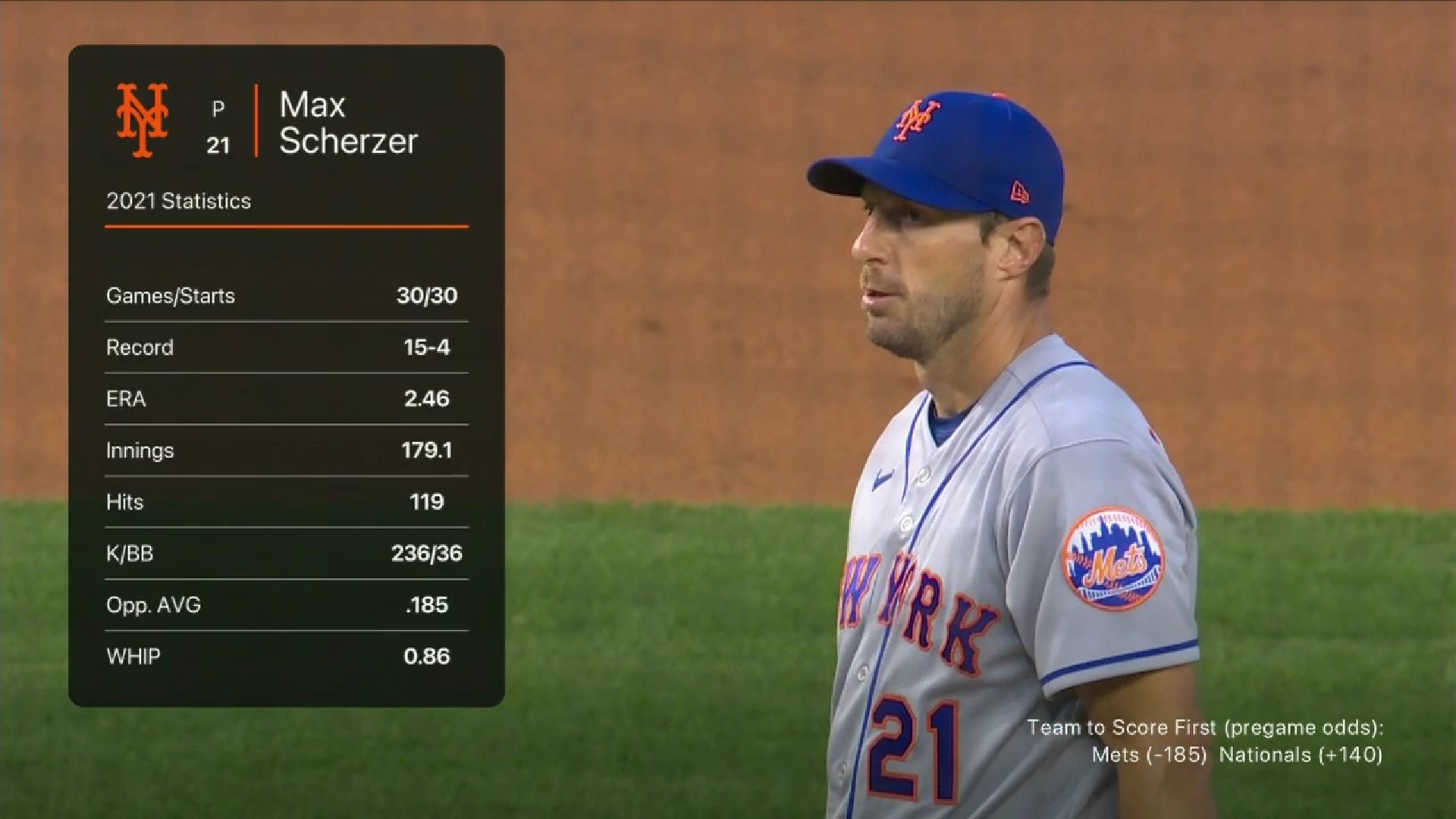
Throughout the graphics package, the text is kept mostly white with the design mostly relegating the use of color to team logos and horizontal and vertical accent rules in coordinating shades.
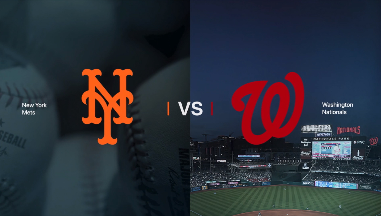
This layout featuring the team matchup logos is one of the more complex layouts used in Apple TV+’s MLB graphics package, but still manages to feature a streamlined look. Careful attention has been paid to how the team names are shown almost as ‘labels’ along with the prominent ‘VS’ text in the middle capped with vertical accents in the team color on either side. The home team side features a stadium image while the guest team gets a generic background tinted blue-gray.
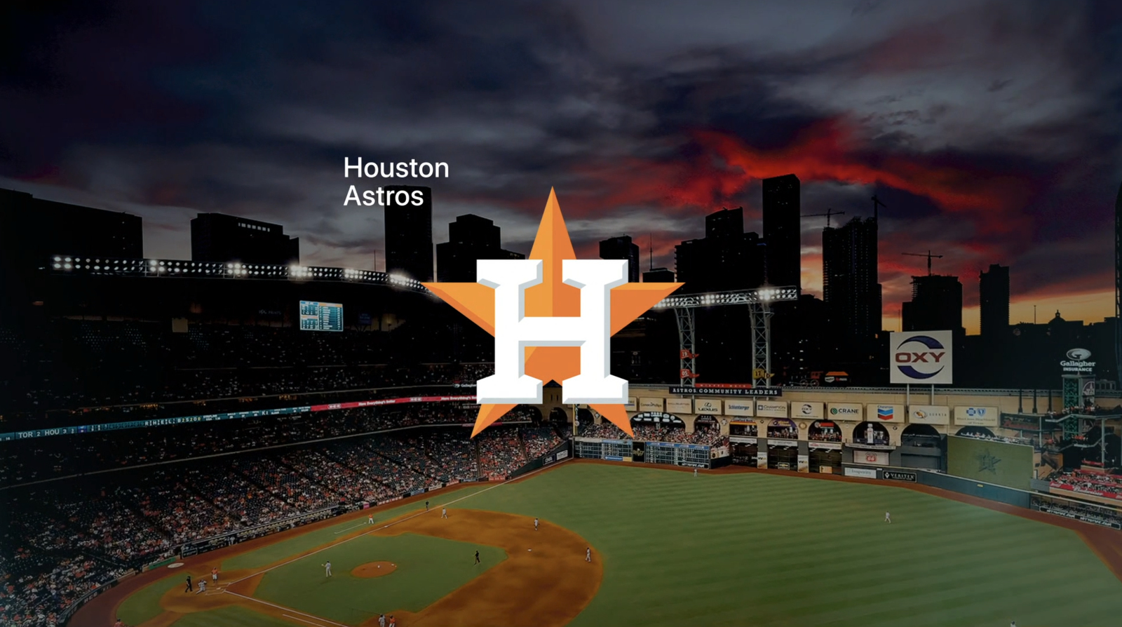
In this layout, the team name moves to the upper left of the team’s logo, which is prominent but still elegantly occupying only a portion of the screen to allow the stadium image to shine as well.

Big, bold typography that’s purposefully oversized compared to the screen real estate appears in stinger-style graphics such as this identifying the 7th inning (though that awkward letter spacing between the ‘7’ and ‘th’ seems like a bit of an oversight). This design also features stylized photography of baseball bat handles with a blue-gray mask.
Stinger wipes can also be combined with player imagery and blue-gray background with rounded rectangle elements.

Fullscreen graphics are heavily typographic as well, but also channeling the company’s penchant for large, dramatic graphical elements set against solid or subtly textural backgrounds.
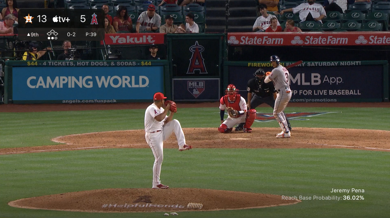
The score bug is placed in the upper left corner of the screen most of the time and features team logo icons, scores and other pertinent game information, including ball and base count indicators that align with Apple’s iconography approach but also are familiar to looks used in other sports graphics packages.

tags
Apple, Apple TV, Apple TV Plus, Baseball, MLB, streaming
categories
Graphics, Heroes, Sports Broadcasting & Production, Streaming