
Australia’s 7News gets bolder, streamlined look
Weekly insights on the technology, production and business decisions shaping media and broadcast. Free to access. Independent coverage. Unsubscribe anytime.
Australia’s Seven Network has updated its various newscasts with new graphics and updated sets that leverage a flatter angular design that’s a significant departure from its old look.
7News, as it is branded, produces both national news programming along with local bulletins and broadcasts, with all of them transitioning to the new graphics package and receiving varying degrees of set updates.

Previously, 7News sported a blue and red color palette with heavy use of glassy angled elements that also frequently magnified the background imagery behind them.
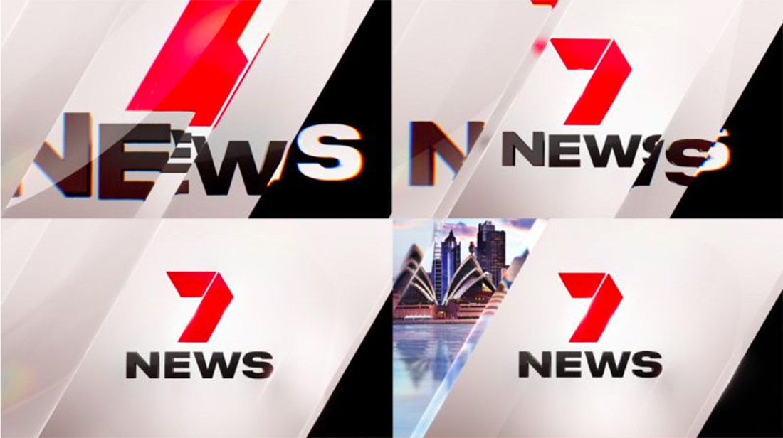
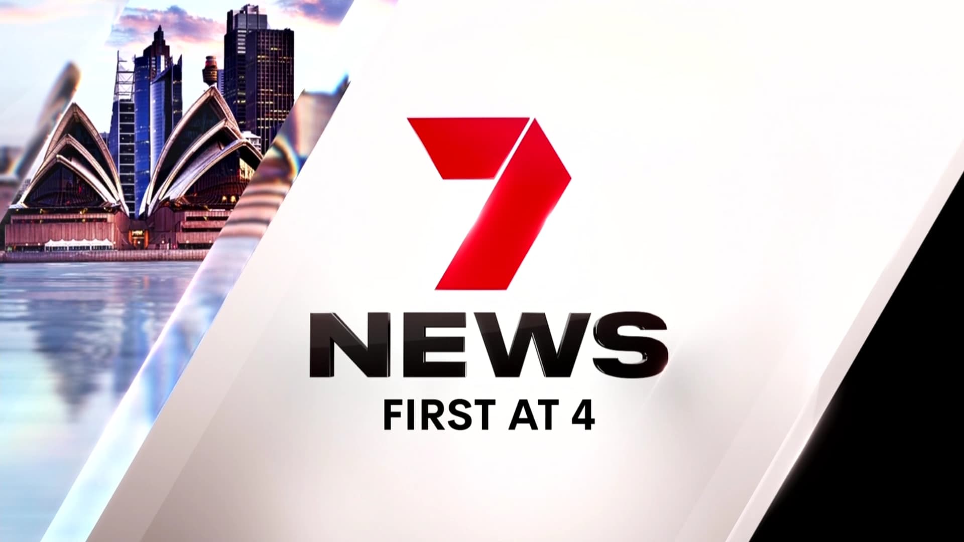
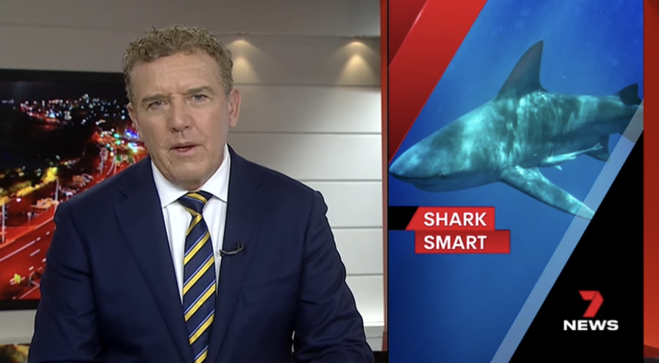
The new broadcast design package from designer John Valastro retains the red, which is featured prominently in the network’s iconic geometric “7” icon but instead pairs it with black and white.

The angular motif, which is inspired by the “7” icon, remains, but it’s now presented in the form of gradient or solid color elements, sometimes with a semitransparent look.
For the new design, the network’s logo remains in the lower right-hand corner as a bug and many of the insert graphics move to this side of the screen as well.
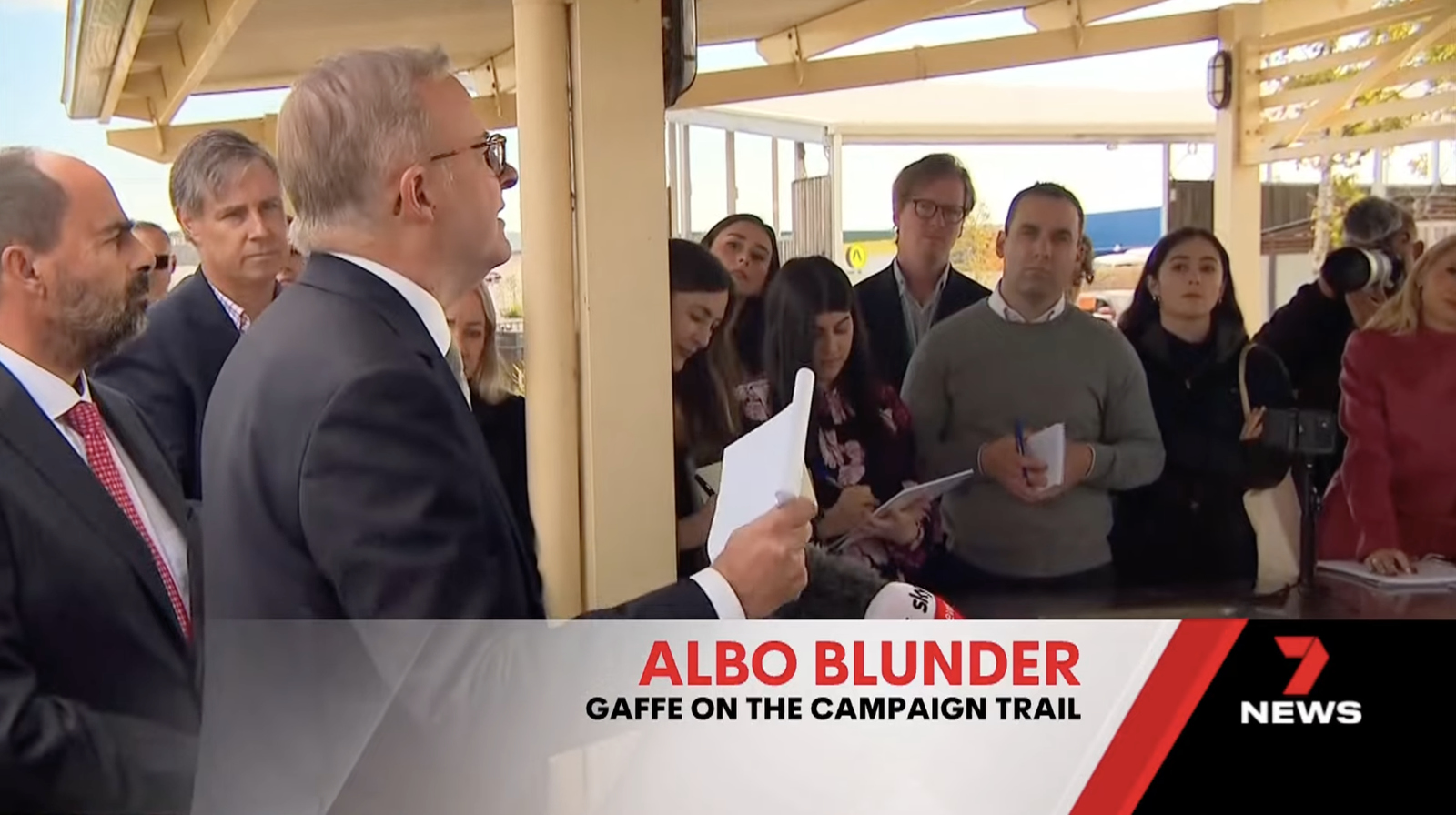
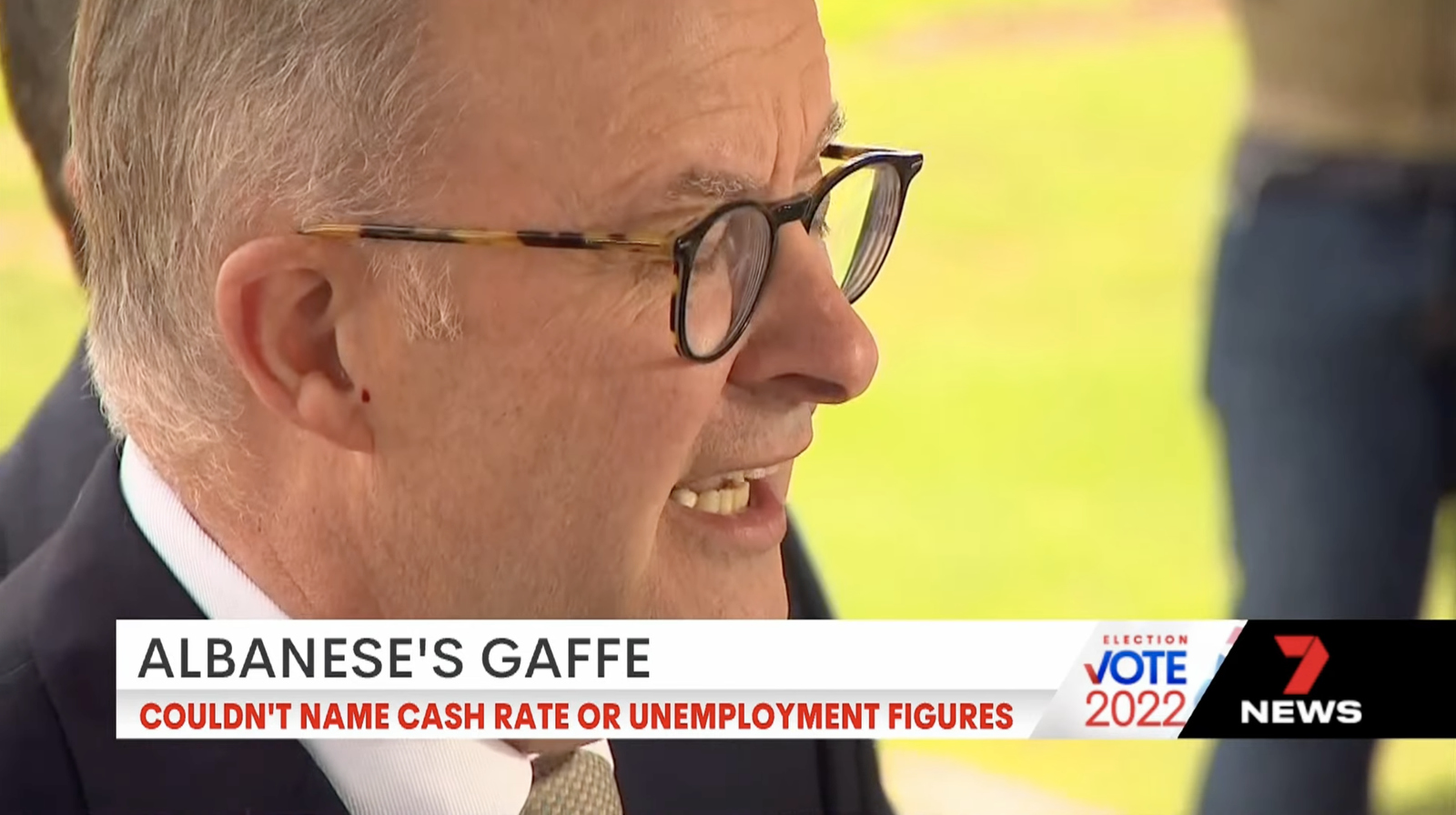
Headline tease banners have shifted from the lower left to the lower right and feature a black angled segment on the far right behind the bug. There’s a red angled element that separates this from the white gradient space provided for the two tiers of text, which are set in red and black type, which appears to be the same geometric sans serif the network used previously.

The design notably keeps both tiers of text flush right, rather than trying to align them with angle — which, in this case, would cause the top line of text to be farther to the right than the one below it.
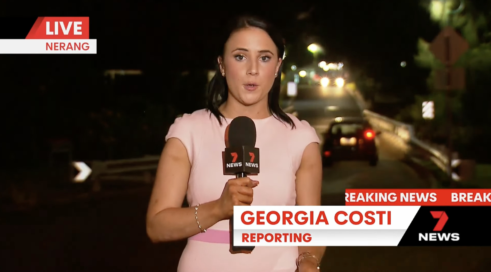
Lower thirds identifying individuals are also set more to the right side of the screen, growing as needed to accommodate a person’s name or text in the second tier. It also adds the black angled element behind the bug with the two tiers of left aligned text separated by a gradient effect.
The network also has the option to insert a breaking news ticker-style ribbon above the bug and part of the lower third.
For story banners, a more traditional full width style is used and can also include an additional angled element to the left of the black bug box for franchise branding.
Both types of lower thirds have the ability to animate in or shift between each other, with the effect using side-to-side animation with angled accents.
Opens and other fullscreen elements such as stingers continue the same look and color palette and use a variety of angled animations combined with zooming effects.
The opens can be localized thanks to portions of the screen becoming windows for geographic imagery to peek through.
There are hints of the glassy elements that play with perspective mostly in the opens, though it appears to be more than an accent rather than primary element.

In addition to the dark gradients used between angled segments, the package also incorporates the effect of a slightly beveled edge hit with bright light as well as angled flares of light hitting text.
One thing that hasn’t changed is the use of the familiar signature from “The Mission” musical suite with the movement of the same name, originally commissioned by NBC News in the U.S and composed by John Williams.
7News and “NBC Nightly News” now use different variations of the movement, though the signature is still very much audible in both.
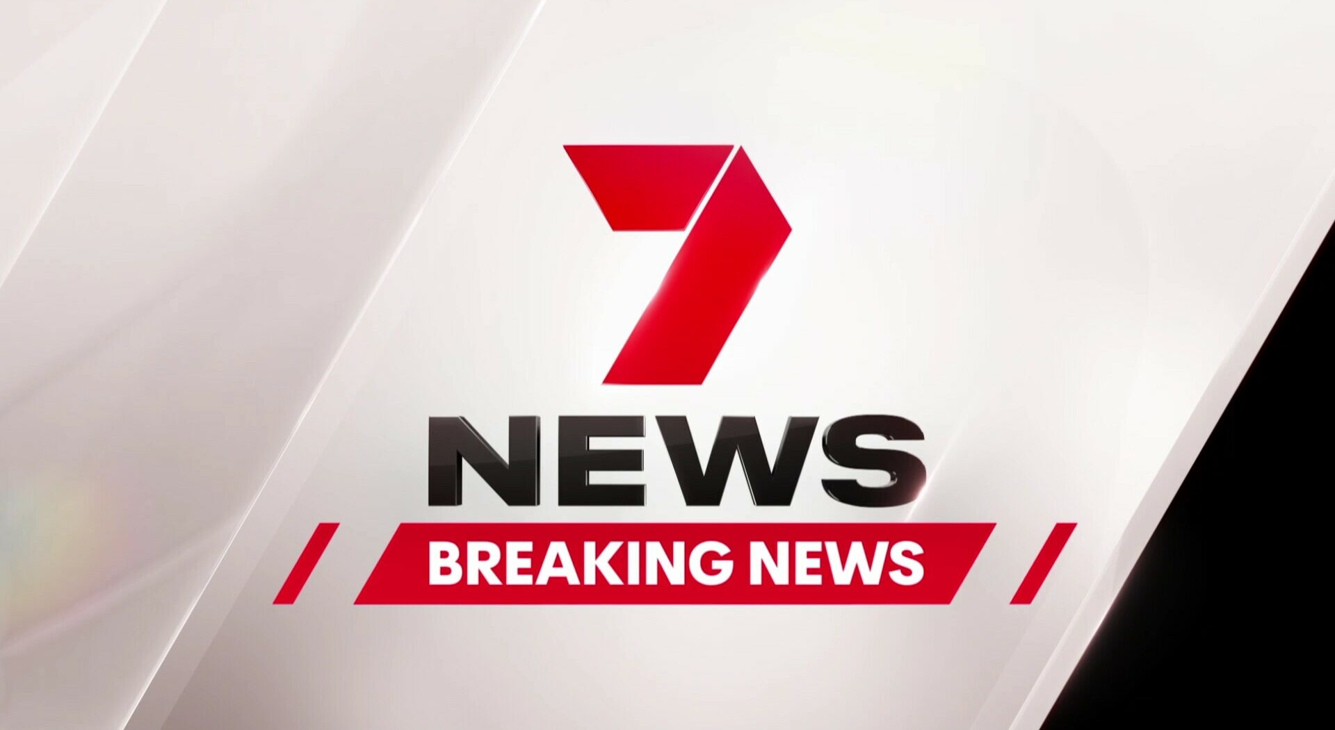
Angled boxes and lines can be used to draw attention to breaking news labels, while slates with fully red backgrounds, white text and black accents are available to add a more eye-catching look, just as for “exclusive” stingers.

The text used in opens and stingers is typically given a slightly 3D effect but it remains fairly subtle.
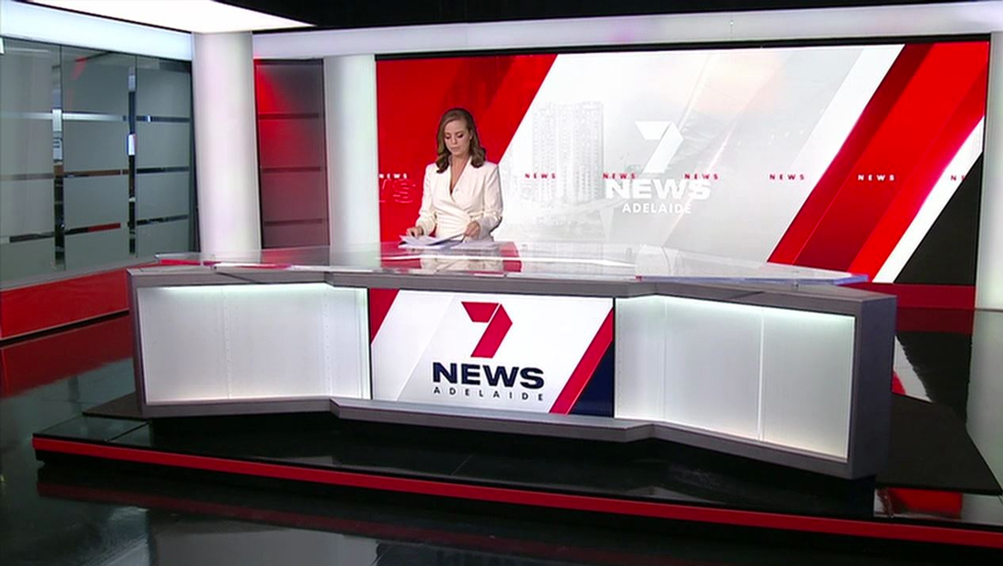
Many of the network’s various studios have large video walls that, like before, are used for topical OTS-style graphics. These graphics have also been updated to match the graphics package.
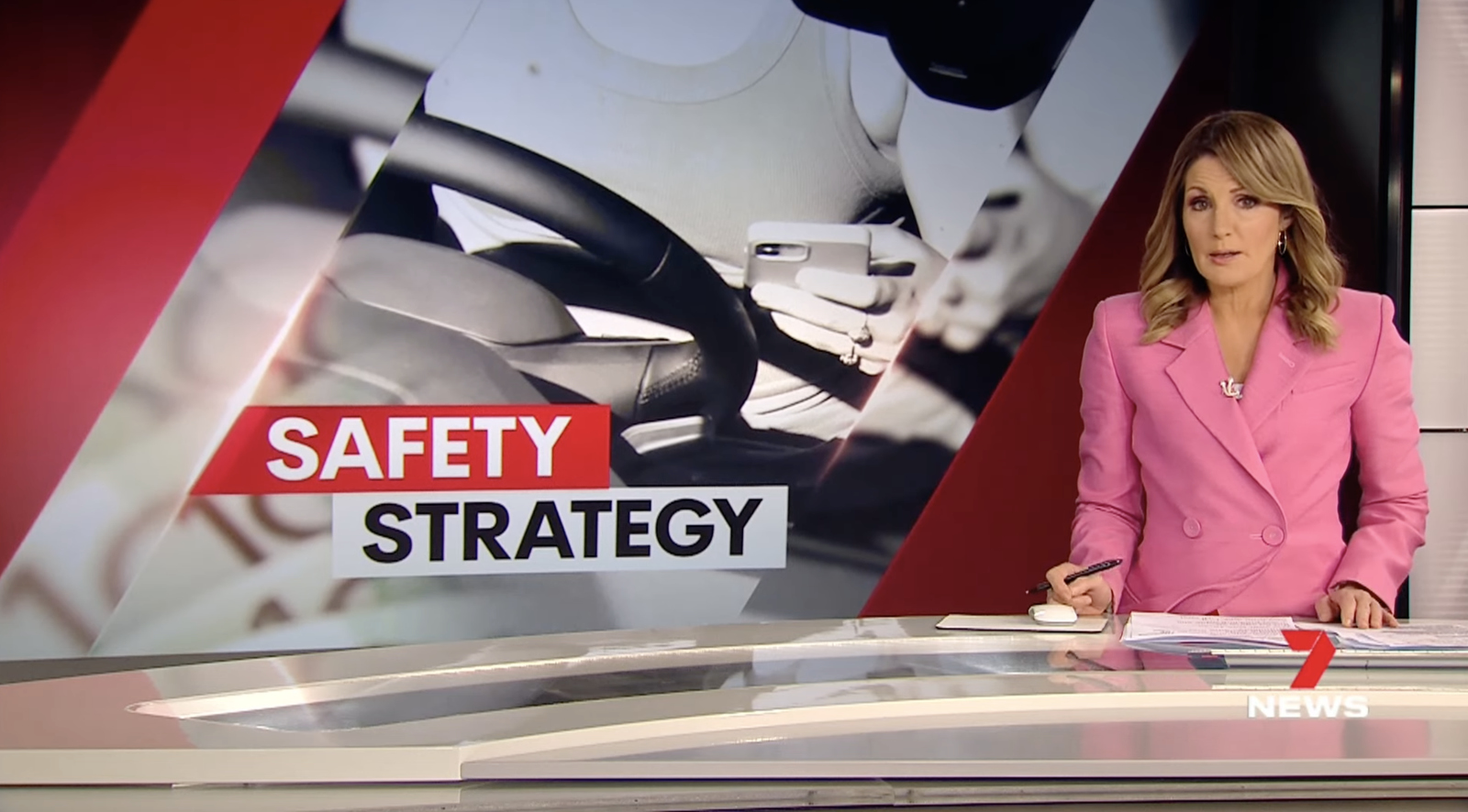
These designs use layers of angled elements, including the use of glassy effects again, to frame topical imagery behind the anchors.
They also have room for on-screen text in a variety of layouts, though at least one line is typically shown butting up against an angled element but squared off on the opposite side while the second tier is a simple rectangle.

There are also multiple formats for the composition of the imagery used — including the option to use a single image across the entire graphic or to combine background elements with a single, more prominent icon or image.
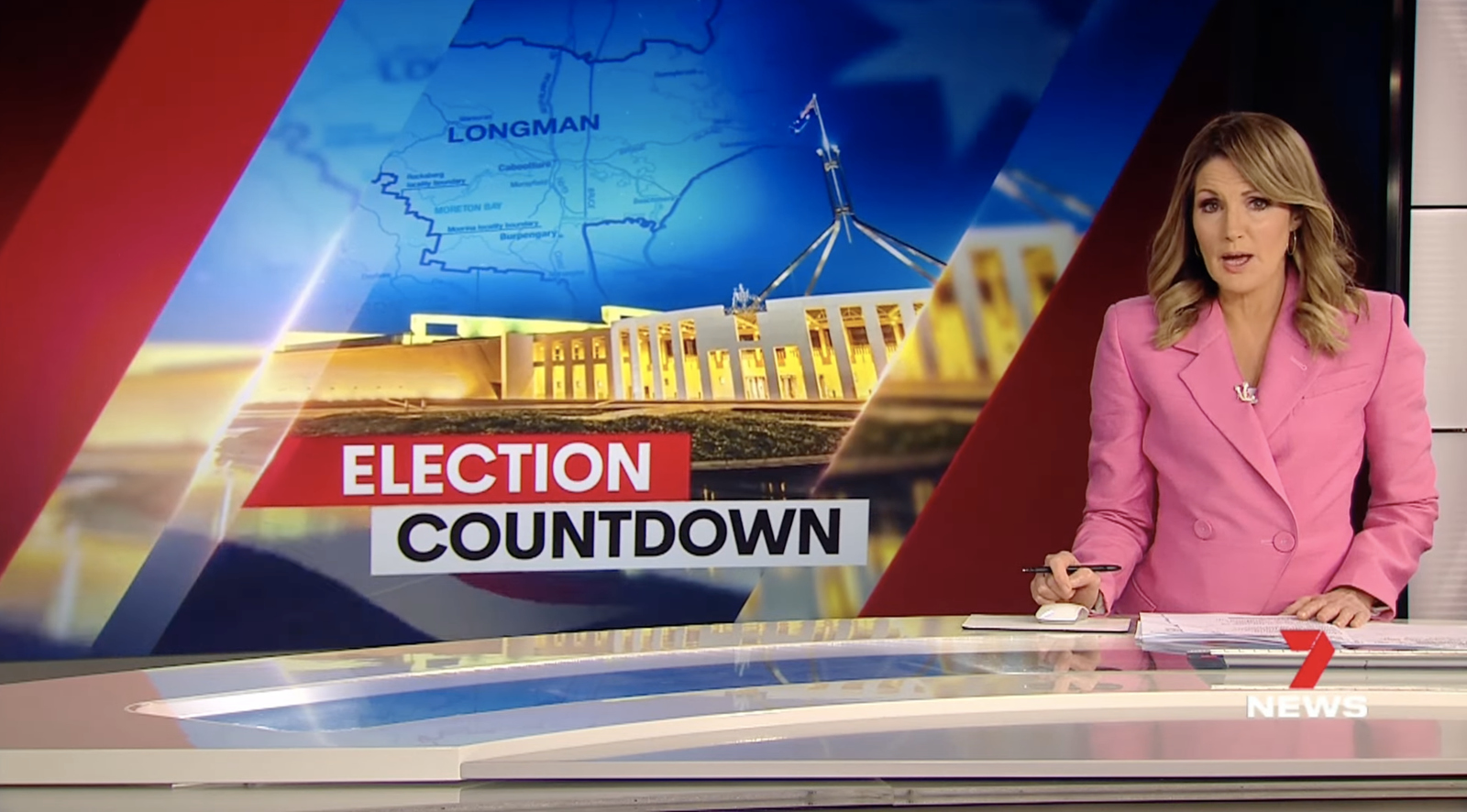
Often the video wall backgrounds are kept monochromatic, but there are times when more color is used in the designs.
For studios without the large video walls, an overlay-style OTS is available, which is displayed as a solid rectangle that takes up a little less than half the screen.
The angular frames and text containers are replicated in this look, though the more vertical nature of the digital canvas makes it a bit trickier to squeeze in a more dramatic design with prominent text.
In addition to the topical video wall graphics, there are also generic looks available that tend to stick more to a white design with subtle gray cityscape views and a white version of the 7News logo along with, as appropriate, the name of the region. There’s also the option to use imagery of the local city as a primary anchor background.
John Valastro, head of broadcast graphics at Seven Network, led the redesign effort with his creative services team.
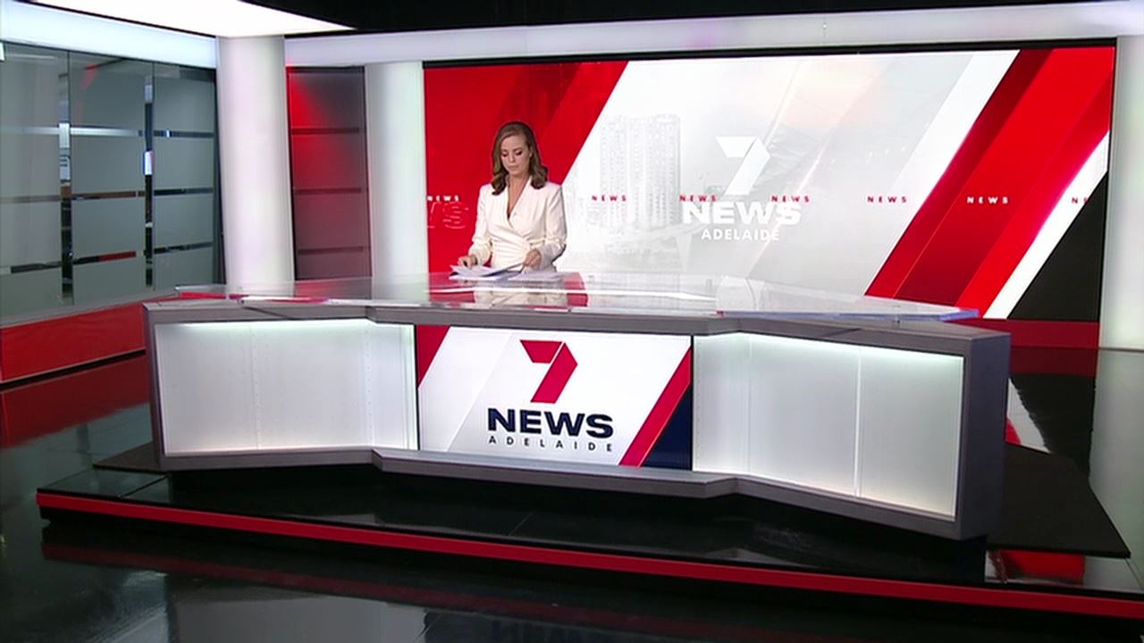
Because 7News produces local newscasts and bulletins from disparate locations, there’s always been some variation in the set designs it uses, though many of them have been updated in a variety of ways to incorporate more white and red, including the use of clean lightbox frames and backlit frosted and other rectangular elements.

tags
7News Australia, John Valastro, Seven Network, The Mission
categories
Broadcast Design, Graphics, Heroes