
WETA brand refresh reimagines ribbon element, logotype
Weekly insights on the technology, production and business decisions shaping media and broadcast. Free to access. Independent coverage. Unsubscribe anytime.
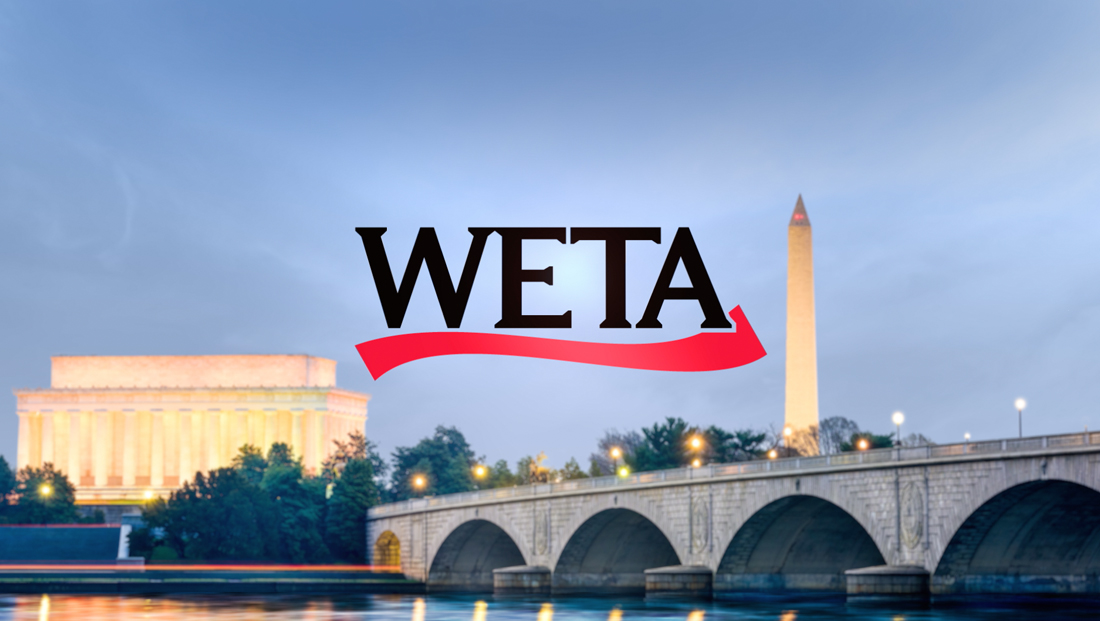
Washington, D.C. PBS member station WETA rolled out a brand refresh in early 2022 aimed at making the station’s look more flexible while also cementing its status as a “cultural institution” in the cluttered field of landmark organizations and broadcasters from around the Beltway.
The design process was triggered by a “perfect storm” of scenarios, says Dylan Wilbur, the station’s creative director.
First was the 2019 rollout of the new PBS logo and brand standards that also had new guidelines on station co-branding.
The old WETA logo used since 1997.
The station is also working on a $50 million update to its Campbell Place broadcast facility in Arlington, Virginia, set for a 2023 completion. Staffers were also finding that the old logo featuring two ribbon elements that suggest a vanishing point behind the wordmark was running into visibility concerns in smaller-sized but highly visible applications such as social media avatars.
Much of that appeared to be driven by those red ribbons taking up extra space. That would often force the call letters to appear at smaller sizes than was ideal.
Finally, the station had also been exploring creating a musical signature mnemonic device that could be used on both its TV and radio properties as well as its nationally distributed productions that, along with a strong logo, would tie all of these assets together cohesively.
When the team started working on the project over a year before its debut, it was careful to frame its ultimate goal.
“We weren’t approaching this as a rebrand, but a refresh. WETA has incredibly strong brand recognition in the Washington, D.C., market as well as through our nationwide network of public broadcasting partners,” said Wilbur.

Working with a committee that included the Greater Washington Educational Telecommunications Association’s CEO Sharon Percy Rockefeller, its Vice President of External Affairs Mary Stewart and its Senior Vice President and General Manager Miguel Monteverde through many iterations of logos.
It was decided to stick with black and red as well as to keep the typography in serif. Along with these, the primary palette also includes white and three shades of gray.
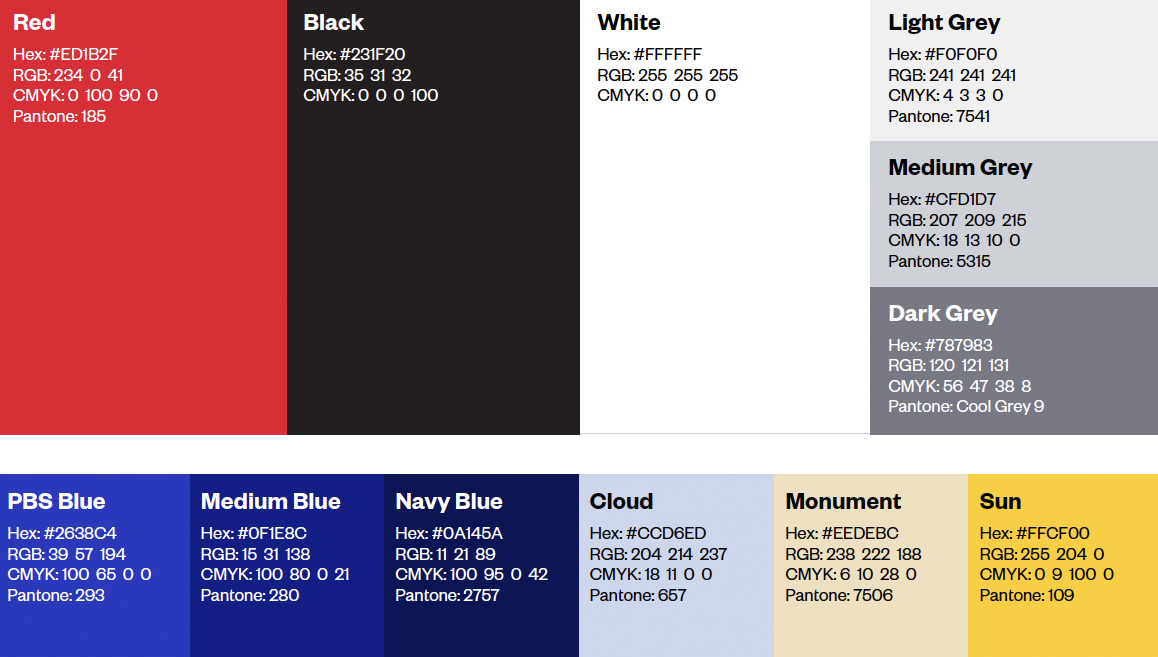
The secondary colors include the three blues from the PBS palette, PBS Blue, Medium Blue and Navy Blue but, instead of the secondary palette of teal, yellow and coral, WETA selected the light blue Cloud, beige Monument and golden Sun, shades that can still work along with the PBS standards but also bring in some local flavor as illustrated by the color names, especially the nod to a city full of historical monuments.
“After looking at a sampling of media brands in the marketplace, it was obvious that a simple, bold, sans serif typeface was just going to cause us to blend right in with all of our competitors,” explained Wilbur.
Logo designs developed during the rebranding process that were ultimately not chosen.
The team felt this called for a modern, serif typeface that would help it stand out in the market but also work well alongside peers in the arts such as The Smithsonian or The Kennedy Center.
“WETA is not just a media company, but also a cultural institution in the Washington, D.C. area, so our mark would need to balance both concepts,” he added.
To that end, a custom-drawn WETA mark was created after an exhaustive search for a serif typeface that was both crisp and stately but would scale well didn’t come up with any standout contenders — though it provided plenty of inspiration.
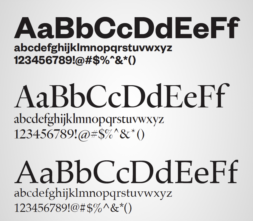
In addition to a custom-drawn logotype, WETA uses, from top, Founders Grotesk, Heldane and, as an alternative body copy, Palatino Regular.
Sans serif Founders Grotesk is also used as headline and subhead typeface while the serif Heldane is assigned to body copy, with Palatino Regular an acceptable alternative. Heldane is also used for show titles in schedule interstitials.
Another key decision was to lean heavier on the ribbon element but give it “depth and meaning.”
“We’re now approaching the ribbon as a symbol of transmission, a red carpet for our wide array of entertainment programming and a stripe of the American flag — a nod to the work we do with filmmaker Ken Burns and Dr. Henry Louis Gates Jr. capturing the history of America, and obviously our location here in the nation’s capital,” said Wilbur.
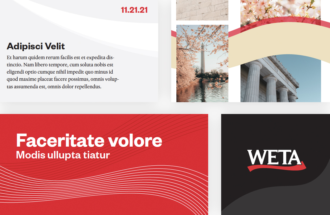
The ribbon can also be used in a variety of representations; some examples taken from the WETA brand guidelines are shown here.
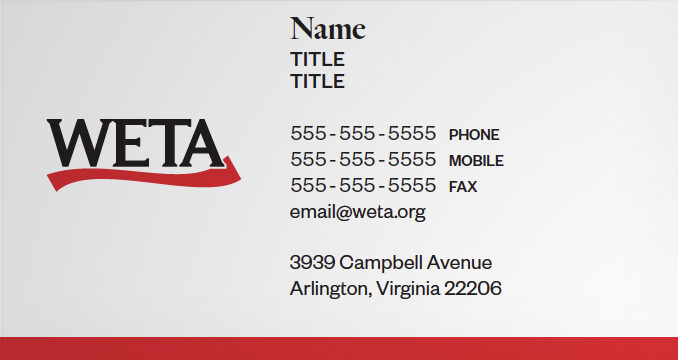
Business card layout sample.
The element was also designed to convey the sense of movement and dimension even in static form, which led to the detail of tucking the right edge of the ribbon behind the “A.”


Once the logo lockup was finalized, WETA worked with Dan Jan Vrem at RenderOn to create a 3-second production slate that accompanies the station’s productions that are seen by PBS viewers across the country, ranging from “Washington Week” to “Finding Your Roots.”
A different version was created for its British programming channel, WETA UK, in-house, which switched from using a Union Jack motif to a crown perched atop one of the strokes in the “u” in the lowercase styling of “UK.”
The station also turned to Stephen Arnold Music’s Chad Cook to compose and record a mnemonic.
“Relying heavily on piano and strings, we landed on a melody that is a musical interpretation of the voicing of our call letters,” explained Wilbur, adding that the station is currently working with Cook to create additional variations of the signature, including a solo instrumentation for top of the hour IDs on its FM classical music radio station and a “thrilling promo bed” to showcase series under its WETA UK brand.
For the interstitials on the channel, landscapes and architecture of England were selected, but they were softened with misty and foggy blues and grays so the program information would stand out.
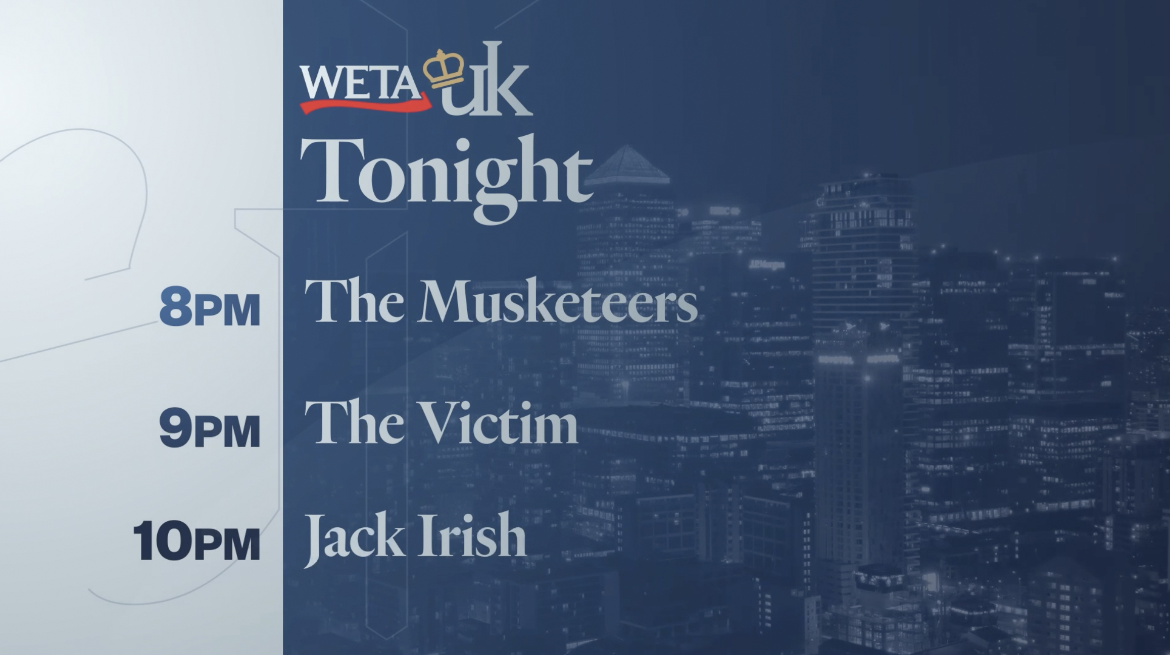
The “UK” lettering has also been updated to coordinate more directly with the redesigned station logotype.

In addition to the UK brand, the station also created updated looks for other offerings across TV and radio: Classical, World and Metro.
The old logo lockups, on the left, with the new iterations, on the right.
Throughout the creative process, the station also had to keep an eye on the new PBS brand and co-branding guidelines first put out in 2019.

“We wanted to be good stewards of their updated brand guidelines,” said Wilbur. It was also important to complement, rather than compete with, the PBS brand standards while also still allowing the station to keep its own distinct identity.
Careful attention was paid to ensuring the new PBS logo and color palette could be leveraged to give both brands equal weight when shown together.
The logo also had to follow guidelines for the PBS Kids brand, which has retained its green circular logo.

tags
Dylan Wilbur, PBS, renderon, Stephen Arnold Music, weta
categories
Branding, Broadcast Design, Broadcast Industry News, Graphics, Heroes, Theme Music