NBA Finals brings back script typeface in logo design

Subscribe to NCS for the latest news, project case studies and product announcements in broadcast technology, creative design and engineering delivered to your inbox.
The NBA Finals logo has brought back a “fan favorite” element — the use of a script typeface — to mark the league’s 75th anniversary.
“The modernized logo incorporates the fan-favorite font alongside the Larry O’Brien Trophy to honor the league’s 75-year history while looking forward to the future,” the league wrote in a post announcing the look.
First released back in April 2022, the logo drops the clean red and blue look used since 2018 and introduces a new, script font for the word “Finals.”
The finals should not be confused with the NBA Playoffs, which use a different look.


This somewhat helps resolve the issue of the logo being mistaken for the non-existent word “Tinals.”


At the same time, the new font is a bit less flowery than the previous script, with dramatic swashes reserved mainly for the “F” and “S.”
The lettering also gets two gold accents on those two letters as well, which are rather insignificant given the overall scale of the typography.
Not restored, however, is the interpretation of the the crossbar in the “F” as the tail of a red shooting star, which itself served as the dot on the “i.”
Where the old script was freeflowing and elegant, the new one feels a bit stilted and restrained, though the look is more in line with recent design trends, including the rise in brutalist-inspired design that emphasizes heavier, stronger looking strokes and elements.
The updated design also moves the name “NBA” into the box with the “logoman” that has been the league’s primary mark for years. It also continues to eliminate the word “The” as part of the official logo design.
The primary mark also adds a simplified rendering of the trophy behind the word “finals” along with the year places in the negative space above the “a.” The placement of the trophy behind and exaggerated top swash of the “F,” however, creates a bit of awkward trapped white space here, while also reducing the year’s visual weight.
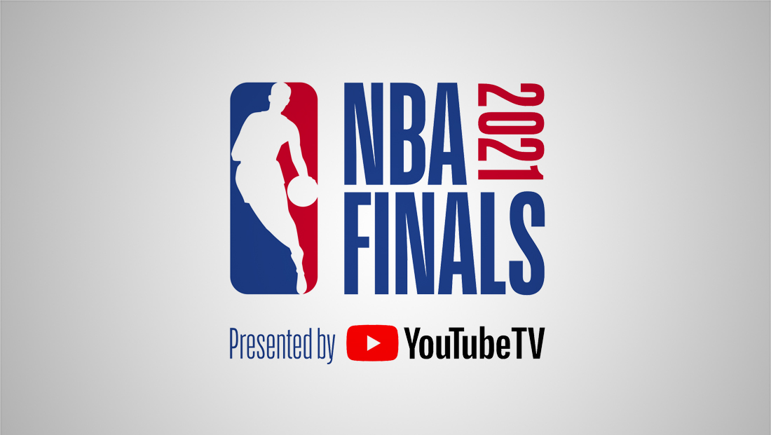

Variations of this logo was used from 2018 to 2021, with the year being updated each time.
The NBA dropped the script in 2018 after using it since 2014 and previously from 1986 to 1995.
Instead, it moved to a bold, condensed sans serif that typically put the word “NBA” and “Finals” on separate lines in all caps next to the logoman. The year, meanwhile, was rotated 90-degrees clockwise and placed in the negative space created by the shorter line with the league initialism.
This look was bolder, though, besides the logoman, it also lacked any distinctive elements that the league or championship could “own.”
Back when a script-style logo was last used, the word “The” was included from 2004 to 2017, tucked inside the tail, in a reduced size, of the “F” that extended to the left of the word.
As indicated, the NBA Finals logo has a history of waffling back and forth between looks and other formatting, including not using “The” from 1996 to 2003.


It was during that period, when the logo became oval and used a sketched-style trophy icon, that the look used a lowercase “i-n-a” in the word “Finals” at near full capital letter height, presumably as a way to avoid creating significant trapped space.


The league wisely updated the look in 2000 to set “Finals” in all caps.


Prior to 1996, the matchup’s logo used a a stacked look with “The” and “Finals” in a script much like the 2004 to 2017 look but with the year and letters “NBA” set in a wide, bold sans serif with humanist tones and dinstictive numerals, especially the “9” and “6,” which, given that double “9”s appeared in each logo from 1990 through 1995, became a familiar part of the look. The games didn’t use the look in 1996, which would have featured all but one number, the “1,” having the unique hook that did not connect to the opposite stroke.
By reverting to the script, the NBA is likely looking to lean on a sense of nostalgia to its earlier days.
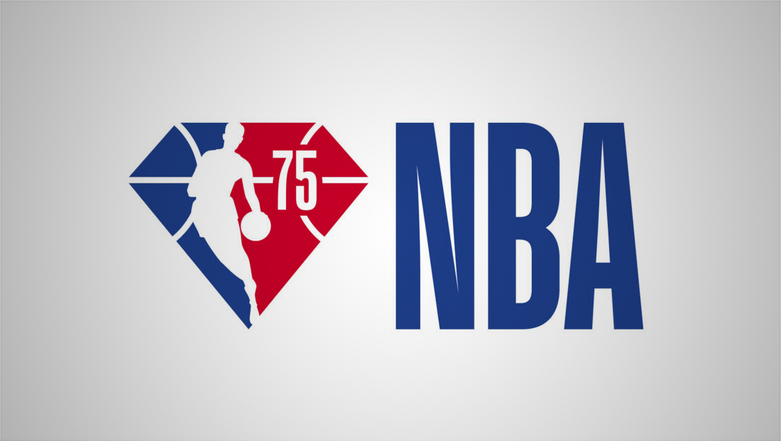

The league itself is in the middle of wrapping up its diamond anniversary of 75 years (though this is not the 75th finals), and developed a diamond and basketball-themed logoman look to mark the occasion that uses the condensed sans serif the finals logo previously used for the initialism, when applicable.
Script typefaces have a mixed history in broadcast logo designs, with another notable use being the distinctive one used to this day by NBC Sports. In many cases, script fonts can be a bit challenging to read.
Subscribe to NCS for the latest news, project case studies and product announcements in broadcast technology, creative design and engineering delivered to your inbox.




tags
logo design, NBA, NBA Finals
categories
Branding, Broadcast Design, Featured, Sports Broadcasting & Production